Year/ID: 2011 / E61002G11 Group: E Direct communication Subgroup: E61 Flat direct mail and small print materials
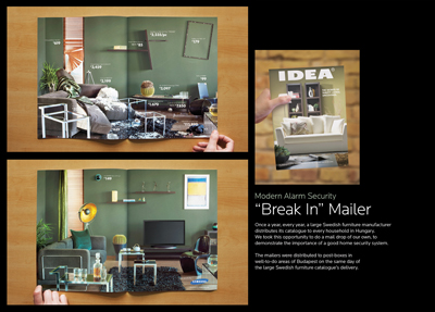
Product and services category: Home Security Registrant: OGILVY GROUP HUNGARY ZRT. Country: HUNGARY Brand name: Modern Alarm Advertiser: Modern Alarm Advertising agency, city: Ogilvy Budapest Art director: Zoltan Visy Copywriter: Karolina Galacz Creative director: Will Rust, Ferenc Benesch Photographer: David Lukacs Creative idea explanation: Once a year, every year, a large Swedish furniture manufacturer distributes its catalogue to every household in Hungary. We took this opportunity to do a mail drop of our own, to demonstrate the importance of a good home security system.The mailers were distributed to post-boxes in well-to-do areas of Budapest on the same day of the large Swedish furniture catalogue's delivery.
Target The Top
Year/ID: 2011 / E62001G11 Group: E Direct communication Subgroup: E62 Multidimensional direct mail and small printed materials
Product and services category: Subaru Hellas Registrant: DAY6 Country: GREECE Brand name: Subaru Symmetrical All-Wheel Drive Advertiser: Subaru Hellas Advertising agency, city: day6, Athens Art director: Redoine Amzlan Creative director: Ivan Papadopoulos Project manager: Panagiotis Kavopoulos Director: Panos Theokas Production company: Antonis Kefalonitis Other credits: Evi Tsatsaki
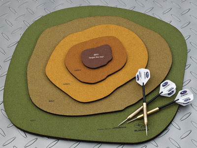
Creative idea explanation: An innovative New Year's gift for selected clients owning Subaru off-road vehicles. Subaru is an excellent choice for any mountain-lover because of its unique Symmetrical All Wheel Drive System (AWD). We made a special darts game. The dartboard represents a mountain with the circles replaced by topographic contour lines. (Contour lines are lines drawn on a map connecting points of equal elevation, allowing us to show the shape of the land surface). The different heights indicate the various scoring sections. This year, using the special Subaru-winged darts representing your Subaru vehicle, you can В«Target the TopВ» at 2011m. and enjoy 2011 points!
Lipton tea bag
Year/ID: 2011 / E62003G11 Group: E Direct communication Subgroup: E62 Multidimensional direct mail and small printed materials
Product and services category: Lipton tea bag Registrant: FORMITAS BBDO Country: SLOVENIJA Brand name: Lipton Advertiser: Unilever Advertising agency, city: Formitas BBDO Art director: Deidra Jovanović Copywriter: Creative Team Creative director: Ana Ivandič Designer: Deidra Jovanović Project manager: Betka Bouha Other credits: Tanja Drašler
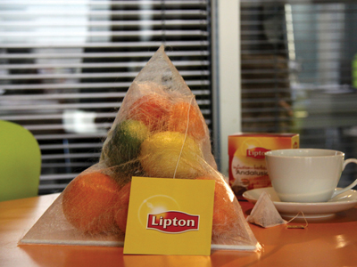
Creative idea explanation: The core of the event, the promotion of the new pyramid-shaped Lipton tea bags, was pointed out to the press already with the shape of the invites. The invitations were shaped as large tea bags filled with fruit, just like Lipton teas.
Feel the road
Year/ID: 2011 / E62010G11 Group: E Direct communication Subgroup: E62 Multidimensional direct mail and small printed materials
Product and services category: Harley Davidson Registrant: YOUNG & RUBICAM PRAHA Country: CZECH REPUBLIC Brand name: Harley Davidson Advertising agency, city: Y&R, Prague Art director: Gerrit Gerischer Copywriter: Daniel Joseph Creative director: Jaime Mandelbaum Photographer: Stock photo Other credits: Head of art: Marco Antonio do Nascimento, retouch: Furia
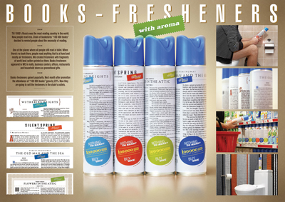
Books Fresheners
Year/ID: 2011 / E62016G11 Group: E Direct communication Subgroup: E62 Multidimensional direct mail and small printed materials
Product and services category: Chain of bookstores Registrant: VOSKHOD Country: RUSSIA Brand name: 100 000 Books Advertising agency, city: Voskhod, Yekaterinburg Art director: Vladislav Derevyannykh Copywriter: Evgeny Primachenko, Aleksandr Parkhomenko, Alexey Nikiforov Creative director: Andrey Gubaydullin Designer: Dmitry Maslakov Creative idea explanation: Till 1990's Russia was the most reading country in the world. Now people read less. Chain of bookstores "100 000 books" decided to remind people about the necessity of reading. One of the places where all people still read is toilet. When there's no book there, people read anything that is at hand and mostly air fresheners. We created fresheners with fragments of world best-sellers printed on them. Books-fresheners appeared in WC in malls, business centers, offices, restaurants and household stores. Books-fresheners gained popularity. Next month after promotion the attendance of "100 000 books" grew by 23 %. Now they are going to sell the fresheners in the chain's outlets.
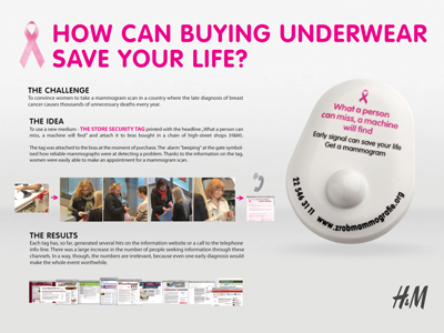
What a person can miss, a machine will find. POS.
Year/ID: 2011 / E63001G11 Group: E Direct communication Subgroup: E63 Point of sale communication
Product and services category: Amazonki - Stowarzyszenie Warszawa Centrum Registrant: EURO RSCG WARSAW Country: POLAND Brand name: Amazonki - Stowarzyszenie Warszawa Centrum Advertiser: Amazonki - Stowarzyszenie Warszawa Centrum Advertising agency, city: Euro RSCG Warsaw Art director: Rafał Ryś Copywriter: Magdalena Banasik Creative director: Jacek Szulecki Project manager: Agnieszka Wichracka Creative idea explanation: Most women know that self-examination can help diagnose breast cancer early. But many women don't know that a mammogram scan is the only way to be certain there are no dangerous lumps.To draw attention to this issue we came up with an original medium: a Store Security Tag Printed with the headline: "What a person can miss a machine will find".The tags were added to the bras by the shop assistant after a customer had bought them. The gate beeped what caught everyone's attention, but more importantly, it symbolized the reliability of a "machine" in detecting lumps.
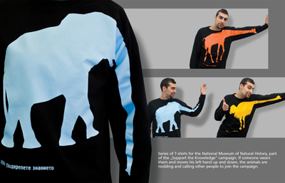
T-shirts - elephant, giraffee, ostrich
Year/ID: 2011 / E63011G11 Group: E Direct communication Subgroup: E63 Point of sale communication
Product and services category: National Museum of Natural History Registrant: PUBLICIS MARC Country: BULGARIA Brand name: National Museum of Natural History Advertiser: National Museum of Natural History Advertising agency, city: Publics Bulgaria Creative director: Publicis team Creative idea explanation: Series of T-shirts for the National Museum of Natural History, part of the "Support the Knowledge" campaign. If someone wears them and moves his left hand up and down, the animals are nodding and calling other people to join the campaign.
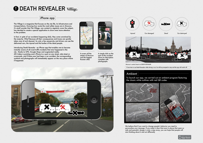
Product and services category: Road Safety Registrant: LEO BURNETT RUSSIA Country: RUSSIA Brand name: The Village Advertiser: The Village Advertising agency, city: Moscow Art director: Mikhail Derkach Creative director: Mikhail Kudashkin, Grigory Sorokin Designer: Andrey Sergeev Production company: Kijjaa
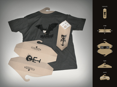
T-shirt packaging and hanger in one
Year/ID: 2011 / E64001G11 Group: E Direct communication Subgroup: E64 Packaging design – custom made
Product and services category: Online T-shirt shop Registrant: VOTAN LEO BURNETT D.O.O. Country: SLOVENIJA Brand name: Cultera Advertiser: Cultera Advertising agency, city: Votan Leo Burnett Art director: Aleš Strajnar Creative director: Aleš Strajnar Creative idea explanation: Recycled cardboard paper packaging for online T-shirt shop delivery which can be transformed into a t-shirt hanger.
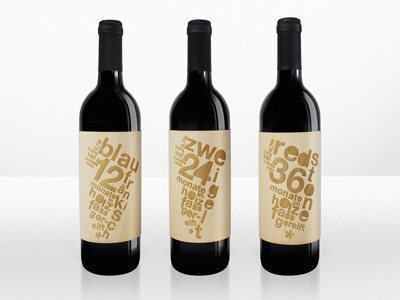
The Wood Edition
Year/ID: 2011 / E64004G11 Group: E Direct communication Subgroup: E64 Packaging design – custom made
Product and services category: Wine farmer Registrant: OGILVY & MATHER GMBH Country: AUSTRIA Brand name: The Wood Edition Advertising agency, city: Ogilvy and Mather, Vienna Art director: Renate Stoica, Heinz Ploder, Natalia Satzinger Copywriter: Sarah Krobath Creative director: Gerd Schulte-Doeinghaus Creative idea explanation: Describe the brief from the client:The Brandl Winery creates limited edition series of oak-aged wines. The series, created from 3 different wines of varying vintages - Blaufränkisch, Zweigelt and Stone Red - were to be given a unified design.Describe the challenges and key objectives: How to show at a glance that the wine has been matured in wooden casks? Describe how you arrived at the final design: The labels were created from veneers, which were cut from the original wooden wine casks. The typeface was engraved directly into the wood. Give some indication of how successful the outcome was in the market (how well the design was received; results; consumer engagement etc.: The bottles were highly desirable - and not only due to their content. Despite its relatively high price, the limited edition sold out within 5 months.
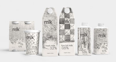
Mlk
Year/ID: 2011 / E65002G11 Group: E Direct communication Subgroup: E65 Packaging design for mass produced goods and services
Product and services category: Mlk organic dairy Registrant: DEPOT WPF Country: RUSSIA Brand name: Mlk Advertiser: Prodmol Advertising agency, city: Depot WPF, Moscow Art director: Aram Mirzoyants Creative director: Alexey Fadeev Creative idea explanation: The brand visual identity consists of black and white graphic patterns which were taken from the real environment of a small milk farm. The patterns of the real farm were used in order to reflect the naturalness of the dairy production and the products. The objective was to differentiate the product on the store shelf and to distinguish it from the products of dairy producers. We understood that the indentity of Mlk brand has to be different from the big mega-producers. As for the illustrations, we used natural farming patterns - a family farm, where the products are produced in a traditional way. Illustrations are hand-made with a pencil which enables to stress the handmade production process. In addition, a pencil technique makes the image 'soft' - and is overall most suitable tool for solving this task.The development strategy stipulates the launch of a huge quantity of products, beginning with a milk line.
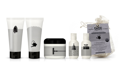
Dizao Organics
Year/ID: 2011 / E65003G11 Group: E Direct communication Subgroup: E65 Packaging design for mass produced goods and services
Product and services category: Dizao Organics Cosmetics Line Registrant: DEPOT WPF Country: RUSSIA Brand name: Dizao Organics Advertiser: Dizao Advertising agency, city: Depot WPF, Moscow Art director: Lyudmila Galchenko Creative director: Alexey Fadeev Creative idea explanation: We were asked to create a trendy line of skin care products targeting consumers keen on innovative packaging. We developed a system of symbols showing the basic quality of each product of the range.Usually the product description runs in small font on the front side of the packaging. In this case black and white graphics conveys the essence of each product in a clear and emotional way. Each SKU has an individual symbol created with a unified logic in mind. The approach became the basis for the brand identity. All information about the producer and the method of application is placed either on the back panel of the packaging or on a label attached to it.
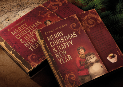
Comilfo Limited Edition
Year/ID: 2011 / E65013G11 Group: E Direct communication Subgroup: E65 Packaging design for mass produced goods and services
Product and services category: Comilfo Chocolates Registrant: DEPOT WPF Country: RUSSIA Brand name: Comilfo Advertiser: Nestle Advertising agency, city: Depot WPF, Moscow Art director: Julia Zhdanova Copywriter: Kirill Rizhkov Creative director: Alexey Fadeev Creative idea explanation: The package is styled as a Christmas gift, left for a while and rediscovered in our days. The gift from the time when flying airplane one have to be crazy rather than busy. The main font resembles a cantle needlework that adds a sense of uniqueness and handmade work to this gift. The package is launched in the New Year Eve.
28.09.2011
19-й международный фестиваль рекламы Golden Drum пройдет в Портороже в Словении, с 2 по 5 октября. За годы своего существования Golden Drum вышел на позиции одного из самых ожидаемых мероприятий для рекламистов со всего мира. Для многих фестиваль является самым важным и заметным обзором рекламного мира за год, превосходя в этом даже фестиваль Cannes Lions.

 Карта рекламного рынка