Year/ID: 2012 / F66001G12 Group: F Design of Brand & Corporate Identity Subgroup: F66 Visual identities
Product and services: Lithuanian vodkaRegistrant: ADELL TAIVAS OGILVYCountry: LITHUANIABrand name: Lithuanian vodkaAdvertiser: AB "Stumbras"Advertising agency, city: Adell Taivas OgilvyArt director: Tomas KarpaviciusCopywriter: Dominykas ZilenasCreative director: Dominykas Zilenas, Tomas KarpaviciusDesigner: DADADA Studio, Aurimas SandarisAccount Director /Manager: Simas Baciulis Other credits:
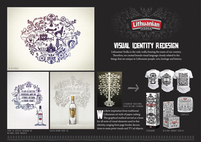
Creative idea explanation: Visual identity redesign. Lithuanian Vodka is the only vodka bearing the name of our country. Therefore, we created brands visual language closely related to the things that are unique to Lithuanian people: arts, heritage and history. We drew inspiration from traditional Lithuanian art style of paper cutting. This graphical method served as a basis for all sorts of visual elements used in this identity, ranging from page border decorations to main print visuals, in-store stands and TV ad objects.
Campaign idea explanation:
Multiple entry explanation:
MYWED
Year/ID: 2012 / F66007G12 Group: F Design of Brand & Corporate Identity Subgroup: F66 Visual identities
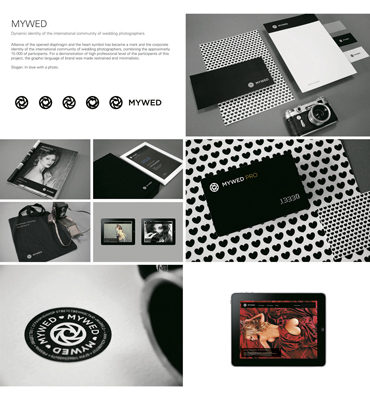
Product and services: IdentityRegistrant: PARADOX BOXCountry: RUSSIABrand name: Paradox BoxAdvertiser: International community of wedding photographersAdvertising agency, city: Paradox Box, UfaArt director: Ilshat BaiburinCopywriter: Ilshat BaiburinCreative director: Ilshat BaiburinDesigner: Ilshat BaiburinAccount Director /Manager: Elena Osadova Creative idea explanation: Alliance of the opened diaphragm and the heart symbol has became a mark and the corporate identity of the international community of wedding photographers, combining the approximetly 15 000 of participants. For a demonstration of high professional level of the participants of this project, the graphic language of brand was made restrained and minimalistic. Slogan: In love with a photo.
Storye Graphic Identity
Year/ID: 2012 / F66010G12 Group: F Design of Brand & Corporate Identity Subgroup: F66 Visual identities URL: http://vimeo.com/27585505
Product and services: Latvian rye breadRegistrant: GUILTYCountry: LATVIABrand name: StoryeAdvertising agency, city: Guilty, RigaArt director: Zigmunds LapsaCopywriter: Voldemars Dudums, Kaspars StaskevicsCreative director: Armands LeitisAccount Director /Manager: Aira Leite Other credits:
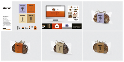
Creative idea explanation: We had to create a brand and packaging design for bread baked in Northern Europe. The bread is created in observance of ancient, very scrupulous baking methods. When creating the brand, we had to take into account that the bread was intended for the U.S. market, where only the rare few know what black bread is. The scrupulous and slow process for creating this type of bread contrasts sharply with America’s popular fast-food and white-bread culture. The black bread is a bread with a story and is made out of rye. This is why we named it Storye.
Campaign idea explanation:
Multiple entry explanation:
T-platforms
Year/ID: 2012 / F66013G12 Group: F Design of Brand & Corporate Identity Subgroup: F66 Visual identities
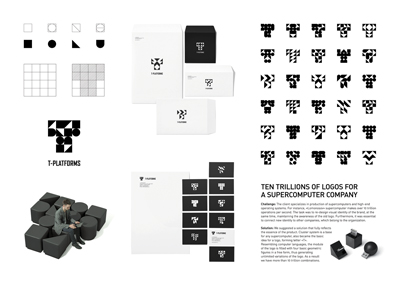
Product and services: Production of supercomputersRegistrant: TOMATDESIGNCountry: RUSSIABrand name: T-platformsAdvertising agency, city: Tomatdesign, MoscowArt director: Andrey TarakanovCopywriter: Farkhad KuchkarovCreative director: Andrey TarakanovDesigner: Denis BashevAccount Director /Manager: Anna Plyaskova Creative idea explanation: Challenges and objectives: The task was to re-design visual identity of the brand, at the same time, maintaining the awareness of the old logo. We had to create more up-to-date logo and explain the potential of the company. One of the challenges was to make the identity a strong instrument to help company compete with such giants as IBM or HP in Russian IT-market, as there was no chance to compete in terms of advertising or promo budgets.Solution: We suggested a solution that fully reflects the essence of the core product. Cluster system is a base for any supercomputer, and it also became the basic idea for a logo, forming letter “T”. Resembling computer languages, the module of the logo is filled with four basic geometric figures in a free order, thus generating unlimited variations of the logo. As a result we have more than 10 trillion combinations.
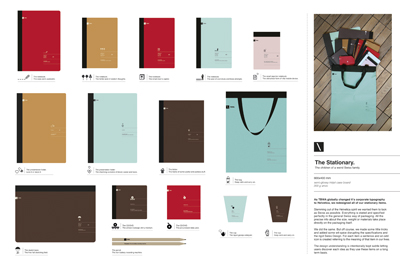
The stationary
Year/ID: 2012 / F66017G12 Group: F Design of Brand & Corporate Identity Subgroup: F66 Visual identities
Product and services: Promotional itemsRegistrant: TBWA/ISTANBULCountry: TURKEYBrand name: TBWA\ISTANBULAdvertising agency, city: TBWA\ISTANBUL, ISTANBULArt director: Zeynep OrbayCopywriter: Ilkay GurpinarCreative director: Ilkay GurpinarAccount Director /Manager: Burcu Ozdemir Kayimtu, Dilek Ucarli Other credits:
Creative idea explanation: As TBWA globally changed it's corporate typography to Helvetica, we needed to design all of our stationary items. For each item a sentence and an odd icon is created referring to the meaning of that item in our lives. We designed everything from cups to folders, notebooks to CD cases that we use in the office. Stemming out of the Helvetica spirit we wanted them to look as Swiss as possible. Everything is stated and specified perfectly in the general Swiss way of packaging. All the precise info about the size, weight or materials take place directly on the packaging itself. We did the same. But off course, we made some little trick and added some wit-spice disrupting the specifications and the rigid Swiss Design. We have been sending the items to different TBWA agencies around the world and to the Turkish marketing scene. We have received great feedbacks and a huge demand for more samples (even a great demand to buy the items). We have already started producing the second round in a very short time period.
Campaign idea explanation:
Multiple entry explanation:
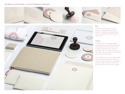
Corporate Identity
Year/ID: 2012 / F66021G12 Group: F Design of Brand & Corporate Identity Subgroup: F66 Visual identities
Product and services: Breast Unit Prague - Clinique for Breast diseasesRegistrant: LEAGAS DELANEY PRAHA S.R.O.Country: CZECH REPUBLICBrand name: Breast Unit Prague - Clinique for Breast diseasesAdvertiser: Breast Unit Prague - Clinique for Breast diseasesAdvertising agency, city: Leagas Delaney, PrahaArt director: Lauren van AswegenCopywriter: Tereza SverakovaCreative director: Tereza Sverakova, Herman WaterkampPhotographer: Goran TacevskiAccount Director /Manager: Marketa KoksalovaFilm Production: Anna Tosovska, Filmservice Other credits: Stepan Kolar
Creative idea explanation: Often it is men who discover a lump in their partner's breast. That is why the campaign encourages men to help their partners with preventive breast examination.
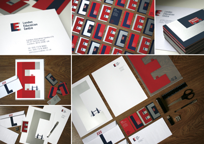
London Education Center
Year/ID: 2012 / F66025G12 Group: F Design of Brand & Corporate Identity Subgroup: F66 Visual identities
Product and services: corporate IdentityRegistrant: GENERAL LINE!Country: RUSSIABrand name: London Education CenterAdvertising agency, city: General Line! SamaraArt director: Irina KarandaevaCopywriter: Svetoslav KosvintsevCreative director: Irina KarandaevaDesigner: Inna GlazovaAccount Director /Manager: Svetoslav Kosvintsev Other credits:
Creative idea explanation: The London Education Center was founded for Russian children, students and businessmen who want to start learning English or improve their language skills. The center also specialises in supporting overseas students in finding suitable courses and educational institutions. The corporate identity plays with the initials of the name, combining them with illustrations of typical London landmarks such as the Tower Bridge and double-decker buses. The three colors of the logo mark the entire corporate stationary.
Campaign idea explanation:
Multiple entry explanation:
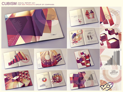
Cubism
Year/ID: 2012 / F67008G12 Group: F Design of Brand & Corporate Identity Subgroup: F67 Annual reports
Product and services: Alcoholic and Energetic DrinksRegistrant: KAFFEINE COMMUNICATIONSCountry: UKRAINEBrand name: 'New Products' Group of CompaniesAdvertiser: 'New Products' Group of CompaniesAdvertising agency, city: Kaffeine Communications, KyivArt director: Dima Tsapko, Roman DavydyukCopywriter: Nadia SkrynnykCreative director: Dima Tsapko, Anze JerebDesigner: Denis RostolopaAccount Director /Manager: Galina Amosova Creative idea explanation: Cube structure is included in logo of 'New Products' Group of companies. It's impossible not to use such an occasion.
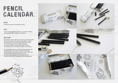
All Year Pencils
Year/ID: 2012 / F68002G12 Group: F Design of Brand & Corporate Identity Subgroup: F68 Calendars
Product and services: 2012 calendarsRegistrant: LEO BURNETT SP. Z O.O.Country: POLANDBrand name: Leo BurnettAdvertiser: Leo BurnettAdvertising agency, city: Leo Burnett WarsawArt director: Malgorzata Parczewska, Robert ChudzikCopywriter: Agata Polinska, Kamil KowalczykCreative director: Pawel HeinzeIllustrator: Ewa LandowskaAccount Director /Manager: Pawel Heinze, Kornel GesickiDigital Production: Andrzej Stys, Pawel KulinskiProgrammer: Rafal Kostecki Other credits: Wiola Rosinska - Kania
Creative idea explanation:
Campaign idea explanation:
Multiple entry explanation:
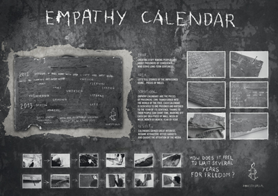
Calendars Of Empathy
Year/ID: 2012 / F68003G12 Group: F Design of Brand & Corporate Identity Subgroup: F69 Business gifts
Product and services: 2012 calendarsRegistrant: LEO BURNETT SP. Z O.O.Country: POLANDBrand name: Amnesty InternationalAdvertiser: Amnesty InternationalAdvertising agency, city: Leo Burnett WarsawArt director: Nina Lupinska, Agnieszka Kaczor - Zajaczkiewicz, Sebastian BulskiCopywriter: Piotr Zygmunt, Kamil KowalczykCreative director: Pawel HeinzeIllustrator: Nina LupinskaAccount Director /Manager: Lukasz Zajaczkiewicz Other credits: Magorzata Nierodzinska, Andrzej Santorski, Agata Bankowska, Agnieszka Jurkiewicz, PR Manager, MSL Warsaw
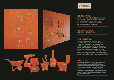
OBI Calendar
Year/ID: 2012 / F68006G12 Group: F Design of Brand & Corporate Identity Subgroup: F68 Calendars
Product and services: OBI, a nationwide Do It Yourself (DIY) storeRegistrant: INBREIFCountry: RUSSIABrand name: OBIAdvertising agency, city: InBrief, MoscowArt director: Radovan AndricCopywriter: Draginya KneziCreative director: Michael Gibson, Draginya KneziAccount Director /Manager: Anna Kostyleva Other credits:
Creative idea explanation: Challenge: Create a New Year gift from OBI, a nationwide Do It Yourself (DIY) store. Like the OBI brand, the gift must be functional, clearly convey the essence of the OBI brand, and reflect the variety of their DIY categories.Creative idea: DIY calendar - Do It Yourself! The solution /description of idea: Interactive, 3D calendar requires you to assemble each month from flat card cut outs. The months resembled objects sold by OBI (a drill, loo, paintbrush, wheelbarrow, lamp, and plant). The conveniently 'packaged' flat card was economical to produce and easy to send out. This calendar not just depicted OBI products, but reflected the DIY philosophy of OBI, requiring the recipient to construct and build.Results: People take pride in the things they make with their own hands, assuring the OBI calendar a place on peoples desks throughout the year. This bright, 3D calendar proved so popular that we ran out and reprinted! Client, Partners and agency loved displaying the pieces on their desks, being both practical and bringing joy to the work space.
Campaign idea explanation:
Multiple entry explanation:
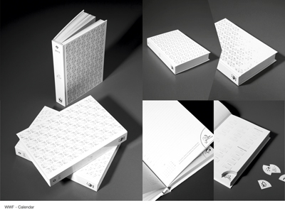
WWF calendar - animals endangered by extinction
Year/ID: 2012 / F68008G12 Group: F Design of Brand & Corporate Identity Subgroup: F68 Calendars
Product and services: calendar 2012Registrant: DDB WARSZAWA SP. Z O.O.Country: POLANDBrand name: WWF polandAdvertiser: WWF PolandAdvertising agency, city: DDB Warsaw, WarsawArt director: Maksym Matuszewski, Urban Godlewski, Katarzyna KielczewskaCopywriter: Katarzyna Dudek, Karol SoczewkaCreative director: Zuzanna Duchniewska-Sobczak, Maciej WaligoraAccount Director /Manager: Ola Malinowska Other credits: head of creative solutions - Kasia Seyfried
Creative idea explanation: Today, tomorrow, next week or in a month… Any day could be the last for many animals endangered by extinction. In the last 150 years the pace of extinction among birds and mammals has increased as much as four-fold. Very soon we might bid farewell to every fourth species of mammals, every eighth of birds and even every third species of amphibians. We wish for people to remember that every single day. We have designed a calendar. The numbers of a majority of protected species are falling every single day.
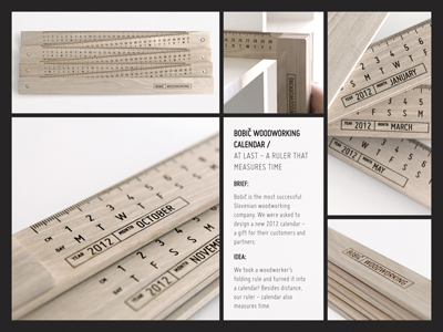
Ruler that measures time
Year/ID: 2012 / F68009G12 Group: F Design of Brand & Corporate Identity Subgroup: F68 Calendars
Product and services: WoodworkingRegistrant: GREY LJUBLJANA D.O.O.Country: SLOVENIJABrand name: Bobic WoodworkingAdvertising agency, city: Grey LjubljanaArt director: Matija Primc, Petra KrulcCopywriter: Matija Primc, Tomaz ApohalCreative director: Petra Krulc, Tomaz ApohalAccount Director /Manager: Ana Zeleznik Other credits:
Creative idea explanation:
Campaign idea explanation:
Multiple entry explanation:
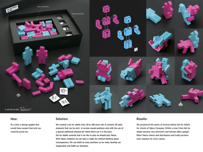
Set for adults
Year/ID: 2012 / F69003G12 Group: F Design of Brand & Corporate Identity Subgroup: F69 Business gifts
Product and services: Glue-Invest S.A.Registrant: GREY WORLDWIDE WARSZAWA SP. Z O.O.Country: POLANDBrand name: Taboo CondomsAdvertising agency, city: GREY GROUP Poland, WarsawArt director: Zofia Nowak, Beata Kotnowska-BujakCopywriter: Monika Swiatek-KrolCreative director: Katarzyna Sosnierz, Grzegorz WaliczekDesigner: Zofia NowakAccount Director /Manager: Dorota Kulma Creative idea explanation: We created a design gadget to show people that safe sex could be a great play. We wanted to help them to develop their imagination.
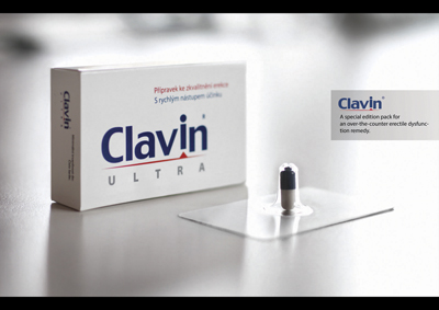
Erection Blister
Year/ID: 2012 / F69004G12 Group: F Design of Brand & Corporate Identity Subgroup: F69 Business gifts
Product and services: Over-the-counter Erection EnhancerRegistrant: OGILVY & MATHER, SPOL. S.R.O.Country: CZECH REPUBLICBrand name: ClavinAdvertising agency, city: Ogilvy & Mather, PragueArt director: Jiri LangpaulCopywriter: Jiri LangpaulCreative director: Will Rust, Tomas BelkoAccount Director /Manager: Frantisek Mares Other credits:
Creative idea explanation:
Campaign idea explanation:
Multiple entry explanation:
03.10.2012
19-й международный фестиваль рекламы Golden Drum пройдет в Портороже в Словении, с 2 по 5 октября. За годы своего существования Golden Drum вышел на позиции одного из самых ожидаемых мероприятий для рекламистов со всего мира. Для многих фестиваль является самым важным и заметным обзором рекламного мира за год, превосходя в этом даже фестиваль Cannes Lions.

 Карта рекламного рынка