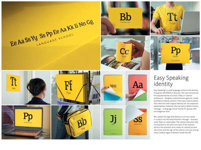
Product and services category: Language school Registrant: TOMATDESIGN Country: RUSSIA Brand name: Language school Advertiser: Easy Speaking language schoool Advertising agency, city: Tomatdesign, Moscow Art director: Andrei Ermilov Copywriter: Farhad Kuchkarov Creative director: Andrei Tarakanov Creative idea explanation: Challenge: Easy Speaking is a small language school on the territory of popular loft arma in Moscow. The main tenants are the representatives of artistic fields or creative professions - designers, advertisement agencies, media and fashion industry workers. There was a need to attract their attention with original identity but not expensive advertisement materials. Also we had to deliver the key message - a language school mainly for groups with zero/beginner level. Solution: We created the logo that allows to turn any media or surface into the advertisement message - business cards, flyers or a door plate. The creative execution fully corresponds to the spirit and style of the location, attracts the attention and creates an interest around the school, and the sign of the school is not lost among many creative logos of tenants inside the loft.
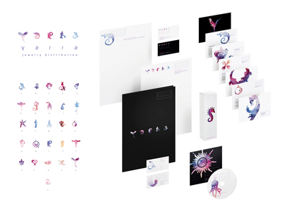
Product and services category: Jewelry Registrant: LIFANOV VLADIMIR Country: RUSSIA Brand name: Jewelry distribution Advertiser: Yarra Advertising agency, city: Suprematika, Moscow Art director: Vladimir Lifanov Designer: Vladimir Lifanov Creative idea explanation: "Yarra" is a distributor company presenting at the Russian market a lot of inexpensive jewelry brands from Europe and South-West Asia, as well as the goods of Russian produce. The idea is as follows: based on a great variety of forms and shapes of the jewelry brands presented by the company Latin alphabet is created. In addition to the alphabet there are several pendent - silhouette ,which sums up to 44 symbols altogether. Then full words can be made out of the letters, for example the one mentioned above "Yarra". Also separate "letters" can be used to decorate anything you like. Alphabet is filled by water-painted pattern, which should unite the variety of separate letters by means of the uniform coloristic design.
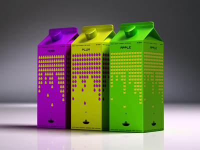
Product and services category: Fruit juice Registrant: NEW MOMENT NEW IDEAS COMPANY SKOPJE Country: MACEDONIA Brand name: Package design Advertiser: Vivaks Advertising agency, city: New Moment New Ideas Skopje Art director: Nikola Vojnov Creative director: Dusan Drakalski Designer: Hari Dudeski Photographer: Gjorgi Klincarov - Gogo Project manager: Filip Dimitrov Creative idea explanation: The guys at VIVA, a company specialized in juices production, contacted us once again to do a new package design - cooler, more modern, attention grabbing one. Great opportunity to do a little refreshment to the VIVA juices and for us, to get back to those high school days and meet the forgotten teenager in us. We combined the fact of using only freshly squeezed fruits, with the iconic game Space invaders. So, the fruits of our work are here and it seems like everyone enjoys them!
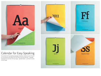
Product and services category: Language school Registrant: TOMATDESIGN Country: RUSSIA Brand name: Language school Advertiser: Easy Speaking language schoool Advertising agency, city: Tomatdesign, Moscow Art director: Andrei Ermilov Copywriter: Farhad Kuchkarov Creative director: Andrei Tarakanov Designer: Andrei Ermilov, Andrei Tarakanov Creative idea explanation: The calendar for Easy Speaking language school was created as a part of launch of a new identity and reflects the main idea of the new identity - language teaching from zero level. The key image - alphabet letters - are shown on each month's page.
Product and services category: Taboo Condoms Registrant: GREY WORLDWIDE WARSZAWA SP. Z O.O. Country: POLAND Brand name: Taboo Condoms Advertiser: Taboo Condoms Advertising agency, city: Grey Warsaw Art director: Zofia Nowak Copywriter: Piotr Zygmunt Creative director: Katarzyna Sosnierz, Grzegorz Waliczek Other credits: Dorota Kulma - print production manager
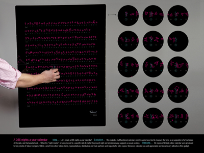
Creative idea explanation: This is a multifunctional calendar, which is useful as a tool to measure dates, as a suggestion of a final stage of the date, and Kamasutra book. When the "night-marker" is being moved to a specific date it marks the present night and simultaneously suggests a sexual position.
28.09.2011
19-й международный фестиваль рекламы Golden Drum пройдет в Портороже в Словении, с 2 по 5 октября. За годы своего существования Golden Drum вышел на позиции одного из самых ожидаемых мероприятий для рекламистов со всего мира. Для многих фестиваль является самым важным и заметным обзором рекламного мира за год, превосходя в этом даже фестиваль Cannes Lions.

 Карта рекламного рынка