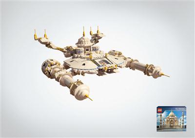
Group: E Design and Art Direction
Subgroup: Illustrations and photo
Award: Finalist
Product and services category: Sport, entertainment, recreation, leisure
Registrant: LEO BURNETT RUSSIA
Country: RUSIJA
Brand name: Lego
Advertiser: Lego
Advertising agency, city: Leo Burnett Moscow
Состав Творческой Группы:
Art director: Arina Avdeeva, Rodrigo Linhares
Creative director: Mikhail Kudashkin
Designer: Dmitry Jakovlev
Photographer/Illustrator: Ninjafilms
Deep Ocean Explorer
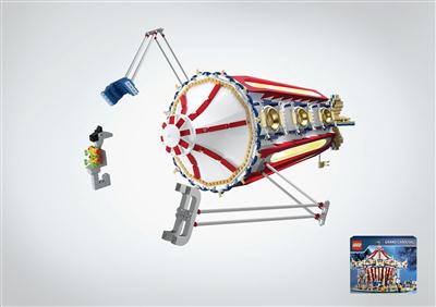
Group: E Design and Art Direction
Subgroup: Illustrations and photo
Award: Finalist
Product and services category: Sport, entertainment, recreation, leisure
Registrant: LEO BURNETT RUSSIA
Country: RUSIJA
Brand name: Lego
Advertiser: Lego
Advertising agency, city: Leo Burnett Moscow
Состав Творческой Группы:
Art director: Arina Avdeeva, Rodrigo Linhares
Creative director: Mikhail Kudashkin
Designer: Dmitry Jakovlev
Photographer/Illustrator: Ninjafilms
Beetle
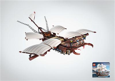
Group: E Design and Art Direction
Subgroup: Illustrations and photo
Award: Finalist
Product and services category: Sport, entertainment, recreation, leisure
Registrant: LEO BURNETT RUSSIA
Country: RUSIJA
Brand name: Lego
Advertiser: Lego
Advertising agency, city: Leo Burnett Moscow
Состав Творческой Группы:
Art director: Arina Avdeeva, Rodrigo Linhares
Creative director: Mikhail Kudashkin
Designer: Dmitry Jakovlev
Photographer/Illustrator: Ninjafilms
» Golden Drum
Animals
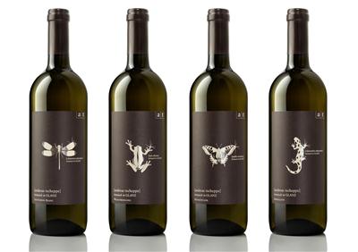
Group: E Design and Art Direction
Subgroup: Packaging design
Award: Finalist
Product and services category: Food and beverages
Registrant: DEMNER, MERLICEK & BERGMANN WERBEGESELLSCHAFT MBH
Country: AVSTRIJA
Brand name: Andreas Tscheppe Wines
Advertiser: Weingut Andreas Tscheppe
Advertising agency, city: Demner, Merlicek & Bergmann Werbegesellschaft mbH, Vienna
Состав Творческой Группы:
Art director: Felix Broscheit
Creative director: Franz Merlicek, Rosa Haider
Creative idea explanation: The new labels put the spotlight on the aspect of intact nature benefited by organic vinicultural methods in Glanz, South Styria. The ,high gloss highlightв_T also provides an interesting 'double entendre' in the German language - ,Glanzв_T, the name of the town, also has the meaning ,gloss, sparkle, splendourв_T in German.
Headline (eng.): native of Glanz
Other credits: Graphics: Felix Broscheit, Copywriter: Franz Merlicek, Arno Reisenbuechler, Account Manager: Petra Koestenbauer
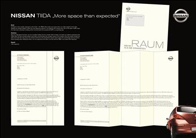
More Space Than Expected
Group: E Design and Art Direction
Subgroup: Direct marketing - flat mailing
Award: Finalist
Product and services category: Cars, other vehicles and accessories
Registrant: TBWA WERBEAGENTUR GMBH DГ_SSELDORF
Country: NEMД_IJA
Brand name: Nissan
Advertiser: Nissan
Advertising agency, city: DГ_sseldorf
Состав Творческой Группы:
Art director: Simon Hattrup
Creative director: Kai Röffen (Executive Creative Director)
Project manager: Bernhard SchГ_rmanns (Account Manager), Tomas Caetano (Management Supervisor)
Creative idea explanation: Not via a high-gloss brochure, not via a complex mailing, but via a simple sheet of paper, we made our Audience experience the TIIDA effect: compact on the outside, supersize on the inside. At first a double folded cover letter communicates the compact nature of the outside. Once the reader unfolds the letter and reads the copy anew, the inserted sentences and subordinate clauses inform about the surprisingly spacious interior. Hence already when reading the letter, one can experience the effect, one has with the TIIDA: more space than expected.
Headline (eng.): More Space Than You Expect
Other credits: Matthias Hardt (Copywriter), Yvonne Rabenhorst (Junior Copywriter), Wibke Brode (Group Head Art), Meo Suzuki-Roeder (Head of Production), Malte Keller (Junior Productioner),
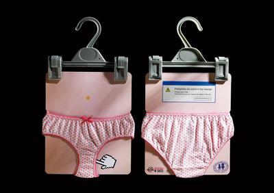
Safe child on the net
Group: E Design and Art Direction
Subgroup: Direct marketing - dimensional mailing
Award: Finalist
Product and services category: Public services and social engagements
Registrant: PUBLICIS SP. Z O.O.
Country: POLJSKA
Brand name: Child on the net
Advertiser: Dzieci Niczyje Foundation
Advertising agency, city: Publicis Poland, Warsaw
Состав Творческой Группы:
Art director: Slawomir Figura
Creative director: Bartek Rams
Designer: Dagmara Witek-Kusmider
Project manager: Ewa Wasniewska
Creative idea explanation: Parents aren't aware of dangers waiting for their children in the net or donв_Tt know how to minimize the risk. We wanted to surprise parents just like their children are surprised by violence in the net.
Headline (eng.): Safe child on the net
Other credits: Grzegorz Jedrych - Producer (Mundoprint)
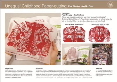
Unequal Childhood Paper-Cutting
Group: E Design and Art Direction
Subgroup: Miscellaneous print and 3 D materials
Award: Finalist
Product and services category: Public services and social engagements
Registrant: LEO BURNETT
Country: ZDA
Brand name: Children's Charity
Advertiser: Christna Noble Children's Foundation
Advertising agency, city: Leo Burnett Hong Kong
Состав Творческой Группы:
Art director: Katie Ng
Creative director: Connie Lo, Miranda Shing
Designer: Chen Jie Rong
Photographer/Illustrator: Illustrator: Chen Jie Rong
Project manager: Pamela Wan, Alice Lam, Kevin Cheung
Creative idea explanation: Christina Noble Children's Foundation (CNCF) as a charity organisation is determined to make HK public aware of this inequality, and seek their support in helping street children. To illustrate this message of inequality, we used traditional paper cut. Traditionally the pattern is supposed to be symmetrical. But we intended to make it asymmetric, with one side depicting a child in a loving family, and the other side showing the child in an abusive environment.
Other credits: Copywriter: Paul Yu, Cyrus Ho, Kiu Chan
» Silver Drum
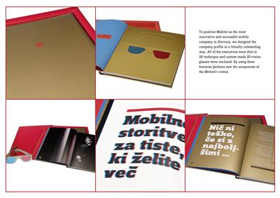
Mobitel Company Profile
Group: E Design and Art Direction
Subgroup: Editorial
Award: Finalist
Product and services category: Communication, publications and electronic media
Registrant: PRISTOP D.O.O.
Country: SLOVENIJA
Advertiser: Mobitel d.d.
Advertising agency, city: Pristop d.o.o., Ljubljana
Состав Творческой Группы:
Creative director: AljoЕЎa Bagola
Designer: Martina Kokovnik
Photographer/Illustrator: Damjan KocjanД_iД_
Project manager: Е_iga Drofenik, Dean LevaД_iД_
Creative idea explanation: To position Mobitel as the most innovative and successful mobile company in Slovenia, we designed the company profile in a literally outstanding way. All of the executives were shot in 3D technique and custom made 3D-vision glasses enclosed. By using them business partners saw the uniqueness of the Mobitelв_Ts vision.
Other credits: Klemen Е efer, copywriter, Rok Kordin
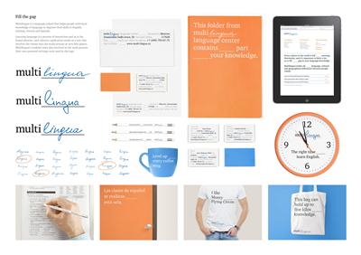
Fill the Gap
Group: E Design and Art Direction
Subgroup: Corporate and brand identity
Award: Finalist
Product and services category: Public services and social engagements
Registrant: TRANSFORMER STUDIO
Country: RUSIJA
Brand name: Multilingua
Advertiser: Multilingua Language Center
Advertising agency, city: Transformer Studio, Moscow
Состав Творческой Группы:
Art director: Nikita Melnikov, Ivan Danyshevsky
Designer: Ivan Danyshevsky
Project manager: Anastasia Guk
Creative idea explanation: Multilingua is a language school that helps people with basic knowledge of language to improve their skills in English, German, French and Spanish. Learning language is a process of interaction and so is the brand identity: each identity application works as a test that involves the viewer into the study process at very first glance. Multilingua's students were also involved in the work process: their own personal writings were used in the logo.
Headline (eng.): Fill the Gap
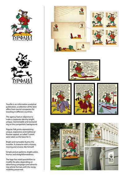
Tourfile, the Travel Guide
Group: E Design and Art Direction
Subgroup: Corporate and brand identity
Award: Finalist
Product and services category: Communication, publications and electronic media
Registrant: AIMC RACKURS LTD.
Country: RUSIJA
Brand name: Tourfile
Advertiser: Guidespark
Advertising agency, city: AIMC Rackurs Ltd., Moscow
Состав Творческой Группы:
Art director: Evgeny Ovsyannikov
Creative director: Evgeny Chizhevsky
Designer: Evgenia Gordeeva
Creative idea explanation: Tourfile is an information analytical publication, a collection of the best offers from tourist companies for traveling in different countries. The agency had an objective to make a corporate identity bright, unique, memorizable and outstanding on the competitorsв_T background. Popular folk prints representing unique, expressive and traditional Russian appeal, so called Lubok, were taken as the basis for it. Bright and nameable Kuzma-the traveller. A character with a history, moving and sincere, like himself. Simple picture patterns, bright colors. Humor and straightforwardness. The logo has inlaid possibilities to modify the plot, depending on advertising campaigns and advertising vehicle formats with the recognizability preserved.
Headline (eng.): Tourfile, the travel guide
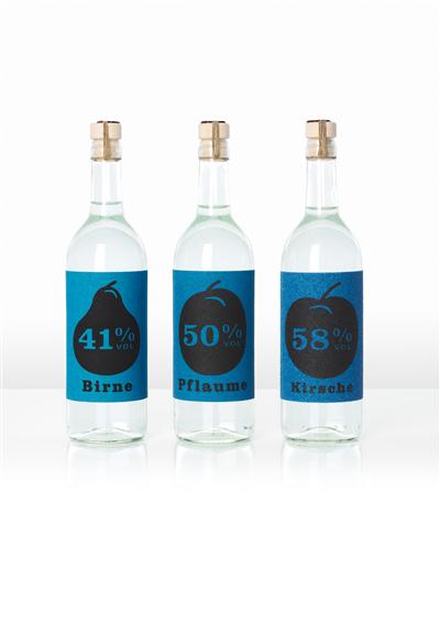
The Sandpaper label -
Group: E Design and Art Direction
Subgroup: Packaging design
Award: Finalist
Product and services category: Food and beverages
Registrant: OGILVY & MATHER GMBH
Country: AVSTRIJA
Brand name: Mario Haller
Advertiser: O & M Vienna
Advertising agency, city: O & M Vienna
Состав Творческой Группы:
Art director: Christian Bircher
Creative director: Gerd Schulte - Doeinghaus
Project manager: Ad director: Patrick Haberzettel
Creative idea explanation: The Sandpaper label. The Mario Haller Schnaps.Briefing:Haller Distillery gave us the task of designing their complete fine fruit brandy range.The range encomspasses three varieties:Cherry, Pear and Plum, which vary in thealcohol percentage and the drinking texture.Solution:For the label we chose varieties of sand paper - the stronger the brandy, the larger the granulation. Already the first grasp of the bottle gives an indication of how intense or mild the content is.Haller Fine Fruit Brandies are created from entirely natural products without any additives. Therefore, the label design has a pure look, in keep with the purely natural contents.Results:Already in the shop we wanted the consumers to FEEL the different strenghts (grade of destillation = percentage alcohol) of the offered Mario Haller Brandies by using various grades of sand paper for the labelling. Furthermore was one of the main objectives to generate quickattention by using unusual eye catcking material/design. In contracts to the previous years, the whole year's production was sold within 5 months.
Headline (eng.): The Sandpaper label - Mario Haller Schnaps
Other credits: Copywriter: Helge Haberzettel
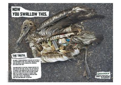
Birds_Swallow
Group: E Design and Art Direction
Subgroup: Illustrations and photo
Award: Finalist
Product and services category: Public services and social engagements
Registrant: SAATCHI & SAATCHI ROMANIA
Country: ROMUNIJA
Brand name: Greenpeace
Advertiser: Greenpeace Romania
Advertising agency, city: Saatchi & Saatchi, Bucharest
Состав Творческой Группы:
Art director: Laura Iane, Daniela Nedelschi
Creative director: Jorg Riommi
Designer: Jorg Riommi, Andrei Nica
Photographer/Illustrator: Chris Jordan
Project manager: Liana Petrascu
Creative idea explanation: Use of real pictures to tell the story.
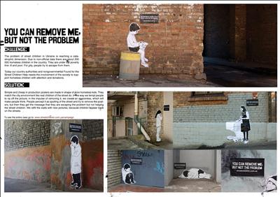
Group: E Design and Art Direction
Subgroup: Ambiental design
Award: Finalist
Product and services category: Public services and social engagements
Registrant: LEO BURNETT UKRAINE
Country: UKRAJINA
Brand name: Found for the Street Children Help
Advertiser: Caritas Kiev
Advertising agency, city: Leo Burnett Ukraine
Состав Творческой Группы:
Art director: Pavel Klubnikin, Egor Petrov
Creative director: Tatiana Fedorenko, Claus-Steffen Braun
Photographer/Illustrator: David Foldvari
Project manager: Marina Klymenko
Creative idea explanation: The problem of street children in Ukraine is reaching a catastrophic dimension. For pity, society tries escape from them. So what are we doing with something we do not want to see? We simply remove it. Like some litter in the streets, you just want to clean any reminder about the problem away. But it does not help. The piece of paper is easily removed, but the problem of street children will stay. Simple and cheap in production posters in shape of pure homeless kids fill the city environment like children of the street do. In the way we tempt people to rip off the picture, in the impulse of removing it, we create an awareness, which will make people think. People percept it as spoiling of the street and try to remove the posters, but then they get the message that they are escaping the problem but not salving it. We refill the walls with new pictures, because children appear back on the streets. Web address leads to promo site where you find information how you can help to salve the pr
Headline (eng.): You can remove me, but not the problem
Other credits: Katya Duda, Katya Denisenko
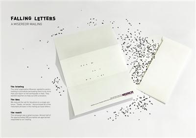
Falling Letters
Group: E Design and Art Direction
Subgroup: Direct marketing - flat mailing
Award: Finalist
Product and services category: Public services and social engagements
Registrant: KOLLE REBBE
Country: NEMД_IJA
Brand name: Charity Organization
Advertiser: Bischoefliches Hilfswerk MISEREOR e.V.
Advertising agency, city: Kolle Rebbe, Hamburg
Состав Творческой Группы:
Art director: Susanne Moebius, Reinhard Krug
Creative director: Ales Polcar, Heiko Schmidt
Project manager: Jessica Gustafsson
Creative idea explanation: The earthquake catastrophe in Haiti was covered in all media. Misereor wanted to move Germany's top journalists not just to cover the misery caused by the earthquake, but to get active themselves and help out with a donation. To encourage as many of the approx. 500 important journalists and media decision-makers as possible to make a donation, we developed an unusual mailing concept. Instead of writing reams of letters asking for donations, we reduced the copy to a provocative demand: deeds, not words! And underlined our message with an attention-grabbing, formal idea.
Headline (eng.): MISEREOR Mailing Falling Letters
Other credits: Copywriter: Henning Flohr, Productioner: Franziska Ziegler
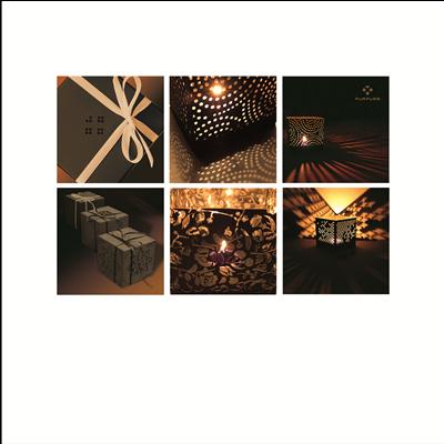
Candlestick from paper 'The stories of light'
Group: E Design and Art Direction
Subgroup: Miscellaneous print and 3 D materials
Award: Finalist
Product and services category: Household products and maintenance, furnishing and accessories
Registrant: 'PURPURS' GINTA SMITE
Country: LATVIJA
Advertising agency, city: Map Latvia AS
Creative idea explanation: Epigraph - enjoy and take as present those twinklings of interaction between shadow and light. Stare, get lost in your dreams, listening to the stories, narrated by light. Construction - afolding gift-box to be used as a candle-stick for a changeable tea candle. Material - chaded or recycled cardboard. Production technology: laser cutting, cutting.
Headline (eng.): Candlestick from paper 'The stories of light'
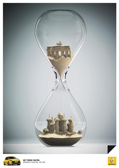
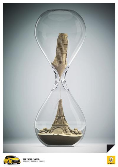
Sandglass 1 of 3
Group: E Design and Art Direction
Subgroup: Miscellaneous print and 3 D materials
Award: Finalist
Product and services category: Cars, other vehicles and accessories
Entry Series: Sandglass
Registrant: PUBLICIS FRANKFURT GMBH
Country: NEMД_IJA
Brand name: Renault Clio RS
Advertiser: Renault Suisse SA
Advertising agency, city: Publicis Frankfurt
Состав Творческой Группы:
Art director: Christian Kuzman
Creative director: Konstantinos Manikas
Designer: Stefan Sperner
Headline (eng.): Get there faster.
Other credits: Copywriter: Daniel Steller, CCO: Stephan Ganser, Volker Schrader
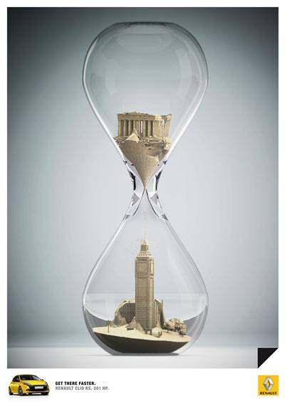
Sandglass 2 of 3
Group: E Design and Art Direction
Subgroup: Miscellaneous print and 3 D materials
Award: Finalist
Product and services category: Cars, other vehicles and accessories
Entry Series: Sandglass
Registrant: PUBLICIS FRANKFURT GMBH
Country: NEMД_IJA
Brand name: Renault Clio RS
Advertiser: Renault Suisse SA
Состав Творческой Группы:
Art director: Christian Kuzman
Creative director: Konstantinos Manikas
Designer: Stefan Sperner
Headline (eng.): Get There Faster
Other credits: Copywriter: Daniel Steller, Brand manager: Frank Lakebrink, CCO: Stephan Ganser, Volker Schrader
Sandglass 3 of 3
Group: E Design and Art Direction
Subgroup: Miscellaneous print and 3 D materials
Award: Finalist
Product and services category: Cars, other vehicles and accessories
Entry Series: Sandglass
Registrant: PUBLICIS FRANKFURT GMBH
Country: NEMД_IJA
Brand name: Renault Clio RS
Advertiser: Renault Suisse SA
Состав Творческой Группы:
Art director: Christian Kuzman
Creative director: Konstantinos Manikas
Designer: Stefan Sperner
Headline (eng.): Get There Faster
Other credits: Copywriter: Daniel Steller, Brand manager: Frank Lakebrink, CCO: Stephan Ganser, Volker Schrader
08.10.2010
19-й международный фестиваль рекламы Golden Drum пройдет в Портороже в Словении, с 2 по 5 октября. За годы своего существования Golden Drum вышел на позиции одного из самых ожидаемых мероприятий для рекламистов со всего мира. Для многих фестиваль является самым важным и заметным обзором рекламного мира за год, превосходя в этом даже фестиваль Cannes Lions.

 Карта рекламного рынка