Type Of Entry: Corporate or Brand Identity
Category: Logos & Trademarks - New Or Redesigned
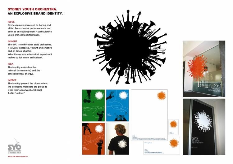
Title: AN EXPLOSIVE BRAND IDENTITY
Advertiser/Client: SYDNEY YOUTH ORCHESTRA
Product/Service: SYDNEY YOUTH ORCHESTRA
Entrant Company, City: SAATCHI & SAATCHI, Sydney
Country: AUSTRALIA
Design/Advertising Agency, City: SAATCHI & SAATCHI, Sydney
Country: AUSTRALIA
Credit Details:
Name
Position
Company
Chris Doyle
Designer
Saatchi Design Sydney
Julian Melhuish
Creative Director
Saatchi Design Sydney
Mary Mills
Strategic Planner
Saatchi & Saatchi
Elaine Purcell
Strategic Planner
Saatchi & Saatchi
Sasha Orr
Account Director
Saatchi & Saatchi
Steve Back
Executive Creative Director
Saatchi & Saatchi
David Nobay
Executive Creative Director
Saatchi & Saatchi
Brief/Objectives/Goals:
Brief from the client: The Sydney Youth Orchestra wanted to update their image. They wanted an identity that they could use on everything from their business cards, to their signage, to their uniforms. The design objectives: Reposition them from boring and elitist to exciting, raw, emotive and enthusiastic. How it achieves its goals: The identity embodies the rational (instruments) and the emotional (raw energy) of the youth orch
Type Of Entry: Corporate or Brand Identity
Category: Logos & Trademarks - New Or Redesigned
Title: THE BIG 4
Advertiser/Client: CHANNEL 4
Product/Service: TV CHANNEL
Entrant Company, City: CHANNEL 4 TELEVISION, London
Country: UNITED KINGDOM
Design/Advertising Agency, City: 4 CREATIVE, London
Country: UNITED KINGDOM
Credit Details:
Name
Position
Company
Brett Foraker
Network Creative Director
Channel 4
Rufus Radcliffe
Head of Marketing
Channel 4
Ben Johnson
Designer
FreeState
Adam Scott
Designer
FreeState
Nick Knight
Photographer
None
Aran Chadwick
Designer
Atelier One
Luis Fernandez
Designer
Atelier One
Adelyne Albrecht
Designer
Atelier One
Mark Titchner
Artist
None
El-Anatsui
Artist
None
Brief/Objectives/Goals:
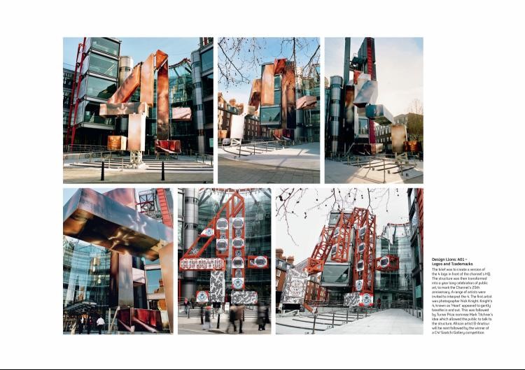
To mark Channel 4's 25th anniversary. The brief was to create a 50ft version of the 4 logo in front of the channel's London HQ. The structure needed to be 3-dimensional and mirror the channel's award-winning idents, where one single viewpoint reveals the '4' mark. The structure was then transformed into a year long celebration of public art. A range of artists were invited to use the '4' as a blank canvas and bring it to life in different ways. The frist artist to interpret the '4' was photographer Nick Knight. Cladding the '4' in lenticular photographs of chests of people of different racial origins, Knight's '4', known as 'Heart', appeared to be gently breathing in and out. This was followed in January 2008 by Turner Prize nominee Mark Titchner's idea which allowed members of the public to walk into the structure and record their views. The next installation will be by African artist El-Anatsui followed by the winner of a competition run in conjunction with the Saatchi Gallery. The channel's logo has evolved into four pieces of talked about public art - an innovative way of using the iconic '4' to mark the Channel's annive
1 of 4 Campaign
Type Of Entry: Corporate or Brand Identity
Category: Posters, Flyers, Tickets, Invitations, Etc.
Title: 50 CENT
Advertiser/Client: MW.COM INDIA
Product/Service: ROLLING STONE INDIA
Entrant Company, City: JWT INDIA, Mumbai
Country: INDIA
Design/Advertising Agency, City: JWT INDIA, Mumbai
Country: INDIA
Credit Details:
Name
Position
Company
Agnello Dias
Chief Creative Officer
JWT - India
Shamik Sengupta
Creative Director
JWT Group - Fortune Communications India
Ferzad Variyava
Creative Director
JWT Group - Fortune Communications India
Shashank Jha
Art Director
JWT - India
Ashish Pathak
Art Director
JWT - India
Shashank Jha
Designer
JWT - India
Ashish Pathak
Designer
JWT - India
Suranjan Das
General Manager
JWT Group - Fortune Communications India
Anuja Arora
Sr. Brand Activator
JWT Group - Fortune Communications India
Binal Shah & Team
Textile Designer
Purushottam Joshi
Director (Creative Services)
JWT - India
Mukund Kapote
Production Manager
JWT - India
Deepak Jadhav
Digital Artist
JWT - India
Vivek Warang
Digital Artist
JWT - India
Israr Qureshi
Photographer
Brief/Objectives/Goals:
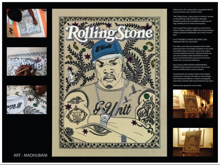
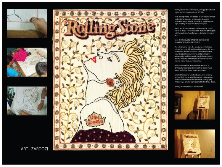
Rolling Stone. The unattainable, unstoppable bible of music journalism was coming to India. 'THE' Rolling Stone... which sold at a rockstar's ransom on the bohemian side of Mumbai's decadent footpaths would now be available in spanking new togs, smelling of rock, metal and newsprint And it would have Indian content as well. A karmic fusion of Ragas and Blues (R&B?) that would transport a billion potential head-bangers into instant nirvana land. So IS IT POSSIBLE TO MAKE THE ICONIC LOOK FAMILIAR? AND STILL BE ICONIC? The refrain came from the heartland of the Indian cultural pot pourri. The oldest civilization in the world had hidden deep in its bosom some of the oldest surviving traditional art forms. Still practised by artisans who had been orally handed down secret lessons that derived their beauty from the primal instinct for survival and celebration. Four of these, BATIK, KANTHA, MADHUBANI & ZARDOZI were chosen to recast four iconic Rolling Stone covers in their new likeness. Gnarled hands and weather beaten eyes tenderly worked their centuries-old magic on cover designs that had become folklore in modern iconography. And slowly a familiar sight opened behind new doors. Rolling Stone opened its soul to
2 of 4 Campaign
Type Of Entry: Corporate or Brand Identity
Category: Posters, Flyers, Tickets, Invitations, Etc.
Title: BOB MARLEY
Advertiser/Client: MW.COM INDIA
Product/Service: ROLLING STONE INDIA
Entrant Company, City: JWT INDIA, Mumbai
Country: INDIA
Design/Advertising Agency, City: JWT INDIA, Mumbai
Country: INDIA
Credit Details:
Name
Position
Company
Agnello Dias
Chief Creative Officer
JWT - India
Shamik Sengupta
Creative Director
JWT Group - Fortune Communications India
Ferzad Variyava
Creative Director
JWT Group - Fortune Communications India
Shashank Jha
Art Director
JWT - India
Ashish Pathak
Art Director
JWT - India
Shashank Jha
Designer
JWT - India
Ashish Pathak
Designer
JWT - India
Suranjan Das
General Manager
JWT Group - Fortune Communications India
Anuja Arora
Sr. Brand Activator
JWT Group - Fortune Communications India
Binal Shah & Team
Textile Designer
Purushottam Joshi
Director (Creative Services)
JWT - India
Mukund Kapote
Production Manager
JWT - India
Deepak Jadhav
Digital Artist
JWT - India
Vivek Warang
Digital Artist
JWT - India
Israr Qureshi
Photographer
Brief/Objectives/Goals:
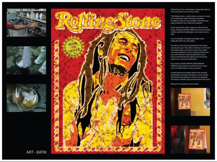
Rolling Stone. The unattainable, unstoppable bible of music journalism was coming to India. 'THE' Rolling Stone... which sold at a rockstar's ransom on the bohemian side of Mumbai's decadent footpaths would now be available in spanking new togs, smelling of rock, metal and newsprint And it would have Indian content as well. A karmic fusion of Ragas and Blues (R&B?) that would transport a billion potential head bangers into instant nirvana land. So IS IT POSSIBLE TO MAKE THE ICONIC LOOK FAMILIAR? AND STILL BE ICONIC? The refrain came from the heartland of the Indian cultural pot pourri. The oldest civilization in the world had hidden deep in its bosom some of the oldest surviving traditional art forms. Still practised by artisans who had been orally handed down secret lessons that derived their beauty from the primal instinct for survival and celebration. Four of these, BATIK, KANTHA, MADHUBANI & ZARDOZI were chosen to recast four iconic Rolling Stone covers in their new likeness. Gnarled hands and weather beaten eyes tenderly worked their centuries-old magic on cover designs that had become folklore in modern iconography. And slowly a familiar sight opened behind new doors. Rolling Stone opened its soul to
3 of 4 Campaign
Type Of Entry: Corporate or Brand Identity
Category: Posters, Flyers, Tickets, Invitations, Etc.
Title: JIM MORRISON
Advertiser/Client: MW.COM INDIA
Product/Service: ROLLING STONE INDIA
Entrant Company, City: JWT INDIA, Mumbai
Country: INDIA
Design/Advertising Agency, City: JWT INDIA, Mumbai
Country: INDIA
Credit Details:
Name
Position
Company
Agnello Dias
Chief Creative Officer
JWT - India
Shamik Sengupta
Creative Director
JWT Group - Fortune Communications India
Ferzad Variyava
Creative Director
JWT Group - Fortune Communications India
Shashank Jha
Art Director
JWT - India
Ashish Pathak
Art Director
JWT - India
Shashank Jha
Designer
JWT - India
Ashish Pathak
Designer
JWT - India
Suranjan Das
General Manager
JWT Group - Fortune Communications India
Anuja Arora
Sr. Brand Activator
JWT Group - Fortune Communications India
Binal Shah & Team
Textile Designer
Purushottam Joshi
Director (Creative Services)
JWT - India
Mukund Kapote
Production Manager
JWT - India
Deepak Jadhav
Digital Artist
JWT - India
Vivek Warang
Digital Artist
JWT - India
Israr Qureshi
Photographer
Brief/Objectives/Goals:
Rolling Stone. The unattainable, unstoppable bible of music journalism was coming to India. 'THE' Rolling Stone... which sold at a rockstar's ransom on the bohemian side of Mumbai's decadent footpaths would now be available in spanking new togs, smelling of rock, metal and newsprint And it would have Indian content as well. A karmic fusion of Ragas and Blues (R&B?) that would transport a billion potential head bangers into instant nirvana land. So IS IT POSSIBLE TO MAKE THE ICONIC LOOK FAMILIAR? AND STILL BE ICONIC? The refrain came from the heartland of the Indian cultural pot pourri. The oldest civilization in the world had hidden deep in its bosom some of the oldest surviving traditional art forms. Still practised by artisans who had been orally handed down secret lessons that derived their beauty from the primal instinct for survival and celebration. Four of these, BATIK, KANTHA, MADHUBANI & ZARDOZI were chosen to recast four iconic Rolling Stone covers in their new likeness. Gnarled hands and weather beaten eyes tenderly worked their centuries-old magic on cover designs that had become folklore in modern iconography. And slowly a familiar sight opened behind new doors. Rolling Stone opened its soul to
4 of 4 Campaign
Type Of Entry: Corporate or Brand Identity
Category: Posters, Flyers, Tickets, Invitations, Etc.
Title: MADONNA
Advertiser/Client: MW.COM INDIA
Product/Service: ROLLING STONE INDIA
Entrant Company, City: JWT INDIA, Mumbai
Country: INDIA
Design/Advertising Agency, City: JWT INDIA, Mumbai
Country: INDIA
Credit Details:
Name
Position
Company
Agnello Dias
Chief Creative Officer
JWT - India
Shamik Sengupta
Creative Director
JWT Group - Fortune Communications India
Ferzad Variyava
Creative Director
JWT Group - Fortune Communications India
Shashank Jha
Art Director
JWT - India
Ashish Pathak
Art Director
JWT - India
Shashank Jha
Designer
JWT - India
Ashish Pathak
Designer
JWT - India
Suranjan Das
General Manager
JWT Group - Fortune Communications India
Anuja Arora
Sr. Brand Activator
JWT Group - Fortune Communications India
Binal Shah & Team
Textile Designer
Purushottam Joshi
Director (Creative Services)
JWT - India
Mukund Kapote
Production Manager
JWT - India
Deepak Jadhav
Digital Artist
JWT - India
Vivek Warang
Digital Artist
JWT - India
Israr Qureshi
Photographer
Brief/Objectives/Goals:
Rolling Stone. The unattainable, unstoppable bible of music journalism was coming to India. 'THE' Rolling Stone... which sold at a rockstar's ransom on the bohemian side of Mumbai's decadent footpaths would now be available in spanking new togs, smelling of rock, metal and newsprint And it would have Indian content as well. A karmic fusion of Ragas and Blues (R&B?) that would transport a billion potential head bangers into instant nirvana land. So IS IT POSSIBLE TO MAKE THE ICONIC LOOK FAMILIAR? AND STILL BE ICONIC? The refrain came from the heartland of the Indian cultural pot pourri. The oldest civilization in the world had hidden deep in its bosom some of the oldest surviving traditional art forms. Still practised by artisans who had been orally handed down secret lessons that derived their beauty from the primal instinct for survival and celebration. Four of these, BATIK, KANTHA, MADHUBANI & ZARDOZI were chosen to recast four iconic Rolling Stone covers in their new likeness. Gnarled hands and weather beaten eyes tenderly worked their centuries-old magic on cover designs that had become folklore in modern iconography. And slowly a familiar sight opened behind new doors. Rolling Stone opened its soul to
Type Of Entry: Corporate or Brand Identity
Category: Posters, Flyers, Tickets, Invitations, Etc.
Title: ELECTIONS POSTER
Advertiser/Client: HUFFINGTON POST
Product/Service: DEMOCRATIC PARTY
Entrant Company, City: GOODBY SILVERSTEIN & PARTNERS, San Francisco
Country: USA
Design/Advertising Agency, City: GOODBY SILVERSTEIN & PARTNERS, San Francisco
Country: USA
Credit Details:
Name
Position
Company
Rich Silverstein
Creative Director
Goodby, Silverstein & Partners
Mark Rurka
Designer
Goodby, Silverstein & Partners
Suzee Barrabee
Print Producer
Goodby, Silverstein & Partners
Brief/Objectives/Goals:
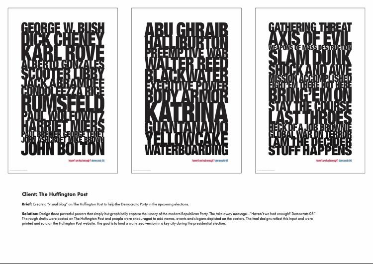
When Arianna Huffington met Rich Silverstein at the Google Zeitgeist conference, they realized they could work together on some ideas to help the Democratic Party. She invited him to blog about his ideas on The Huffington Post, but since he usually expresses himself best in visual terms, he wanted to see if he could "blog visually." The result was three posters that graphically capture the lunacy of the modern Republican Party. Rich Silverstein's thinking was, "What if we could TiVo the last six-lplus years and play them back - without comment - for the American people, and let them connect the dots? It's not a pretty picture." The take away message is simple: "Haven't we had enough? Democrats '08." The rough drafts of the designs were posted on The Huffington Post. People were encouraged to add to the names, events and slogans depicted on the posters. Given the comments and input, the designs were finalized and printed. They are being sold on the website, and the ultimate goal is to fund a wall-sized version in a key city during the presidential elections. Approximately 2000 posters have been sold, and the search for the wall location has
Type Of Entry: Corporate or Brand Identity
Category: Posters, Flyers, Tickets, Invitations, Etc.
Title: PROMOTIONS FLYER
Advertiser/Client: THE AKATU INSTITUTE FOR CONSCIOUS CONSUMPTION
Product/Service: CONSCIOUS CONSUMPTION
Entrant Company, City: LEO BURNETT BRASIL, Sao Paulo
Country: BRAZIL
Design/Advertising Agency, City: LEO BURNETT BRASIL, Sao Paulo
Country: BRAZIL
Credit Details:
Name
Position
Company
Andrй Kirkelis
Art Director/Illustrator
Leo Burnett Brasil
Mihail Aleksandrov
Art Director/Illustrator
Leo Burnett Brasil
Carlos Schleder
Copywriter
Leo Burnett Brasil
Ruy Lindenberg
Creative Director
Leo Burnett Brasil
Arie
Illustrator
Hype Pre Media
Ricardo Polomon
Account Director
Leo Burnett Brasil
Rodrigo Mesquita
Account Director
Leo Burnett Brasil
Lъcio Cunha
Photographer
Brief/Objectives/Goals:
Instituto Akatu for Conscious Consumption needed a low-cost action to inform the population about the fact that 1/3 of everything that is bought goes straight to the garbage, which contributes to increase hunger and pollution. The major cause for this waste is that people usually buy much more than they really need to live. As such, we decided to use the same weapons used by supermarkets to make people buy more. Thus, we created offer flyers in which all the products were rotten, to call attention to the waste of food and how much it costs. These flyers were handed out by actors disguised as sales promoters at the entrance of supermarkets. Consumers were caught by surprise by the content of the piece and instantaneously got concerned with the way they buy food and products. The actions caused large repercussion and generated more than 300 thousand hits to the Instituto Akatu
Type Of Entry: Corporate or Brand Identity
Category: Calendars
Title: WASTE ME NOT CALENDAR 2008 'MOTTAINAI'
Advertiser/Client: YOMIKO ADVERTISING
Product/Service: ADVERTISING AGENCY CALENDAR
Entrant Company, City: YOMIKO ADVERTISING, Tokyo
Country: JAPAN
Design/Advertising Agency, City: YOMIKO ADVERTISING, Tokyo
Country: JAPAN
Credit Details:
Name
Position
Company
Minoru Fujisaki
Creative Director
Yomiko Advertising
Wakako Endo
Art Director
Yomiko Advertising
Yuji Nagase
Art Director
Yomiko Advertising
Kiyoshi Nakayama
Produce
Yomiko Advertising
Yukikazu Ito
Photographer
Yukiko Anazawa
Printing Direction
Noriko/Don Carroll
Calendar Naming
Masaharu Ohsuga
Illustration
Chizuru Mori
Translation
Philip Hamilton Rhodes 3
Translation
Brief/Objectives/Goals:
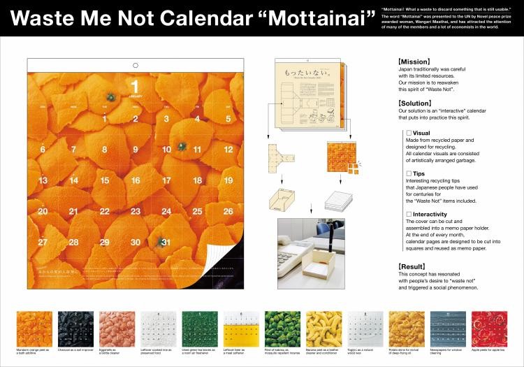
Mission: With today's mass production and mass consumption, Japan is flooded with goods and has a culture of disposable materialism. But in previous ages, we were a "Waste Not" society, treasuring our precious and limited resources. We would like to revive this spirit and sense of values. While self-promotion is one objective, foremost is our desire to contribute to a better society. Challenge: How can we redesign the calendar in a way that attracts attention and resonates with anyone who sees it in every daily life? Solution: We saw the calendar as a form of "engaging" interactive communication that encourages people to put into practice the "Waste Not" spirit. At the end of every month, the sheet backs are designed to be reused as memo paper, giving the calendar new life and purpose. A completely new recycled and recycling calendar was born. Result: Throughout Japan, this concept has resonated with people's desire to "waste not" and triggered a social phenomenon. Responding to demand, the calendar has been made available for purchase, creating a deeper engagement with cons
Type Of Entry: Corporate or Brand Identity
Category: Posters, Flyers, Tickets, Invitations, Etc.
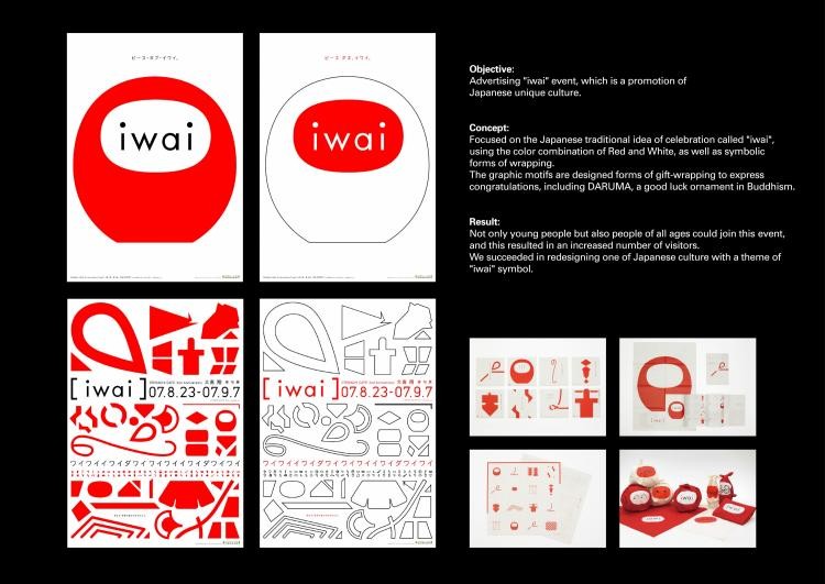
Title: IWAI
Advertiser/Client: KYURYUDO ART-PUBLISHING CO.
Product/Service: EVENT
Entrant Company, City: DENTSU KANSAI, Osaka
Country: JAPAN
Design/Advertising Agency, City: DENTSU KANSAI, Osaka
Country: JAPAN
Credit Details:
Name
Position
Company
Yoshihiro Yagi
Creative Director
DENTSU Kansai
Yoshihiro Yagi
Art Director
DENTSU Kansai
Haruko Tsutsui
Copywriter
DENTSU Kansai
Yoshihiro Yagi
Designer
DENTSU Kansai
Yo Kimura
Designer
Katachi Co.
Yuka Yokokawa
Designer
Katachi Co.
Brief/Objectives/Goals:
Advertising iwai event, which is a promotion of unique Japanese culture. Concept: Focused on the Japanese traditional idea of celebration called iwai, using the colour combination of red and white as well as symbolic forms of wrapping. The graphic motifs are designed forms of gift-wrapping to express congratulations, including DARUMA, a good luck ornament in Buddhism. Result: Not only young people but also people of all ages could join this event, and this resulted in an increased number of visitors. We succeeded in redesigning one aspect of Japanese culture with the theme of iwai s
Type Of Entry: Packaging Design
Category: Non-Alcoholic Drinks
Title: STORSKOGEN WATER
Advertiser/Client: STORSKOGEN
Product/Service: MINERAL WATER
Entrant Company, City: HAPPY FORSMAN & BODENFORS, Gothenburg
Country: SWEDEN
Design/Advertising Agency, City: HAPPY FORSMAN & BODENFORS, Gothenburg
Country: SWEDEN
Credit Details:
Name
Position
Company
Anders Kornestedt
Creative Director
Happy Forsman & Bodenfors
Andreas Kittel
Art Director
Happy Forsman & Bodenfors
Camilla Iliefski
Illustration
10
Catarina Еkerblom
Account Manager
Happy Forsman & Bodenfors
Jessica Wallin
Account Manager
Happy Forsman & Bodenfors
Louise Lindgren
Final Art
Happy Forsman & Bodenfors
Brief/Objectives/Goals:
Design the packaging for a new brand of Swedish mineral water called Storskogen ("the Deep Forest") - named after the forest in which the water well is sit
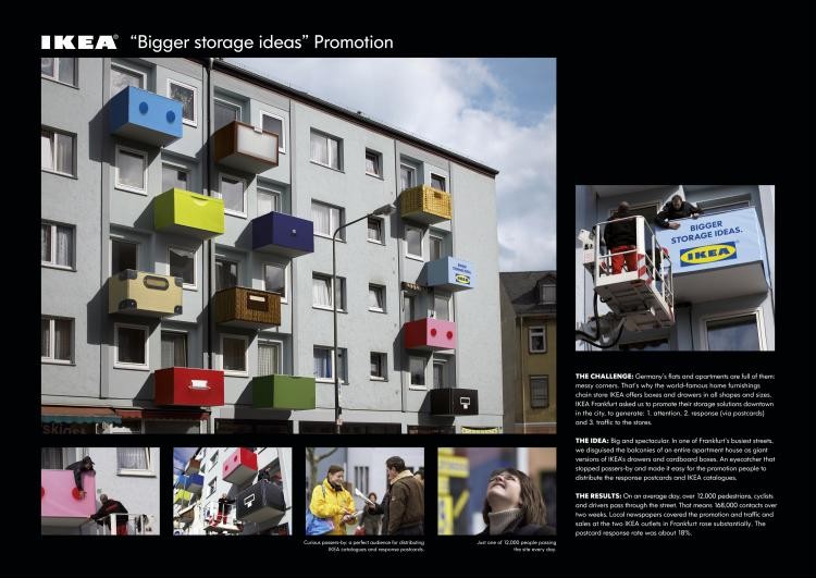
Naturally, German flats and apartments are full of messy corners. That's why IKEA produces practical boxes and drawers in all shapes and sizes for all storage needs. Targeted especially at people living in smaller apartments, Frankfurt IKEA asked us to promote their storage solutions with a really BIG outdoor idea. The idea was to play with the widely recognisable shapes and designs of the Ikea storage range and to put them into a new and surprising context. By redesigning the front of a whole apartment building in one of the busiest streets in Frankfurt with giant-size mock-ups of IKEA drawers and cardboard boxes, we made two points: Gaining the highest level of attention and literally linking the product to where it belongs: small flats and apartments. Presented in this spectacular, three-dimensional way, IKEA's storage solutions could hardly be missed by the citizens of Frankfurt. And what could be more fitting than placing a product that simplifies peoples' lives actually right there where people
Type Of Entry: Corporate or Brand Identity
Category: Calendars
Title: CALENDAR SURFRIDER
Advertiser/Client: SURFRIDER FOUNDATION
Product/Service: SURFRIDER FOUNDATION
Entrant Company, City: Y&R FRANCE, Boulogne Billancourt
Country: FRANCE
Design/Advertising Agency, City: Y&R FRANCE, Boulogne Billancourt
Country: FRANCE
Credit Details:
Name
Position
Company
Les Six
Director Creative
Young & Rubicam France
Alexandre Hildebrand
Copywritter
Young & Rubicam France
Louis Carpentier
Director Artistique
Young & Rubicam France
Type Of Entry: Packaging Design
Category: Foods
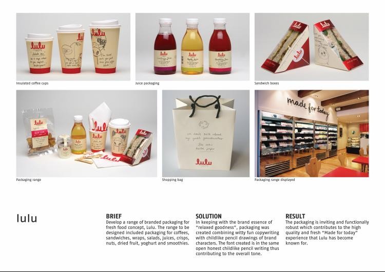
Title: LULU - MADE FOR TODAY
Advertiser/Client: LULU COFFEE SHOP
Product/Service: COFFEE SHOP
Entrant Company, City: GRID WORLDWIDE BRANDING & DESIGN, Johannesburg
Country: SOUTH AFRICA
Design/Advertising Agency, City: GRID WORLDWIDE BRANDING & DESIGN, Johannesburg
Country: SOUTH AFRICA
Credit Details:
Name
Position
Company
Catherine Bloemkamp
Creative Director
Grid
Paul Hinch
Designer
Grid
Samantha Koenderman
Copywriter
Grid
Nathan Reddy
Executive Creative Director
Grid
Brief/Objectives/Goals:
We were asked to develop a range of branded packaging for the fresh food concept, Lulu. The range to be designed included packaging for coffees, sandwiches, wraps, salads, juices, crisps, nuts, dried fruit, yoghurt and smoothies. In keeping with the brand essence of "relaxed goodness", packaging was created combining witty fun copywriting with childlike pencil drawings of brand characters. The font created is in the same open honest childlike pencil writing thus contributing to the overall tone. The packaging is inviting and functionally robust which contributes to the high quality and fresh "Made for today" experience that Lulu has become know
Type Of Entry: Corporate or Brand Identity
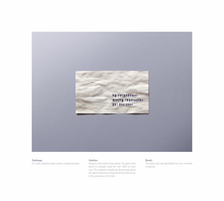
Category: Stationery
Title: WET CARD
Advertiser/Client: KO RATANASEVI
Product/Service: DIVING INSTRUCTOR
Entrant Company: BBDO BANGKOK
Country: THAILAND
Design/Advertising Agency: BBDO BANGKOK
Country: THAILAND
Credit Details:
Name
Position
Company
Suthisak Sucharittanonta
Executive Creative Director/Copywriter
BBDO Bangkok
Weerachon Weeraworawit
Creative Director/Copywriter
BBDO Bangkok
Kajnarong Inpornvichitr
Art Director/Designer
BBDO Bangkok
Raj Deepak Das
Art Director/Designer
BBDO Bangkok
Sitthichai Jiaranai
Photographer
Contango
Brief/Objectives/Goals:
Brief: To create a business name card for a diving instructor. Solution: Since diving is a very small & niche market in our country, we decided to create a hand-made name card for our client. By creating the "wet" effect on each card, the recipients could touch and instantly recognise the instructor's love of the deep blu
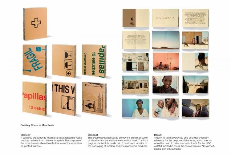
Type Of Entry: Corporate or Brand Identity
Category: Publications
Title: SOLIDARY ROUTE TO MAURITANIA
Advertiser/Client: CONSEJERНA DE MEDIO AMBIENTE MURCIA + RUTA MOTOR
Product/Service: SOLIDARY BOOK
Entrant Company, City: DFRAILE, Murcia
Country: SPAIN
Design/Advertising Agency, City: DFRAILE, Murcia
Country: SPAIN
Credit Details:
Name
Position
Company
Eduardo del Fraile
Creative Director
DFraile
Eduardo del Fraile
Designer
Dfraile
Juan Jimenez
Designer
Dfraile
Antonio Marquez
Designer
Dfraile
Eduardo del fraile
Photographer
DFraile
Gabriel Pasamontes
Photographer
Ruta Motor
Ana Leal
Text
DFraile
Brief/Objectives/Goals:
A solidarity expedition to Mauritania was arranged through a Rally Lisbon-Dakar team aiming to reuse medical material from different hospitals. The purpose of the project was to provide photographic evidence of the trip and show the effectiveness of the expedition on printed material. The creative proposal was to portray the current situation of Mauritania in parallel to the expedition itself. The result: a book to raise awareness and be a documentary reference for the purpose of the route, which later on would be used to raise economic funds for the NGO AMAMI, located in one of the poorest areas of Nouakchott, capital city of Mauritania. Today the book is a source of income for the NGO. The front page of the book is made out of cardboard remains of the packaging of medical and pharmaceutical products. The photographs bring us closer to the reality of the country, to an environment of scarcity and poverty. They impregnate themselves with the dignity of the people, their simple harmony, showing their daily life within their culture and their so
 Состав рекламного рынка