|
Roll Pin Calendar Group: E Design and Art Direction Subgroup: Editorial Award: Finalist Product and services category: Food and beverages Registrant: FUTURA 2/2 Country: MAKEDONIJA Brand name: World Wide Bakery Advertiser: Kadino Industry Group Advertising agency, city: Futura 2/2, Skopje Ñîñòàâ Òâîð÷åñêîé Ãðóïïû: Art director: Milan Stojanov Creative director: Filip Unkovski Photographer/Illustrator: Filip Kondovski, Dejan Panovski Project manager: Natasha Mitreva Creative idea explanation: 
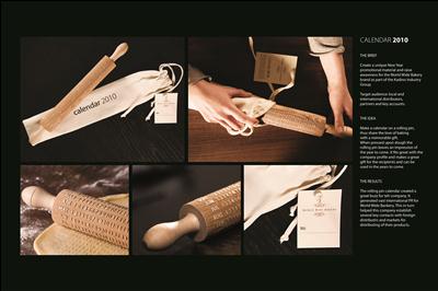
Make a calendar on a rolling pin, thus share the love of baking with a memorable gift. When pressed upon dough the rolling pin leaves an impression of the year to come. It fits great with the company profile and makes a great gift for the recipients can be used in the years to come. Other credits: Owner and Managing Director: Ivan Unkovski, Production Manager: Dusko Atanasovski |
|
Borkebjs. The return of the monsters. Group: E Design and Art Direction Subgroup: Editorial Award: Finalist Product and services category: Sport, entertainment, recreation, leisure Registrant: KOLLE REBBE Country: NEMÄ_IJA Brand name: Borkebjs. The return of the monsters. Advertiser: Borkebjs.com Advertising agency, city: Kolle Rebbe / KOREFE, Hamburg Ñîñòàâ Òâîð÷åñêîé Ãðóïïû: Art director: Reginald Wagner Creative director: Katrin Oeding Photographer/Illustrator: Ulrike Kirmse, Guido Stanke (Photographer), Sarah Gossner (Illustrator) Project manager: Juliane Ahlfeld Creative idea explanation: Develop a unique design concept, which sets the book apart from normal, bound books. And which also hints to the idea of the story in the way it is designed: you can only see the Borkebjs if you use your imagination. The Borkebjs are the heroes of this modern 332-page fairy tale book, which casts a spell on children and adults alike. The book is all about the adventures of ten furry creatures who you can only see if you use your imagination. The book plays with this idea in its design. The message on the cover of the book isnâ_Tt immediately visible to everyone. However, people who see the bookâ_Ts cover as a game can assemble the title and find the entrance into the realm of fantasy. Headline (eng.): Borkebjs. The return of the Monsters. Other credits: Copywriter: Delia D. Marti, Till Grabsch, Productioner: Franziska Ziegler, Frank Schneider, Postproduction: PX2@Medien GmbH & Co. KG, Print Office: H. Heenemann GmbH & Co. KG |
|
The Fascination of Hunting Group: E Design and Art Direction Subgroup: Editorial Award: Finalist Product and services category: Sport, entertainment, recreation, leisure Registrant: ARGONAUTEN G2 GMBH - A MEMBER OF GREY | G2 GROUP Country: NEMÄ_IJA Brand name: Leica Sport Optics Advertiser: Leica Camera AG Advertising agency, city: Argonauten G2 GmbH - a member of Grey | G2 Group (Headquarters: Berlin) Ñîñòàâ Òâîð÷åñêîé Ãðóïïû: Art director: Felix DÃ_richen, Mona Möller Creative director: Felix DÃ_richen, Jutta Häussler Designer: Felix DÃ_richen Photographer/Illustrator: Photographer: Maik Scharfscheer Project manager: Maik Hofmann, Stefanie Arnold Creative idea explanation: If you thought â__camerasâ__ when you read â__Leicaâ__, youâ_Tre not alone. So the job of redesigning the brochure for these premium binoculars, telescopes and rifle scopes was to establish a visual concept that demonstrates Leicaâ_Ts bona fides â_" to hunters and birdwatchers whose bullshit detectors are pretty sensitive. So, from photo style to page layout, we show that Leicaâ_Ts home isnâ_Tt the pristine sterility of an optics lab, but rather the lived-in wilderness. It's the intensity of â__that one magical momentâ__ for which wilderness lovers happily invest hours of concentration. Cited at the 2010 European Design Awards, Red Dot winner. Headline (eng.): The Fascination of Hunting Other credits: Copywriters: Jutta Häussler, Anne Stroschein / Strategic Planning: Judd Labarthe |
|
Leica M Group: E Design and Art Direction Subgroup: Editorial Award: Finalist Product and services category: Sport, entertainment, recreation, leisure Registrant: ARGONAUTEN G2 GMBH - A MEMBER OF GREY | G2 GROUP Country: NEMÄ_IJA Brand name: Leica M Advertiser: Leica Camera AG Advertising agency, city: Argonauten G2 GmbH - a member of Grey | G2 Group (Headquarters: Berlin) Ñîñòàâ Òâîð÷åñêîé Ãðóïïû: Art director: Sabine Brinkmann Creative director: Anita Stoll, Felix DÃ_richen Designer: Sabine Brinkmann Photographer/Illustrator: Photographer: Maik Scharfscheer Project manager: Maik Hofmann, Silvana Meyer Creative idea explanation: Since the 1920s the M-series of cameras has represented Leicaâ_Ts soul, and every new M model sparks intense anticipation. The secret is utter concentration on the essentials: uncompromising quality, the worldâ_Ts most brilliant lenses and a radically reduced design. This brochureâ_Ts equally reduced design fits the M9 perfectly, while a photo documentation demonstrates both thematically and pictorially the values Leica owners so prize. The setting is Cuba, for decades home of the worldâ_Ts best amateur boxers, whose extraordinary success can be attributed toâ_¦utter concentration on the essentials. Won Silver at the 2010 European Design Awards plus a red Dot. Headline (eng.): Leica M Other credits: Copywriters: Anita Stoll, Sabine Weber / Strategic Planning: Judd Labarthe |
|
Mobitel Company Profile Group: E Design and Art Direction Subgroup: Editorial Award: Finalist Product and services category: Communication, publications and electronic media Registrant: PRISTOP D.O.O. Country: SLOVENIJA Advertiser: Mobitel d.d. Advertising agency, city: Pristop d.o.o., Ljubljana Ñîñòàâ Òâîð÷åñêîé Ãðóïïû: Creative director: AljoÅ¡a Bagola Designer: Martina Kokovnik Photographer/Illustrator: Damjan KocjanÄ_iÄ_ Project manager: Å_iga Drofenik, Dean LevaÄ_iÄ_ Creative idea explanation: To position Mobitel as the most innovative and successful mobile company in Slovenia, we designed the company profile in a literally outstanding way. All of the executives were shot in 3D technique and custom made 3D-vision glasses enclosed. By using them business partners saw the uniqueness of the Mobitelâ_Ts vision. Other credits: Klemen Å efer, copywriter, Rok Kordin |
|
Herbarium - book inspired by Rajec herbal waters Group: E Design and Art Direction Subgroup: Editorial Award: Finalist Product and services category: Food and beverages Registrant: LEAGAS DELANEY PRAHA S.R.O. Country: Ä_EÅ KA Brand name: Rajec Advertiser: Kofola a.s. Advertising agency, city: Leagas Delaney Praha s.r.o. Ñîñòàâ Òâîð÷åñêîé Ãðóïïû: Art director: Pauline Kerleroux Creative director: Tereza SvÄ>ráková Photographer/Illustrator: Pauline Kerleroux, Kristina Ambrozová Creative idea explanation: Herbarium - book about herbs is a project supporting range of herbal waters Rajec. It serves as a consumer competition award and a nontraditional image material for B2B and journalists. It is as well on sale in regular bookstores. Headline (eng.): Herbarium - book inspired by Rajec herbal waters |
|
STIHL Autumn Calendar 2010 Group: E Design and Art Direction Subgroup: Editorial Award: Finalist Product and services category: Household products and maintenance, furnishing and accessories Registrant: EURO RSCG DUESSELDORF Country: NEMÄ_IJA Brand name: STIHL handheld blowers Advertiser: STIHL Vertriebszentrale AG & Co. KG Advertising agency, city: Euro RSCG Duesseldorf, Euro RSCG Muenchen Ñîñòàâ Òâîð÷åñêîé Ãðóïïû: Art director: Martin Staubach, Kai Tusar Creative director: Felix Glauner, Torsten Pollmann Project manager: Marcus Kotarba, Daniel Grube Creative idea explanation: Brief: STIHL asked the agency to develop a business gift promoting the product range of leave blowers. Target audience: international key accounts, like municipalities of major cities. Explicit request: make something never seen before! Solution: The agency created an invention. Introducing the autumn calender 2010 â_" the first tear-off calender, that tears off its leafs automatically. To show the necessity of STIHL Handheld Blowers in an entertaining way â_" day by day. Due to the fact, that leafs fall in autumn, our calender covers the time period 09/23 - 12/21. Headline (eng.): The first calendar that tears off its leaves automatically Other credits: Christoph Mueller, Till Koester, Detlef Stuhldreier, Uwe Strahl |
|
World Heritage Serbia Group: E Design and Art Direction Subgroup: Editorial Award: Finalist Product and services category: Communication, publications and electronic media Registrant: NEW MOMENT NEW IDEAS COMPANY Y&R BELGRADE Country: SRBIJA Advertiser: Ministry of Culture Republic Of Serbia Ñîñòàâ Òâîð÷åñêîé Ãðóïïû: Art director: SlaviÅ¡a SaviÄ+ Creative director: Dragan Sakan Creative idea explanation: The brief was to create a book that would represent 4 Serbian UNESCO monuments in an attractive package for diplomatic visits. No. 4 is the number of monuments and the number of elements on Serbian heraldic shield. Other credits: Copywriter: Dragan Sakan |
|
Fill the Gap Group: E Design and Art Direction Subgroup: Corporate and brand identity Award: Finalist Product and services category: Public services and social engagements Registrant: TRANSFORMER STUDIO Country: RUSIJA Brand name: Multilingua Advertiser: Multilingua Language Center Advertising agency, city: Transformer Studio, Moscow Ñîñòàâ Òâîð÷åñêîé Ãðóïïû: Art director: Nikita Melnikov, Ivan Danyshevsky Designer: Ivan Danyshevsky Project manager: Anastasia Guk Creative idea explanation: Multilingua is a language school that helps people with basic knowledge of language to improve their skills in English, German, French and Spanish. Learning language is a process of interaction and so is the brand identity: each identity application works as a test that involves the viewer into the study process at very first glance. Multilingua's students were also involved in the work process: their own personal writings were used in the logo. Headline (eng.): Fill the Gap |
|
The Deli Garage Range Group: E Design and Art Direction Subgroup: Corporate and brand identity Award: Finalist Product and services category: Food and beverages Registrant: KOLLE REBBE Country: NEMÄ_IJA Brand name: The Deli Garage Advertiser: T.D.G. Vertriebs UG (Haftungsbeschränkt) & Co. KG Advertising agency, city: Kolle Rebbe / KOREFE, Hamburg Ñîñòàâ Òâîð÷åñêîé Ãðóïïû: Art director: Reginald Wagner Creative director: Katrin Oeding Project manager: Kristina Wulf Creative idea explanation: The brand image brings together the world of the garage and sophisticated design. It incorporates the functional aesthetic of tools side by side with modern illustration and typography. With its decidedly contemporary look and feel, the artwork is finely tuned to reflect the various productsâ_T attributes. The individual elements of the corporate design are kept minimalistic and clear, underlining the level of functionality. At the same time, they give the hand-made product design a luxurious sheen and also emphasize the quality of the ingredients. Headline (eng.): The Deli Garage Range Other credits: Copywriter: Lorenz Ritter, Till Grabsch, Katharina Trumbach, Madelen Gwosdz, Graphic Design: Jan Simmerl, Paul Svoboda, Santa Gustina, Productioner: Frank Witte (Romey von Malottky), Stephan Gerlach (Kolle Rebbe) |
|
Tourfile, the Travel Guide Group: E Design and Art Direction Subgroup: Corporate and brand identity Award: Finalist Product and services category: Communication, publications and electronic media Registrant: AIMC RACKURS LTD. Country: RUSIJA Brand name: Tourfile Advertiser: Guidespark Advertising agency, city: AIMC Rackurs Ltd., Moscow Ñîñòàâ Òâîð÷åñêîé Ãðóïïû: Art director: Evgeny Ovsyannikov Creative director: Evgeny Chizhevsky Designer: Evgenia Gordeeva Creative idea explanation: Tourfile is an information analytical publication, a collection of the best offers from tourist companies for traveling in different countries. The agency had an objective to make a corporate identity bright, unique, memorizable and outstanding on the competitorsâ_T background. Popular folk prints representing unique, expressive and traditional Russian appeal, so called Lubok, were taken as the basis for it. Bright and nameable Kuzma-the traveller. A character with a history, moving and sincere, like himself. Simple picture patterns, bright colors. Humor and straightforwardness. The logo has inlaid possibilities to modify the plot, depending on advertising campaigns and advertising vehicle formats with the recognizability preserved. Headline (eng.): Tourfile, the travel guide |
|
Gurieli Group: E Design and Art Direction Subgroup: Packaging design Award: Finalist Product and services category: Food and beverages Registrant: OGILVY & MATHER UKRAINE Country: UKRAJINA Brand name: Gurieli Export tea Advertiser: Geoplant Ltd. Advertising agency, city: Ogilvy & Mather Ukraine, Kiev Ñîñòàâ Òâîð÷åñêîé Ãðóïïû: Art director: Taras Dzendrovskii Creative director: Will Rust Designer: Palina Pliashchanka, Nadezhda Diachenko Photographer/Illustrator: Eugenii Krylov Project manager: Alexandra Savonik, Martin Alles Creative idea explanation: Gurieli was a noble dynasty ruling over the Western Georgian province, where Gurieli tea is now grown and produced. The logo reflects the image of Duke Gurieli himself, while the loose tea pattern on the packaging resembles genuine Georgian weave. Other credits: Alexander Katkov, Evgeniya Dzyubenko, Dmitriy Shishkin, Irina Pigal |
|
Animals Group: E Design and Art Direction Subgroup: Packaging design Award: Finalist Product and services category: Food and beverages Registrant: DEMNER, MERLICEK & BERGMANN WERBEGESELLSCHAFT MBH Country: AVSTRIJA Brand name: Andreas Tscheppe Wines Advertiser: Weingut Andreas Tscheppe Advertising agency, city: Demner, Merlicek & Bergmann Werbegesellschaft mbH, Vienna Ñîñòàâ Òâîð÷åñêîé Ãðóïïû: Art director: Felix Broscheit Creative director: Franz Merlicek, Rosa Haider Creative idea explanation: The new labels put the spotlight on the aspect of intact nature benefited by organic vinicultural methods in Glanz, South Styria. The ,high gloss highlightâ_T also provides an interesting 'double entendre' in the German language - ,Glanzâ_T, the name of the town, also has the meaning ,gloss, sparkle, splendourâ_T in German. Headline (eng.): native of Glanz Other credits: Graphics: Felix Broscheit, Copywriter: Franz Merlicek, Arno Reisenbuechler, Account Manager: Petra Koestenbauer |
|
HappyPek Bird house Group: E Design and Art Direction Subgroup: Packaging design Award: Finalist Product and services category: Corporate and financial Registrant: LEO BURNETT DOO BEOGRAD Country: SRBIJA Brand name: HappyPek Advertiser: Pekarna Blatnik, Slovenia Advertising agency, city: Leo Burnett Belgrade Ñîñòàâ Òâîð÷åñêîé Ãðóïïû: Art director: Svetlana Dukic, Ivana Zekovic, Sinisa Grahovac Creative director: Anja Radulovic / Associate Creative Director: Veljko Golubovic Designer: Ivan Simijonovic Photographer/Illustrator: Ivana Zekovic, Svetlana Dukic Project manager: Sonja Milovic Creative idea explanation: HappyPek is a Slovenian brand of bakeries and bakery products that has one amazing advantage â_" the people behind it. Blatnik family has a long family tradition in baking. All family members love their work and sharing it with others. It makes them happy. In accordance with HappyPek brand motto: Sharing happiness, we created special birdhouses in which we collect bread crumbs and then give them to people to feed the birds with them. There are two sizes of birdhouses, adjusted to match different feeding locations. When birdhouse gets empty, they can easily refill it with bread leftovers. Headline (eng.): HappyPek Bird house Other credits: Copywriter: Bozidar Cvetkovic Planning: Tatjana Rakic, Mirjana Ojdanic |
|
The Sandpaper label - Group: E Design and Art Direction Subgroup: Packaging design Award: Finalist Product and services category: Food and beverages Registrant: OGILVY & MATHER GMBH Country: AVSTRIJA Brand name: Mario Haller Advertiser: O & M Vienna Advertising agency, city: O & M Vienna Ñîñòàâ Òâîð÷åñêîé Ãðóïïû: Art director: Christian Bircher Creative director: Gerd Schulte - Doeinghaus Project manager: Ad director: Patrick Haberzettel Creative idea explanation: The Sandpaper label. The Mario Haller Schnaps.Briefing:Haller Distillery gave us the task of designing their complete fine fruit brandy range.The range encomspasses three varieties:Cherry, Pear and Plum, which vary in thealcohol percentage and the drinking texture.Solution:For the label we chose varieties of sand paper - the stronger the brandy, the larger the granulation. Already the first grasp of the bottle gives an indication of how intense or mild the content is.Haller Fine Fruit Brandies are created from entirely natural products without any additives. Therefore, the label design has a pure look, in keep with the purely natural contents.Results:Already in the shop we wanted the consumers to FEEL the different strenghts (grade of destillation = percentage alcohol) of the offered Mario Haller Brandies by using various grades of sand paper for the labelling. Furthermore was one of the main objectives to generate quickattention by using unusual eye catcking material/design. In contracts to the previous years, the whole year's production was sold within 5 months. Headline (eng.): The Sandpaper label - Mario Haller Schnaps Other credits: Copywriter: Helge Haberzettel |
|
Austria is dying - Vienna Group: E Design and Art Direction Subgroup: Illustrations and photo Award: Finalist Product and services category: Public services and social engagements Entry Series: AMREF Austria is dying Registrant: RAHOFER WERBEAGENTUR Country: AVSTRIJA Brand name: AMREF / Austria is dying Advertiser: Amref Austria inc. / Rahofer Werbeagentur Advertising agency, city: Rahofer Werbeagentur, Salzburg Ñîñòàâ Òâîð÷åñêîé Ãðóïïû: Art director: Bernd Mitterhauser Creative director: Jo Nussbaumer Photographer/Illustrator: Christian Pucher, Andreas Fitzner Project manager: Christian Rahofer Creative idea explanation: We equate the number of victims dying every year in Africa from malaria and AIDS with the number of inhabitants of Vienna and Salzburg. The visuals each show a well-known view from both of the towns. The photos are turned into horror scenarios by means of image editing: The towns may indeed remain recognisable at the first glance, but - from the mood of the lighting right through to the smallest image detail - they reveal themselves to be run-down and deserted. Goal: To create awareness of the fact that hundreds of thousands of people die in Africa every year from the effects of a malaria or HIV infection. Headline (eng.): The whole of Vienna is dying from malaria. |
|
Tsunami Group: E Design and Art Direction Subgroup: Illustrations and photo Award: Finalist Product and services category: Public services and social engagements Registrant: SCHOLZ & FRIENDS WARSZAWA SP. Z O.O. Country: POLJSKA Brand name: Emergency Club (fast reactive to natural disasters) Advertiser: Charity for Polska Akcja Humanitarna Advertising agency, city: Scholz&Friends Warszawa Sp. z o.o. Ñîñòàâ Òâîð÷åñêîé Ãðóïïû: Art director: Karina Marczak Creative director: Jarek WiewiÃ_rski Designer: Sameer Kulavoor Photographer/Illustrator: Sameer Kulavoor Project manager: Agnieszka Szylkin Creative idea explanation: You won't stop the disasters, but you can be faster than them. Headline (eng.): The world is challenging you every seckond Other credits: Weronika ZarÄTbska |
|
Earthquake Group: E Design and Art Direction Subgroup: Illustrations and photo Award: Finalist Product and services category: Public services and social engagements Registrant: SCHOLZ & FRIENDS WARSZAWA SP. Z O.O. Country: POLJSKA Brand name: Emergency Club (fast reactive to natural disasters) Advertiser: charity for Polska Akcja Humanitarna Advertising agency, city: Scholz&Friends Warszawa Sp. z o.o. Ñîñòàâ Òâîð÷åñêîé Ãðóïïû: Art director: Karina Marczak Creative director: Jarek WiewiÃ_rski Designer: JÃ_zek Dutkiewicz Photographer/Illustrator: Sameer Kulavoor Project manager: Agnieszka Szylkin Creative idea explanation: You won't stop the disasters, but you can be faster than them. Headline (eng.): The world is challenging you every second Other credits: Weronika ZarÄTbska |
|
Spaceship Group: E Design and Art Direction Subgroup: Illustrations and photo Award: Finalist Product and services category: Sport, entertainment, recreation, leisure Registrant: LEO BURNETT RUSSIA Country: RUSIJA Brand name: Lego Advertiser: Lego Advertising agency, city: Leo Burnett Moscow Ñîñòàâ Òâîð÷åñêîé Ãðóïïû: Art director: Arina Avdeeva, Rodrigo Linhares Creative director: Mikhail Kudashkin Designer: Dmitry Jakovlev Photographer/Illustrator: Ninjafilms |
|
Deep Ocean Explorer Group: E Design and Art Direction Subgroup: Illustrations and photo Award: Finalist Product and services category: Sport, entertainment, recreation, leisure Registrant: LEO BURNETT RUSSIA Country: RUSIJA Brand name: Lego Advertiser: Lego Advertising agency, city: Leo Burnett Moscow Ñîñòàâ Òâîð÷åñêîé Ãðóïïû: Art director: Arina Avdeeva, Rodrigo Linhares Creative director: Mikhail Kudashkin Designer: Dmitry Jakovlev Photographer/Illustrator: Ninjafilms |
|
Beetle Group: E Design and Art Direction Subgroup: Illustrations and photo Award: Finalist Product and services category: Sport, entertainment, recreation, leisure Registrant: LEO BURNETT RUSSIA Country: RUSIJA Brand name: Lego Advertiser: Lego Advertising agency, city: Leo Burnett Moscow Ñîñòàâ Òâîð÷åñêîé Ãðóïïû: Art director: Arina Avdeeva, Rodrigo Linhares Creative director: Mikhail Kudashkin Designer: Dmitry Jakovlev Photographer/Illustrator: Ninjafilms |
|
''Ticket'' Hotwheels Group: E Design and Art Direction Subgroup: Illustrations and photo Award: Finalist Product and services category: Sport, entertainment, recreation, leisure Registrant: OGILVY GROUP HUNGARY ZRT. Country: MADÅ_ARSKA Advertising agency, city: Ogilvy Group Hungary Ñîñòàâ Òâîð÷åñêîé Ãðóïïû: Art director: Balazs Kismarty-Lechner Creative director: Balazs Kismarty-Lechner Photographer/Illustrator: Istvan Labady |
|
''Panda Bike'' - WWF Group: E Design and Art Direction Subgroup: Illustrations and photo Award: Finalist Product and services category: Public services and social engagements Registrant: OGILVY GROUP HUNGARY ZRT. Country: MADÅ_ARSKA Advertiser: WWF hungary Advertising agency, city: Ogilvy Group Hungary Ñîñòàâ Òâîð÷åñêîé Ãðóïïû: Art director: Diana Pusztai Creative director: Bartek Rams Photographer/Illustrator: Gabor De Fiala Headline (eng.): For a Living Planet Other credits: Judit Kun, copywriter |
|
Birds_Swallow Group: E Design and Art Direction Subgroup: Illustrations and photo Award: Finalist Product and services category: Public services and social engagements Registrant: SAATCHI & SAATCHI ROMANIA Country: ROMUNIJA Brand name: Greenpeace Advertiser: Greenpeace Romania Advertising agency, city: Saatchi & Saatchi, Bucharest Ñîñòàâ Òâîð÷åñêîé Ãðóïïû: Art director: Laura Iane, Daniela Nedelschi Creative director: Jorg Riommi Designer: Jorg Riommi, Andrei Nica Photographer/Illustrator: Chris Jordan Project manager: Liana Petrascu Creative idea explanation: Use of real pictures to tell the story. Other credits: Account Executive: Madalin Nitis, Producers: Monica Garbur, Vitalie Brega |
|
Street Children illustration Group: E Design and Art Direction Subgroup: Illustrations and photo Award: Finalist Product and services category: Public services and social engagements Registrant: LEO BURNETT UKRAINE Country: UKRAJINA Brand name: Found for the Street Children Help Advertiser: Caritas Kiev Advertising agency, city: Leo Burnett Ukraine Ñîñòàâ Òâîð÷åñêîé Ãðóïïû: Art director: Pavel Klubnikin, Egor Petrov Creative director: Tatiana Fedorenko, Claus-Steffen Braun Photographer/Illustrator: David Foldvari Project manager: Marina Klymenko Creative idea explanation: The problem of street children in Ukraine is reaching a catastrophic dimension. For pity, society tries escape from them. So what are we doing with something we do not want to see? We simply remove it. Like some litter in the streets, you just want to clean any reminder about the problem away. But it does not help. The piece of paper is easily removed, but the problem of street children will stay. Simple and cheap in production posters in shape of pure homeless kids fill the city environment like children of the street do. In the way we tempt people to rip off the picture, in the impulse of removing it, we create an awareness, which will make people think. People percept it as spoiling of the street and try to remove the posters, but then they get the message that they are escaping the problem but not salving it. We refill the walls with new pictures, because children appear back on the streets. Web address leads to promo site where you find information how you can help to salve the pr Headline (eng.): You can remove me, but not the problem Other credits: Katya Duda, Katya Denisenko |
|
Street Children Ambiental Group: E Design and Art Direction Subgroup: Ambiental design Award: Finalist Product and services category: Public services and social engagements Registrant: LEO BURNETT UKRAINE Country: UKRAJINA Brand name: Found for the Street Children Help Advertiser: Caritas Kiev Advertising agency, city: Leo Burnett Ukraine Ñîñòàâ Òâîð÷åñêîé Ãðóïïû: Art director: Pavel Klubnikin, Egor Petrov Creative director: Tatiana Fedorenko, Claus-Steffen Braun Photographer/Illustrator: David Foldvari Project manager: Marina Klymenko Creative idea explanation: The problem of street children in Ukraine is reaching a catastrophic dimension. For pity, society tries escape from them. So what are we doing with something we do not want to see? We simply remove it. Like some litter in the streets, you just want to clean any reminder about the problem away. But it does not help. The piece of paper is easily removed, but the problem of street children will stay. Simple and cheap in production posters in shape of pure homeless kids fill the city environment like children of the street do. In the way we tempt people to rip off the picture, in the impulse of removing it, we create an awareness, which will make people think. People percept it as spoiling of the street and try to remove the posters, but then they get the message that they are escaping the problem but not salving it. We refill the walls with new pictures, because children appear back on the streets. Web address leads to promo site where you find information how you can help to salve the pr Headline (eng.): You can remove me, but not the problem Other credits: Katya Duda, Katya Denisenko |
|
More Space Than Expected Group: E Design and Art Direction Subgroup: Direct marketing - flat mailing Award: Finalist Product and services category: Cars, other vehicles and accessories Registrant: TBWA WERBEAGENTUR GMBH DÃ_SSELDORF Country: NEMÄ_IJA Brand name: Nissan Advertiser: Nissan Advertising agency, city: DÃ_sseldorf Ñîñòàâ Òâîð÷åñêîé Ãðóïïû: Art director: Simon Hattrup Creative director: Kai Röffen (Executive Creative Director) Project manager: Bernhard SchÃ_rmanns (Account Manager), Tomas Caetano (Management Supervisor) Creative idea explanation: Not via a high-gloss brochure, not via a complex mailing, but via a simple sheet of paper, we made our Audience experience the TIIDA effect: compact on the outside, supersize on the inside. At first a double folded cover letter communicates the compact nature of the outside. Once the reader unfolds the letter and reads the copy anew, the inserted sentences and subordinate clauses inform about the surprisingly spacious interior. Hence already when reading the letter, one can experience the effect, one has with the TIIDA: more space than expected. Headline (eng.): More Space Than You Expect Other credits: Matthias Hardt (Copywriter), Yvonne Rabenhorst (Junior Copywriter), Wibke Brode (Group Head Art), Meo Suzuki-Roeder (Head of Production), Malte Keller (Junior Productioner), |
|
Falling Letters Group: E Design and Art Direction Subgroup: Direct marketing - flat mailing Award: Finalist Product and services category: Public services and social engagements Registrant: KOLLE REBBE Country: NEMÄ_IJA Brand name: Charity Organization Advertiser: Bischoefliches Hilfswerk MISEREOR e.V. Advertising agency, city: Kolle Rebbe, Hamburg Ñîñòàâ Òâîð÷åñêîé Ãðóïïû: Art director: Susanne Moebius, Reinhard Krug Creative director: Ales Polcar, Heiko Schmidt Project manager: Jessica Gustafsson Creative idea explanation: The earthquake catastrophe in Haiti was covered in all media. Misereor wanted to move Germany's top journalists not just to cover the misery caused by the earthquake, but to get active themselves and help out with a donation. To encourage as many of the approx. 500 important journalists and media decision-makers as possible to make a donation, we developed an unusual mailing concept. Instead of writing reams of letters asking for donations, we reduced the copy to a provocative demand: deeds, not words! And underlined our message with an attention-grabbing, formal idea. Headline (eng.): MISEREOR Mailing Falling Letters Other credits: Copywriter: Henning Flohr, Productioner: Franziska Ziegler |
|
Safe child on the net Group: E Design and Art Direction Subgroup: Direct marketing - dimensional mailing Award: Finalist Product and services category: Public services and social engagements Registrant: PUBLICIS SP. Z O.O. Country: POLJSKA Brand name: Child on the net Advertiser: Dzieci Niczyje Foundation Advertising agency, city: Publicis Poland, Warsaw Ñîñòàâ Òâîð÷åñêîé Ãðóïïû: Art director: Slawomir Figura Creative director: Bartek Rams Designer: Dagmara Witek-Kusmider Project manager: Ewa Wasniewska Creative idea explanation: Parents aren't aware of dangers waiting for their children in the net or donâ_Tt know how to minimize the risk. We wanted to surprise parents just like their children are surprised by violence in the net. Headline (eng.): Safe child on the net Other credits: Grzegorz Jedrych - Producer (Mundoprint) |
|
Candlestick from paper 'The stories of light' Group: E Design and Art Direction Subgroup: Miscellaneous print and 3 D materials Award: Finalist Product and services category: Household products and maintenance, furnishing and accessories Registrant: 'PURPURS' GINTA SMITE Country: LATVIJA Advertising agency, city: Map Latvia AS Ñîñòàâ Òâîð÷åñêîé Ãðóïïû: Creative director: Purpurs Designer: Purpurs Project manager: Ginta Smite Creative idea explanation: Epigraph - enjoy and take as present those twinklings of interaction between shadow and light. Stare, get lost in your dreams, listening to the stories, narrated by light. Construction - afolding gift-box to be used as a candle-stick for a changeable tea candle. Material - chaded or recycled cardboard. Production technology: laser cutting, cutting. Headline (eng.): Candlestick from paper 'The stories of light' |
|
Unequal Childhood Paper-Cutting Group: E Design and Art Direction Subgroup: Miscellaneous print and 3 D materials Award: Finalist Product and services category: Public services and social engagements Registrant: LEO BURNETT Country: ZDA Brand name: Children's Charity Advertiser: Christna Noble Children's Foundation Advertising agency, city: Leo Burnett Hong Kong Ñîñòàâ Òâîð÷åñêîé Ãðóïïû: Art director: Katie Ng Creative director: Connie Lo, Miranda Shing Designer: Chen Jie Rong Photographer/Illustrator: Illustrator: Chen Jie Rong Project manager: Pamela Wan, Alice Lam, Kevin Cheung Creative idea explanation: Christina Noble Children's Foundation (CNCF) as a charity organisation is determined to make HK public aware of this inequality, and seek their support in helping street children. To illustrate this message of inequality, we used traditional paper cut. Traditionally the pattern is supposed to be symmetrical. But we intended to make it asymmetric, with one side depicting a child in a loving family, and the other side showing the child in an abusive environment. Other credits: Copywriter: Paul Yu, Cyrus Ho, Kiu Chan |
|
Sandglass 1 of 3 Group: E Design and Art Direction Subgroup: Miscellaneous print and 3 D materials Award: Finalist Product and services category: Cars, other vehicles and accessories Entry Series: Sandglass Registrant: PUBLICIS FRANKFURT GMBH Country: NEMÄ_IJA Brand name: Renault Clio RS Advertiser: Renault Suisse SA Advertising agency, city: Publicis Frankfurt Ñîñòàâ Òâîð÷åñêîé Ãðóïïû: Art director: Christian Kuzman Creative director: Konstantinos Manikas Designer: Stefan Sperner Headline (eng.): Get there faster. Other credits: Copywriter: Daniel Steller, CCO: Stephan Ganser, Volker Schrader |
|
Sandglass 2 of 3 Group: E Design and Art Direction Subgroup: Miscellaneous print and 3 D materials Award: Finalist Product and services category: Cars, other vehicles and accessories Entry Series: Sandglass Registrant: PUBLICIS FRANKFURT GMBH Country: NEMÄ_IJA Brand name: Renault Clio RS Advertiser: Renault Suisse SA Ñîñòàâ Òâîð÷åñêîé Ãðóïïû: Art director: Christian Kuzman Creative director: Konstantinos Manikas Designer: Stefan Sperner Headline (eng.): Get There Faster Other credits: Copywriter: Daniel Steller, Brand manager: Frank Lakebrink, CCO: Stephan Ganser, Volker Schrader |
|
Sandglass 3 of 3 Group: E Design and Art Direction Subgroup: Miscellaneous print and 3 D materials Award: Finalist Product and services category: Cars, other vehicles and accessories Entry Series: Sandglass Registrant: PUBLICIS FRANKFURT GMBH Country: NEMÄ_IJA Brand name: Renault Clio RS Advertiser: Renault Suisse SA Ñîñòàâ Òâîð÷åñêîé Ãðóïïû: Art director: Christian Kuzman Creative director: Konstantinos Manikas Designer: Stefan Sperner Headline (eng.): Get There Faster Other credits: Copywriter: Daniel Steller, Brand manager: Frank Lakebrink, CCO: Stephan Ganser, Volker Schrader |