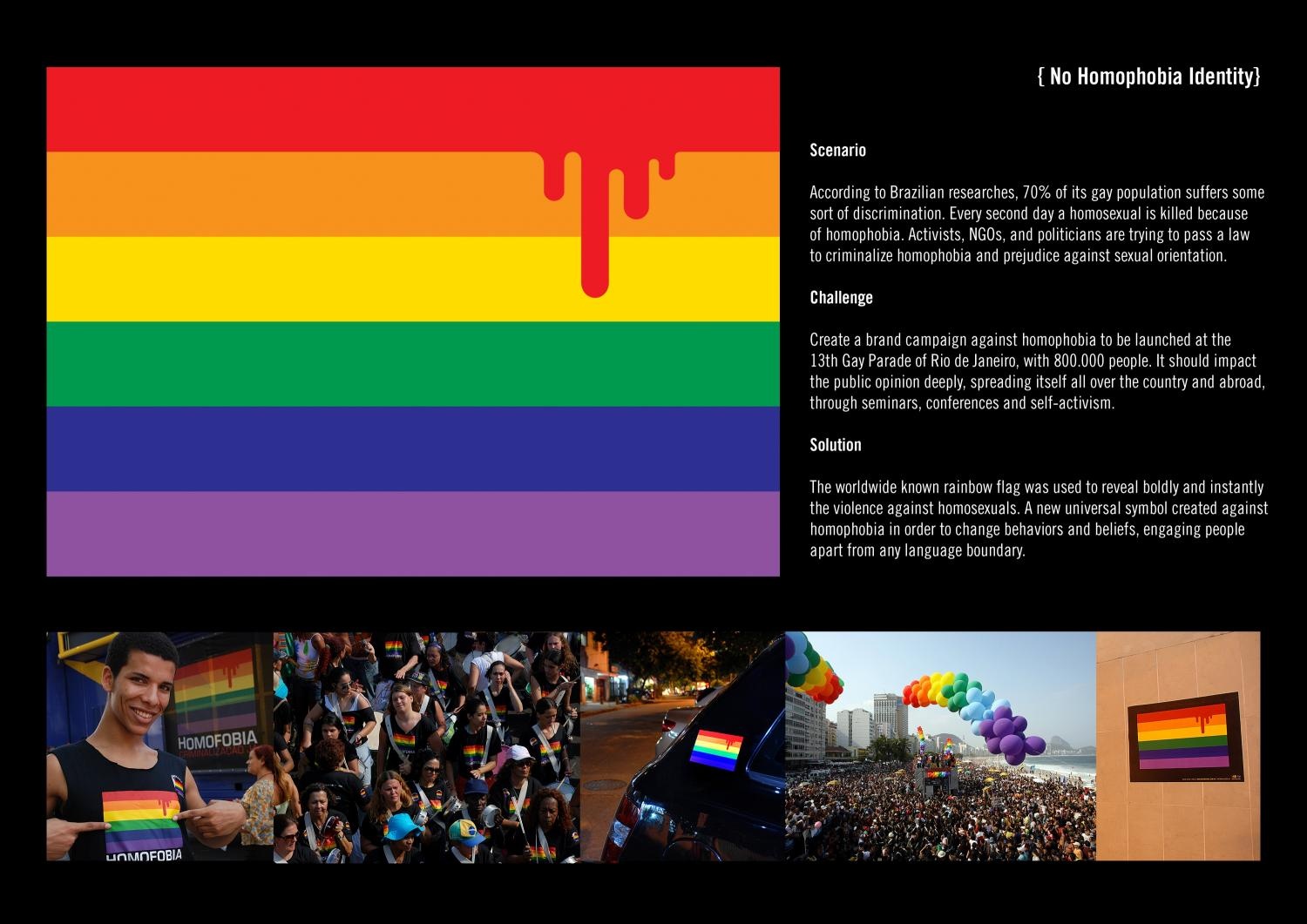
| Type of Entry: | Corporate or Brand Identity |
| Category: | Books |
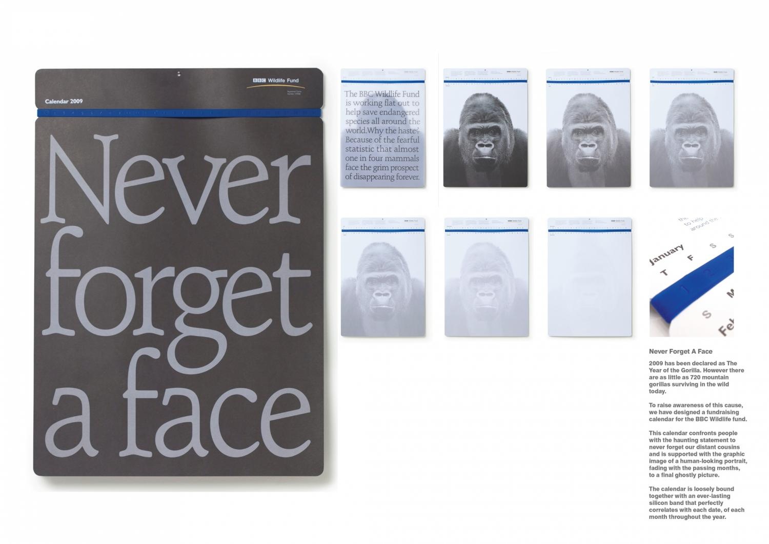
| Title: | ECO DIARY |
| Advertiser/Client: | CELL C |
| Product/Service: | CELLULAR OPERATOR |
| Entrant Company: | NET
| Describe the brief from the client: |
| To design a diary for 2008. |
|
Description of how you arrived at the final design:
|
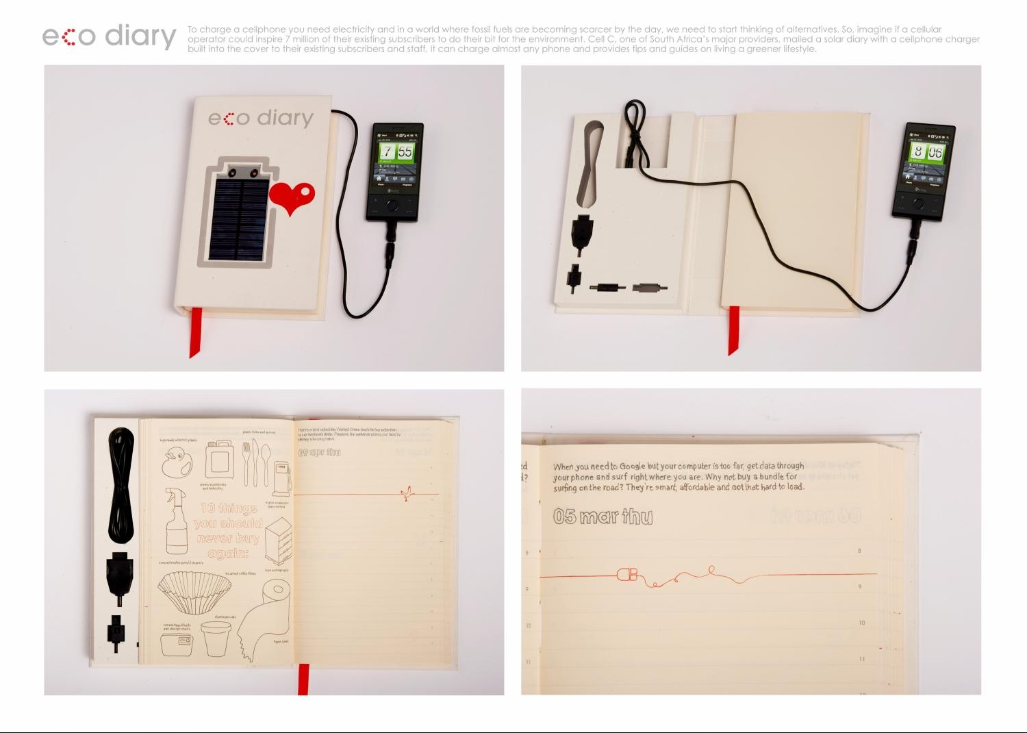
| This is the cell C eco diary. It features a solar charger on the cover that can charge almost any cellphone. It included 312 poems on being green, and provides tips and guides on living a greener lifestyle. It was mailed to existing subscribers and staff. Who better than a Cellular company to send you a solar charger to charge your phone? |
|
Indication of how successful the outcome was in the market:
|
| Emails from staff and customers flooded in thanking Cell C. The idea made an impact with the media too. The book appeared on blogs like africancarbontrust.org and was featured on the national television program, Morning Live. At the 2009 Design Indaba Conference the Diary also achieved second place in the South Exhibition, an initiative that honours South African designers for ideas on sustainability. |
|
| FACES OF EVIL |
|
|
| Type of Entry: | Corporate or Brand Identity |
| Category: | Books |
| Title: | FACES OF EVIL |
| Advertiser/Client: | DAS COMITEE |
| Product/Service: | PUBLISHING COMPANY |
| Entrant Company: | DAS COMITEE Hamburg, GERMANY |
| Design/Advertising Agency: | DAS COMITEE Hamburg, GERMANY |
Creative Credits
| Name |
Company |
Position |
| Hans Weishäupl |
Das Comitee |
Creative Director |
| Janet Riedel |
Das Comitee |
Graphic Designer |
| Dirk Silz |
Das Comitee |
Creative Director |
| Helen Zeggai |
Das Comitee |
Brand Manager |
| Hans Weishäupl |
Das Comitee |
Photographer |
| Brief Explanation: |
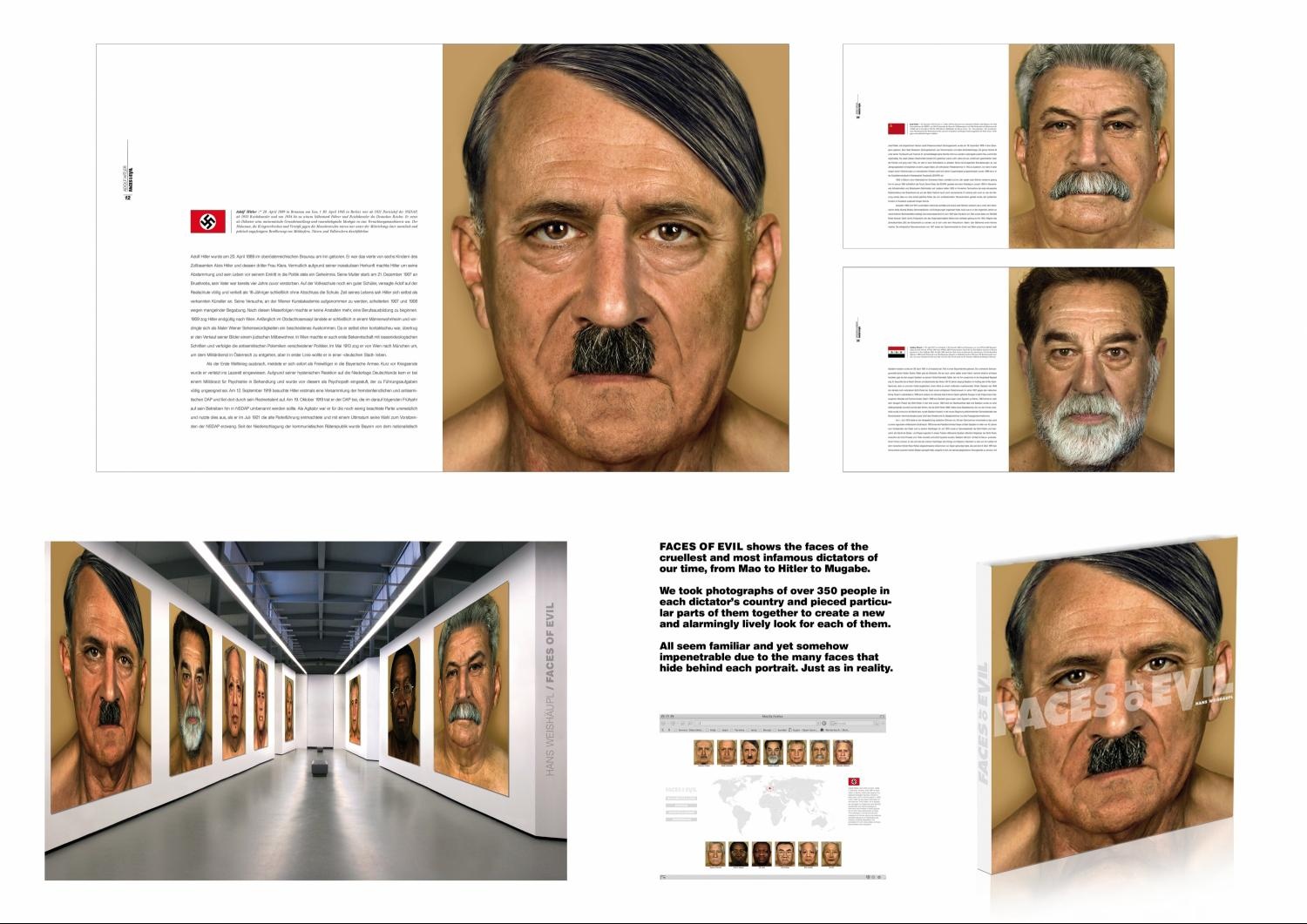
| FACES OF EVIL в?" this is the theme of Hans WeishГ¤uplв?Ts book and art project, which shows the thirteen cruellest and most infamous dictators of the last century as they have never been seen before: naked, uncensored, close-up and vulnerable. The portraits were created from separate photographs of over 350 people from the countries that suffered from their dictatorial regimes. |
| Describe the brief from the client: |
| Project for our own publishing company. |
|
Description of how you arrived at the final design:
|
| Hitlerв?Ts portrait has been carefully constructed from photographs of 37 different people. His nose belongs to an estate agent from Berlin, his upper lip to a locksmith in Dresden. His hair is put together from the hair of an artist in Weiden and a ranger in Bamberg. The chin stems from a Hamburg restaurant owner, the eyes are those of a bank advisor in Frankfurt, the lachrymal sacks are from a precision mechanic in Bautzenв?¦Every wrinkle, eyebrow and mole has been replicated true to the original. |
|
Indication of how successful the outcome was in the market:
|
| 2 book presentations in Frankfurt and Leipzig (Germany), 5 exhibitions in europe, more than 200 press reactions around the world, more than 1000 google entries. |
|
| HIGH 5 |
|
|
| Type of Entry: | Corporate or Brand Identity |
| Category: | Publications |
| Title: | HIGH 5 |
| Advertiser/Client: | ENABLIS |
| Product/Service: | CHARITABLE ORGANISATION |
| Entrant Company: | COSSETTE MontrГcal, CANADA |
| Design/Advertising Agency: | COSSETTE MontrГcal, CANADA |
Creative Credits
| Name |
Company |
Position |
| Barbara Jacques |
Identica |
Creative Director |
| Julie Brassard |
Identica |
Art Director/Designer |
| Isabelle Allard |
Identica |
Designer |
| Patrice Dancziger |
Freelancer |
Writer |
| Enablis |
Enablis |
Photographer |
| Daniel Cartier |
Identica |
Production Artist |
| Louis Dorval |
Identica |
Producer |
| Litho Acme |
Transcontinental |
Printer |
| Multi-Reliure |
Multi-Reliure |
Binder |
| Brief Explanation: |
| - Report the activities of Enablis to key stakeholders.
- Ensure their continued support of the organisation as partners.
- Create a highly creative piece with a limited budget.
- Show their pride at celebrating their fifth year of existence. |
| Describe the brief from the client: |
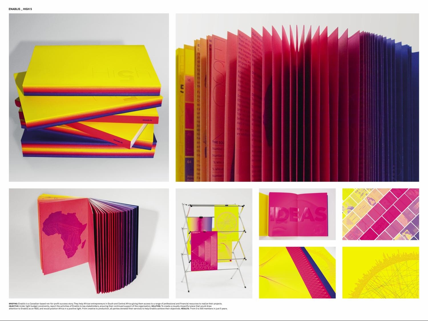
| Enablis is a Canadian-based not-for-profit success story. Through its organized and interactive global network, Enablis helps African entrepreneurs realize their projects in South and Central Africa, giving them access to a range of professional and financial resources. This year, Enablis is celebrating its 5th anniversary. |
|
Description of how you arrived at the final design:
|
| The annual reportв?Ts concept was based on Enablisв?T fifth anniversary, which has a direct correlation with the growing number of entrepreneurs supported by the organization. The annual reportв?Ts colour spectrum reflects the unique diversity of Africa.
В |
|
Indication of how successful the outcome was in the market:
|
| High 5 won two awards in 2009:
В
- Grafika Awards (Quebec, Canada): Grand Prize; category: Printing.
В
- TDC 55 (New York, U.S.A.): Certificate of Typographic Excellence; category: Annual Report.
В
Weв?Tve grown from 0 to 500 members, staff and volunteers, and from one success to another. |
|
| THE BOOK OF OREGON |
|
|
| Type of Entry: | Corporate or Brand Identity |
| Category: | Self Promotion |
| Title: | THE BOOK OF OREGON |
| Advertiser/Client: | TRAVEL OREGON |
| Product/Service: | SELF PROMOTION BOOK |
| Entrant Company: | WIEDEN+KENNEDY Portland, USA |
| Design/Advertising Agency: | WIEDEN+KENNEDY Portland, USA |
Creative Credits
| Name |
Company |
Position |
| Dan Wieden |
Wieden/Kennedy |
Ecd |
| Kelly Wright |
Wieden/Kennedy |
Designer |
| Ken Smith |
Wieden/Kennedy |
Account Director |
| Mira Kaddoura |
Wieden/Kennedy |
Art Director/Acd |
| Ginger Robinson |
Wieden/Kennedy |
Writer/Acd |
| Scrappers (justin) Morrison |
N/A |
Illustrator |
| Chris Mueller |
N/A |
Photographer |
| Brief Explanation: |
| Our objectives were to showcase all the work that had gone into the buildling of Brand Oregon yet in an exclusive and lasting object that would be treasured by a few key decisionmakers at the top of each organization. |
| Describe the brief from the client: |
| We were tasked with creating a piece to celebrate the extraordinary 20-year relationship between Travel Oregon and Wieden+Kennedy. |
|
Description of how you arrived at the final design:
|
| The solution is a very limited edition, handcrafted в??Book of Oregon,в?? which embodies the spirit of Brand Oregon and elevates the work from advertising to artefact. Part art piece, part whimsical travel guide, the book interweaves hand-illustrated maps outlining regional adventures with tales of unconventional Oregonians. |
|
Indication of how successful the outcome was in the market:
|
| The book has been exhibited as a piece of art at the agency and the client organization. |
|
| T-SHIRT |
|
|
| Type of Entry: | Corporate or Brand Identity |
| Category: | Self Promotion |
| Title: | T-SHIRT |
| Advertiser/Client: | ROLAND SEMPRIE |
| Product/Service: | PERSONAL TRAINER |
| Entrant Company: | GJP ADVERTISING + DESIGN Toronto, CANADA |
| Design/Advertising Agency: | GJP ADVERTISING + DESIGN Toronto, CANADA |
Creative Credits
| Name |
Company |
Position |
| Lisa Greenberg |
GJP Advertising/Design |
Creative Director |
| Trevor Schoenfeld |
GJP Advertising/Design |
Creative Director |
| Chris Duchaine |
GJP Advertising/Design |
Art Director/Designer |
| Ross Pryde |
GJP Advertising/Design |
Copywriter |
| Artik |
|
Printer |
| Brief Explanation: |
| Design a shirt that Roland's clients would be proud to wear in the gym environment and not just stick in their drawer. |
| Describe the brief from the client: |
| Create a t-shirt design for Roland Semprie, a well-known personal trainer in Toronto, Canada |
|
Description of how you arrived at the final design:
|
| The solution was a t-shirt that gauges how long you have trained with Roland by the amount you sweat. This would be a motivator for Roland's clients, and also let Roland know if they were truly getting a full workout. |
|
Indication of how successful the outcome was in the market:
|
| The shirt was a complete success for not only Roland, but for his clients as well. They are not only using the shirt during workouts, they are also competing against each other, using the shirt as bragging rights, to see who is working out the most. |
|
| EVERY STORY HAS A BEGINNING |
|
|
| Type of Entry: | Corporate or Brand Identity |
| Category: | Self Promotion |
| Title: | EVERY STORY HAS A BEGINNING |
| Advertiser/Client: | ROLAND BERGER STRATEGY CONSULTANTS |
| Product/Service: | RECRUITING OF STRATEGY CONSULTANTS |
| Entrant Company: | GГ?RTLERBACHMANN WERBUNG Hamburg, GERMANY |
| Design/Advertising Agency: | GГ?RTLERBACHMANN WERBUNG Hamburg, GERMANY |
Creative Credits
| Name |
Company |
Position |
| Uli GГ?rtler |
GГ?rtlerbachmann Werbung |
Creative Director |
| Merle Schröder |
GГ?rtlerbachmann Werbung |
Art Director |
| Anke Gröner |
Freelancer |
Copywriter |
| Dr. Björn Bloching |
Roland Berger Strategy Consultants Holding |
Head Of Marketing |
| Sharifa Hawari |
GГ?rtlerbachmann Werbung |
Account Manager |
| Christine Klein |
GГ?rtlerbachmann Werbung |
Pre-Press |
| Brief Explanation: |
| Frequently highly skilled talents are target of many companies and can choose between various job offers. A convincing appearance as an employer brand was needed to recruit competent staff. Especially because Roland Berger competes with McKinsey & Company, Boston Consulting Group and Accenture.
By sending a mailing to selected high-potential graduates we wanted to enhance the chances for qualified applications and guide them to Roland Berger in order to start a dialog with these highly skilled talents. |
| Describe the brief from the client: |
| Roland Berger Strategy Consultants is the biggest consultant in Europe. They are always looking for new talents who want to start a career at their company. |
|
Description of how you arrived at the final design:
|
| We developed a high-quality book and slipcase to assist the recruiting. Accompanied by a personalized correspondence and contact information of the relevant contact person the graduates were animated to get in touch with Roland Berger. This intelligent, high-end approach aims to stimulate interest in a career at Roland Berger. Designed like old books, with the motto в??Every story has a beginningв??, first sentences of famous works are cited. After many first sentences, which resemble beginnings of outstanding stories, the reader is invited to start his / her own story at Roland Berger. |
|
Indication of how successful the outcome was in the market:
|
| Out of 1.500 produced books 850 were sent to selected graduates in 2008. A response rate of 721 was better than expected and more than double of the desired 350 contacts. Altogether Roland Berger received 640 applications with a high potential of new graduates so that they could choose from the best consultant talents. With production costs of 12,- EUR per book and average costs of 14,15 EUR per contact this recruiting tactic beat all recruiting events they have ever done before in price and efficiency with the outcome of numerous skilled contenders. |
|
| SIT SHIT ON MUSIC FESTIVALS |
|
|
| Type of Entry: | Corporate or Brand Identity |
| Category: | Self Promotion |
| Title: | SIT SHIT ON MUSIC FESTIVALS |
| Advertiser/Client: | RADIO STATION STUDIO BRUSSELS |
| Product/Service: | RADIO STATION |
| Entrant Company: | MORTIERBRIGADE Brussels, BELGIUM |
| Design/Advertising Agency: | MORTIERBRIGADE Brussels, BELGIUM |
Creative Credits
| Name |
Company |
Position |
| Jens Mortier/Joost Berends/Philippe Deceuster |
Mortierbrigade |
Creative Directors |
| Stephanie Zimmermann |
Mortierbrigade |
Head Of Strategy |
| Patricia Vandekerckhove |
Mortierbrigade |
Producer |
| Tim/Joeri |
Mortierbrigade |
Creatives |
| Brief Explanation: |
| Being a small player the challenge was to reach our target audience amongst big spenders like Coca-Cola, Vodafone and Toyota. Second, we learned from research too much sponsoring on festivals quickly annoys people. They feel aggressed at a moment they come to for pleasure. As we knew that people go to festivals to see concerts and not to be harassed our objective was to be present in a more relevant way than just with a sponsor flag and some leaflets. |
| Describe the brief from the client: |
| Radio station Studio Brussels is a rather small music channel in Belgium. Every summer they are present at all the major music festivals. More than being one of the many sponsors we needed to claim the moment but with a modest budget. |
|
Description of how you arrived at the final design:
|
| We created something that shows Studio Brussels understands the festival-spirit and really cares about its audience. What is this festival spirit? Watching a concert, having a beer, waiting until the next one starts and having a beer. The idea of creating a cushion was born. People could sit on something cosier when waiting the next concert or just by having a beer.
Regarding the design, as most of the festivals take place on a field, we created a cushion, which looked exactly like a cowВ№s droppings. De Zitvlaai (The Sitshit). More than a useful item, a relevant design. |
|
Indication of how successful the outcome was in the market:
|
| It was a gigantic hit. For each festival Studio Brussels supplied a couple of thousand cushions, which were all sold out in minutes. People lined up in long queues so they could get their own copy. Next to a lot of free press, people were very enthusiastic about the cushion and they left great comments on the Studio Brussel website. An important indication of success results in the fact that De Zitvlaai was admitted in an exhibition of the Belgium Design Museum. And it features already in the book в?? design with a smileв??. |
|
| IKEA SALE |
|
|
| Type of Entry: | Corporate or Brand Identity |
| Category: | Point of Sale |
| Title: | IKEA SALE |
| Advertiser/Client: | IKEA MALAYSIA |
| Product/Service: | IKEA |
| Entrant Company: | LOWE & PARTNERS KUALA LUMPUR, MALAYSIA |
| Design/Advertising Agency: | LOWE & PARTNERS KUALA LUMPUR, MALAYSIA |
Creative Credits
| Name |
Company |
Position |
| Ng Heok Seong |
Lowe/Partners |
Executive Creative Director |
| Khor Kok Yang |
Lowe/Partners |
Art Director |
| Joseph Lee |
Lowe/Partners |
Art Director |
| Mohan Prabhakar |
Lowe/Partners |
Copywriter |
| Lim Ken Peng |
Lowe/Partners |
Designer |
| Eddie Lee |
Lowe/Partners |
Production Manager |
| Ong Bee Lin |
Lowe/Partners |
General Manager |
| Nicole Wong |
Lowe/Partners |
Account Manager |
| Hoch |
Studio Pashe |
Photographer |
| Brief Explanation: |
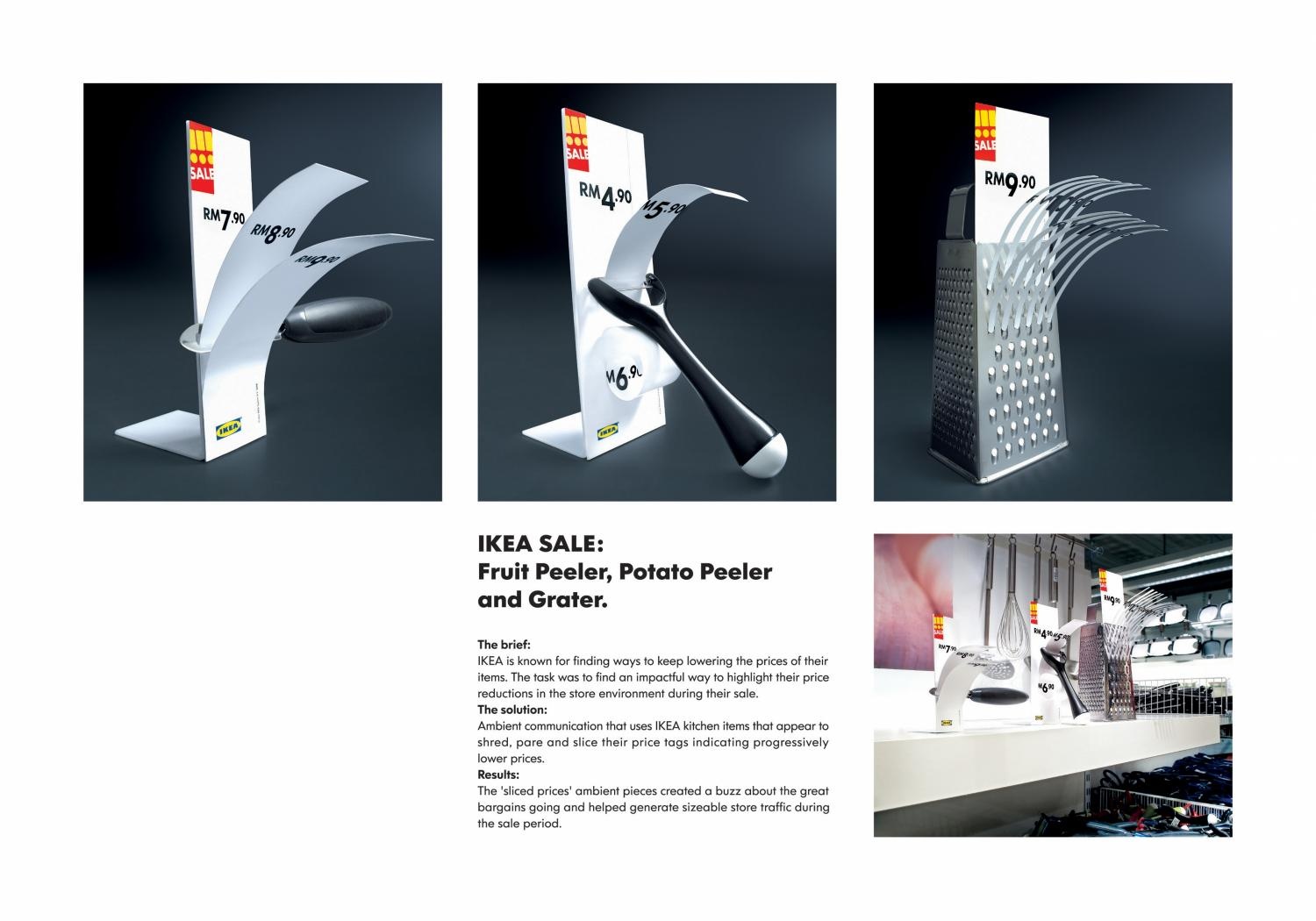
| In a market where customers are inundated by offers and various promotions, the challenge was to find a fresh way to convey the same message of lower prices. |
| Describe the brief from the client: |
| The client briefed the agency to find an impactful way to communicate their price reductions during the IKEA sale. |
|
Description of how you arrived at the final design:
|
| The inspiration for the final design came from IKEA's own kitchen products, which peel, grate and pare food items. We combined the function of those items with the price tags to highlight the progressively lower prices IKEA was offering customers. |
|
Indication of how successful the outcome was in the market:
|
| The ambient pieces created considerable buzz about the great bargains going during the sale period and helped generate sizable store traffic. |
|
| BARBECUE |
|
|
| Type of Entry: | Corporate or Brand Identity |
| Category: | Point of Sale |
| Title: | BARBECUE |
| Advertiser/Client: | VISION ART |
| Product/Service: | 3M POST-IT STICKY NOTES |
| Entrant Company: | PUBLICIS COMMUNICATIONS MALAYSIA Petaling Jaya, MALAYSIA |
| Design/Advertising Agency: | PUBLICIS COMMUNICATIONS MALAYSIA Petaling Jaya, MALAYSIA |
Creative Credits
| Name |
Company |
Position |
| Calvin Soh |
Publicis Communications Malaysia |
Chief Creative Officer |
| Andy Soong |
Publicis Communications Malaysia |
Executive Creative Director |
| Teh Le Vin |
Publicis Communications Malaysia |
Copywriter |
| Calvin Soh |
Publicis Communications Malaysia |
Copywriter |
| Hong Xiao Yeen |
Publicis Communications Malaysia |
Art Director |
| Chong Khong Lum |
Publicis Communications Malaysia |
Art Director |
| Lee Kwee Keak |
Publicis Communications Malaysia |
Art Director |
| Andy Soong |
Publicis Communications Malaysia |
Copywriter |
| Norman Tang |
Ifl Studio |
Photographer |
| Norman Tang |
Ifl Studio |
Art Director |
| Brief Explanation: |
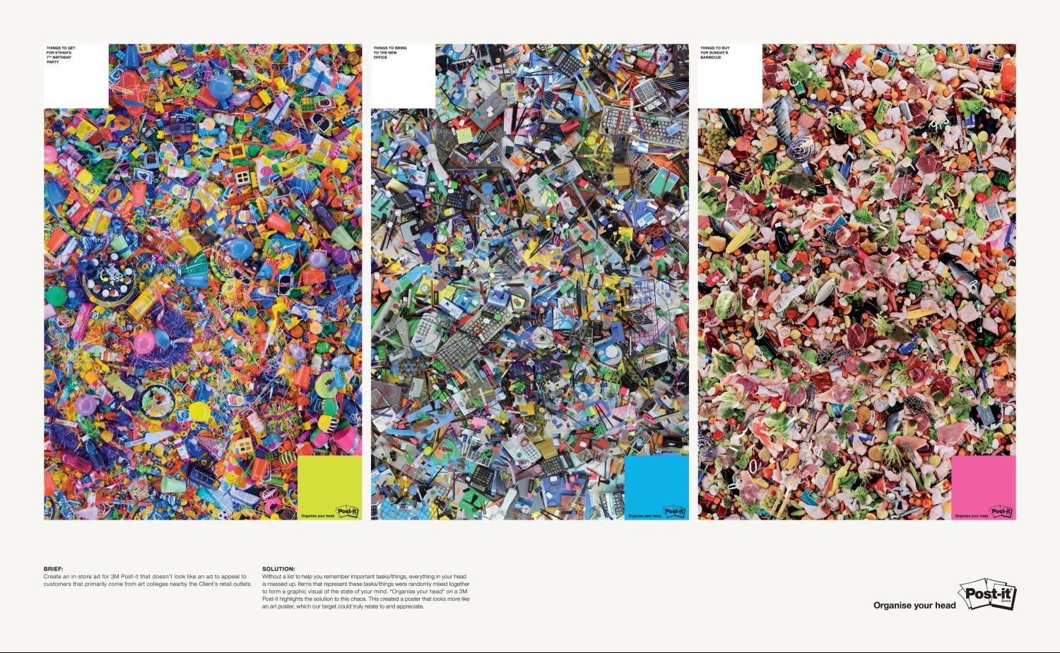
| Challenges: Clientв?Ts tight advertising budget and finding a benefit that would be relevant to the Clientв?Ts primary customers (art students).
Key objectives: Drive awareness and sales of 3M Post-it note. |
| Describe the brief from the client: |
| Create an in-store ad for 3M Post-it note that doesnв?Tt look like an ad, to appeal to customers that primarily come from art colleges nearby the Clientв?Ts retail outlets. |
|
Description of how you arrived at the final design:
|
| Without a list to help you remember important tasks/things, youв?Tll lose focus and everything in your head is messed up. To demonstrate this, we created 3 posters out of items that represent things you have to do, bring or buy. These were randomly mixed and piled together, which resulted in a graphic visual of the state of your mind. в??Organise your headв?? on a 3M Post-it highlights the solution to this chaos. This creative execution created ads that look more like art posters. Plus, the highlighted benefit relates well with students who always have a lot in their heads. |
|
Indication of how successful the outcome was in the market:
|
| Out of the 15 stores where these posters were put up, 9 stores sold their 4-month 3M Post-it stock in 18 days. The other 6 stores sold their 4-month stock in 35 days.
Several customers requested a copy of the poster as an art collectible. |
|
| ALL AGAINST EACH OTHER |
|
|
| Type of Entry: | Corporate or Brand Identity |
| Category: | Broadcast Design & Graphics |
| Title: | ALL AGAINST EACH OTHER |
| Advertiser/Client: | AMNESTY INTERNATIONAL |
| Product/Service: | HUMAN RIGHTS ORGANISATION |
| Entrant Company: | LEO BURNETT LISBOA, PORTUGAL |
| Design/Advertising Agency: | LEO BURNETT LISBOA, PORTUGAL |
Creative Credits
| Name |
Company |
Position |
| Chacho Puebla |
Leo Burnett Lisboa |
Creative Director |
| Chacho Puebla |
Leo Burnett Lisboa |
Copywriter |
| Fernando Bellotti |
Leo Burnett Lisboa |
Copywriter |
| Bruno Ribeiro |
Leo Burnett Lisboa |
Copywriter |
| Ricardo Toledo |
Leo Burnett Lisboa |
Art Director |
| Cristina Almeida |
Leo Burnett Lisboa |
Production Director |
| Hugo Lage |
Leo Burnett Lisboa |
Av Producer |
| Mateus De Paula Santos |
Lobo/AnimatГ?rio |
Director |
| Loic Dubois |
Lobo/AnimatГ?rio |
Producer |
| Alberto Lopes |
Lobo/AnimatГ?rio |
Executive Producer |
| Paulo Beto |
Lobo/AnimatГ?rio |
Sound Design |
| Lobo/AnimatГ?rio |
Lobo/AnimatГ?rio |
Animation |
| Tura |
Leo Burnett Lisboa |
Creative Advisor |
| Miguel SimГчes |
Leo Burnett Lisboa |
Account Director |
| Brief Explanation: |
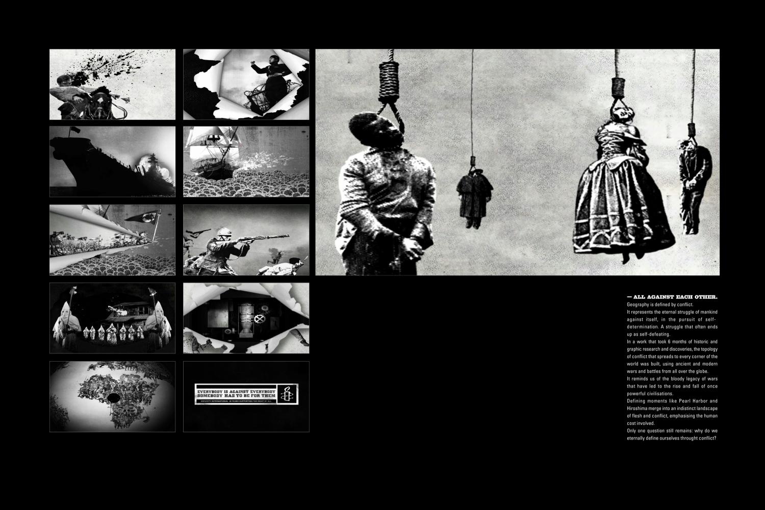
| In this kind of campaign, the biggest obstacle is always indifference. People are mostly aware of the conflicts in our world, but most of them do nothing. |
| Describe the brief from the client: |
| The objective was clear and simple. Telling everyone that Amnesty is an identity that fights for human rights. Everyone's human rights. Not just a few. Everyone's. It doesn't matter sides or groups of a fight. What really matters is making sure the human rights are respected. |
|
Description of how you arrived at the final design:
|
| We've created an illustrated image where we can see all the conflicts that have taken place on the planet. The images all together show in detail every region in the world and its conflicts, present and past. |
|
Indication of how successful the outcome was in the market:
|
| The TV spot was broadcast on major Portuguese media and online. By the first week the video had more than 30,000 hits on YouTube. People realized the truth of this message and Amnesty International received more contacts than ever. |
|
| SEE FURTHER |
|
|
| Type of Entry: | Corporate or Brand Identity |
| Category: | Digital Design |
| Title: | SEE FURTHER |
| Advertiser/Client: | FIAT |
| Product/Service: | STILO BLACKMOTION CAR |
| Entrant Company: | AGГ?NCIACLICK SГ?o Paulo, BRAZIL |
| Design/Advertising Agency: | AGГ?NCIACLICK SГ?o Paulo, BRAZIL |
Creative Credits
| Name |
Company |
Position |
| Raphael Vasconcellos |
AgГЄnciaclick |
Executive Creative Director |
| Juliana Constantino |
AgГЄnciaclick |
Creative Director |
| Mateus Braga |
AgГЄnciaclick |
Creative Director |
| Brief Explanation: |
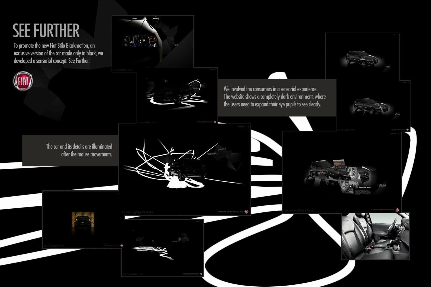
| To spread the word about design. |
| Describe the brief from the client: |
| A special series of a car. |
|
Description of how you arrived at the final design:
|
| Inspired by the car color. |
|
Indication of how successful the outcome was in the market:
|
| Wow factor. |
|
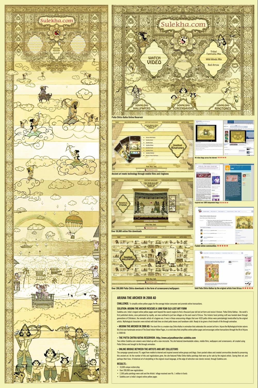
| ARJUNA THE ARCHER |
|
|
| Type of Entry: | Corporate or Brand Identity |
| Category: | Digital Design |
| Title: | ARJUNA THE ARCHER |
| Advertiser/Client: | SULEKHA.COM |
| Product/Service: | YELLOW PAGES ONLINE DIRECTORY |
| Entrant Company: | JWT INDIA Mumbai, INDIA |
| Design/Advertising Agency: | JWT INDIA Mumbai, INDIA |
Creative Credits
| Name |
Company |
Position |
| Senthil Kumar |
Jwt |
Executive Creative Director |
| Senthil Kumar |
Jwt |
Designer/Copywriter |
| Suresh Eriyat |
Famous House Of Animation |
Designer/Art Director |
| Jeff Emmanuel |
Jwt |
Digital Art Director |
| Arjun Nalapat |
Jwt |
Digital Writer |
| Sharath Shankar |
Famous House Of Animation |
Producer |
| Arun K |
Jwt |
Web Architect |
| Original Artists Village |
Orissa Handicrafts |
Illustrators |
| Brief Explanation: |
| Most Indian consumers are wary of e-commerce and online transactions.
Many consider the internet only for email, news and social networking.
Less than 6% of Indian credit card users indulge in online shopping.
The biggest objective therefore was to simplify online Yellow Pages for the Indian consumer and encourage online transactions via Sulekha.com |
| Describe the brief from the client: |
| To simplify online Yellow Pages for the Indian consumer and demonstrate the ease of online transactions. To encourage consumers to switch from the usual paperback Yellow Pages to Sulekha.com online Yellow Pages and classifieds. |
|
Description of how you arrived at the final design:
|
| We started by marrying the mythological arrow with the technological cursor and brought Arjuna The Archer back to life in the online age.
The design of the character and the space revived the art form of Patta Chitra Katha, featuring ancient illustrations hand printed on sun dried patta leaves. The illustrative process involved mixing tamarind seed paste with rice powder, applied on patta leaves to create the canvas. Next animal hair brushes were dipped in vegetable colours to imprint each image. 4320 Patta Chitras were hand crafted and transformed into the digital space using flash applications for the site. |
|
Indication of how successful the outcome was in the market:
|
| A microsite with a macro cause: designed to demonstrate online yellow pages and revive the Lost Art of Patta Chitra Katha.
The site became the online identity of Sulekha.com as it was used as the home page lead in, engaging over 5 million online Indians since launch, featuring free downloads of videos, screensavers, wallpapers, ringtones and the collective online Pattu Chitra Katha Reservoir on Sulekha.com.
A digital design initiative that bridges Mythology with Technology to save a priceless art form and revive it for future generations through the online medium, while drawing millions of online Indians to transact via Sulekha.com. |
|
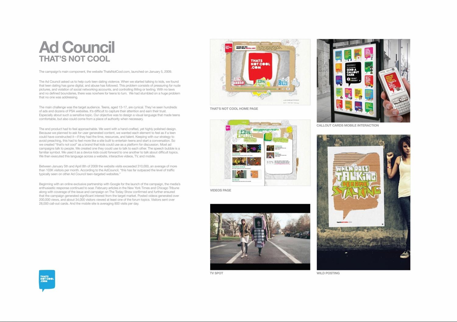
| THAT'S NOT COOL |
|
|
| Type of Entry: | Corporate or Brand Identity |
| Category: | Digital Design |
| Title: | THAT'S NOT COOL |
| Advertiser/Client: | AD COUNCIL |
| Product/Service: | AD COUNCIL |
| Entrant Company: | R/GA New York, USA |
| Design/Advertising Agency: | R/GA New York, USA |
Creative Credits
| Name |
Company |
Position |
| Nick Law |
R/GA |
Chief Creative Officer/North America |
| Taras Wayner |
R/GA |
Executive Creative Director Copywriting |
| Jim Therkalsen |
R/GA |
Associate Creative Director/Copywriting |
| Erin Noonan |
R/GA |
Account Director |
| Eric Deichl |
R/GA |
Visual Designer |
| David Brown |
R/GA |
Visual Designer |
| Sean Farrell |
R/GA |
Producer |
| David Trumpf |
R/GA |
Senior Visual Designer |
| Marc Shillum |
R/GA |
Director Of Brand Design |
| Chloe Gottlieb |
R/GA |
Executive Creative Director/Interaction Design |
| Jean Paul Tremblay |
R/GA |
Senior Interaction Designer |
| Rob Khristov |
R/GA |
Line Producer |
| Nicolas Karlson |
R/GA |
Line Producer |
| Mike Roufa |
R/GA |
Senior Software Engineer |
| Nick Katsivelos |
R/GA |
Technical Director |
| Brad Oв?Tbrien |
R/GA |
Print Producer |
| Rawle Curtis |
R/GA |
Senior Digital Advertising Lead |
| Ben Przespolewski |
R/GA |
Creative Director/Digital Advertising |
| Michael Lowenstern |
R/GA |
Group Director/Digital Advertising |
| Brooke-Lynn Luat |
R/GA |
Senior Planner |
| Brief Explanation: |
| The main challenge was the target audience. Teens, aged 13-17, are cynical. Theyв?Tve seen hundreds of ads and dozens of PSA websites. Itв?Ts difficult to capture their attention and earn their trust. Especially about such a sensitive topic. Our objective was to design a visual language that made teens comfortable, but also could come from a place of authority when necessary. |
| Describe the brief from the client: |
| The Ad Council asked us to help curb teen dating violence. When we started talking to kids, we found that teen dating has gone digital, and abuse has followed. This problem consists of pressuring for nude pictures, and violation of social networking accounts, and controlling IMing or texting. With no laws and no defined boundaries, there was nowhere for teens to turn. We had stumbled on a huge problem that no one was addressing. |
|
Description of how you arrived at the final design:
|
| The product had to feel approachable. We went with a hand-crafted, yet polished design. Because we planned for user-generated content, we wanted each element to look like a teen might've constructed it. Minding our strategy to avoid preaching, this had to feel more like a site built to entertain and start conversations. We created в??thatв?Ts not coolв?? as a brand kids could use as a platform for discussion. The speech bubble, familiar symbol, was used as a device kids could forward to peers to talk about difficult topics. This language was executed across a website, interactive videos, TV, and mobile. |
|
Indication of how successful the outcome was in the market:
|
| Between January 5th and April 8th, 2009 website visits exceeded 310,000, averaging more than 103K visitors/month.
Articles in The New York Times, Chicago Tribune, and coverage on The Today Show ensured that the campaign generated significant interest from the target. Videos generated over 200,000 views, and about 34,000 visitors viewed the forum topics. Visitors sent over 28,000 call-out cards. The mobile site averages 800 visits daily.
Every kid who comments, watches a video, sends a call-out, or reaches out for help is a successful business outcome. The influence of this campaign is measured in classrooms and homes across America. |
|
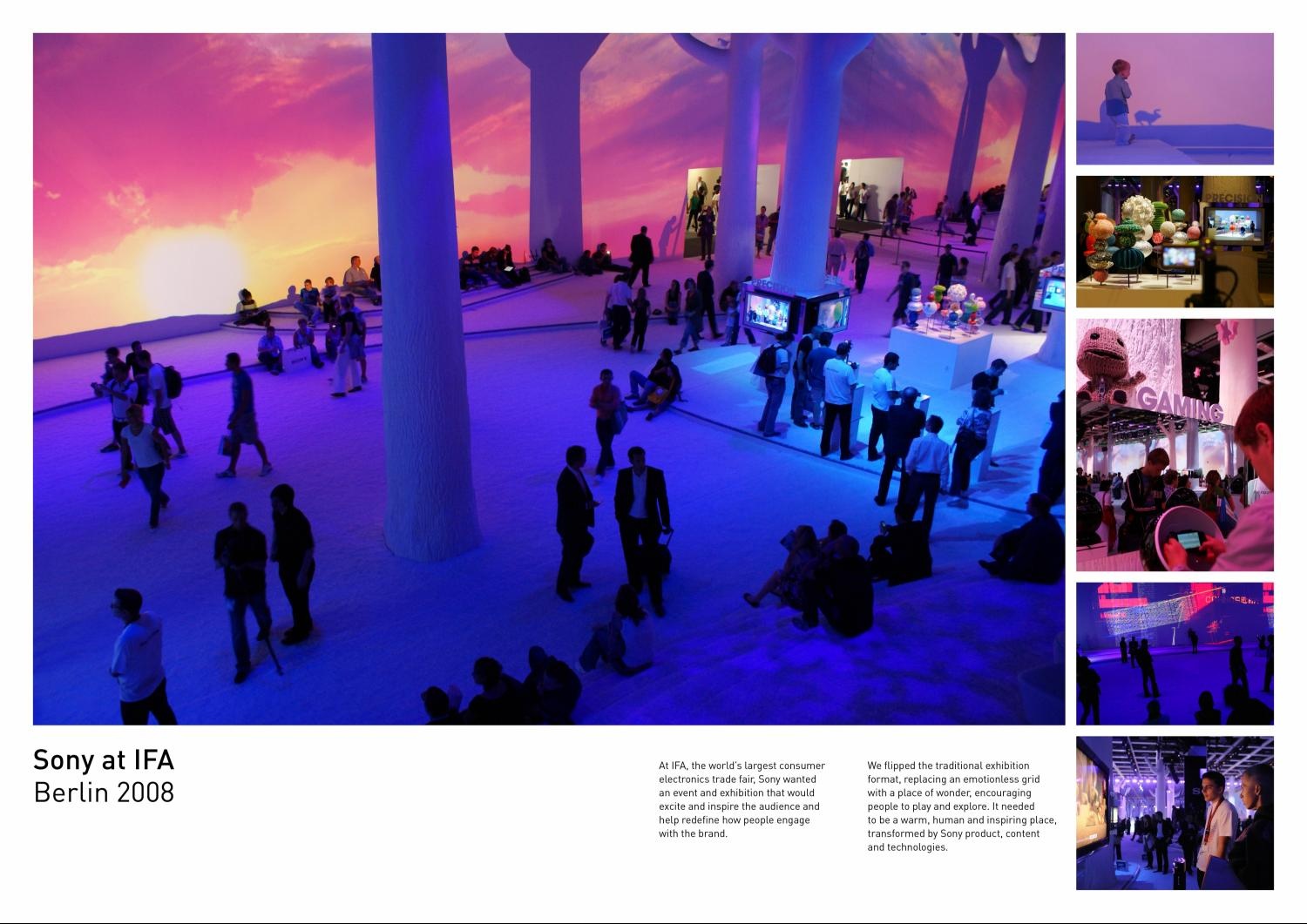
| SONY @ IFA 2008 |
|
|
| Type of Entry: | Environmental Design |
| Category: | Environmental Design: Semi-Permanent |
| Title: | SONY @ IFA 2008 |
| Advertiser/Client: | SONY EUROPE |
| Product/Service: | SONY ELECTRONICS & ENTERTAINMENT |
| Entrant Company: | FREESTATE London, UNITED KINGDOM |
| Design/Advertising Agency: | FREESTATE London, UNITED KINGDOM |
Creative Credits
| Name |
Company |
Position |
| Adam Scott |
Freestate |
Chief Creative Director |
| Charlotte Boyens |
Freestate |
Creative Director |
| Ben Johnson |
Freestate |
Client Director |
| Jeremy Hutchison |
Freestate |
Associate Creative Director/Content |
| Morris Lyda |
Freestate |
Producer |
| Kathrin Jacobsen |
Freestate /Kathrin Jacobsen |
Head Of Graphics |
| Gitta Gschwendtner |
Gitta Gschwendtner |
Exhibition Designer |
| Brief Explanation: |
| Sony is an amalgam of the biggest names and entities in consumer electronics and entertainment. Individual product groups and operating companies are sector dominant, with their own significant brands and identities. Rarely are they в??made realв?T as a single, unified entity; rarely do they attempt to lead with an overarching brand expression.
The concept needed to be strong and striking and work equally for a combined trade and consumer audience of over 200,000 people. It needed to be functional and inspirational.
It needed to be a place to connect with the Sony brand. |
| Describe the brief from the client: |
| IFA: the worldв?Ts largest consumer electronics trade fair. Berlin, August 2008.
Sony required an exhibition and event that:
- Helped unite their myriad of products, technologies and content around a single idea, that together they represent the future of digital entertainment.
- Inspired and excited visitors to help redefine how people engaged with the brand. |
|
Description of how you arrived at the final design:
|
| We flipped the traditional exhibition format, replacing an emotionless grid with a place of wonder, encouraging people to play and explore. It was a warm, human and inspiring place, transformed by Sony product, content and technologies; an expression of the brand.
The White Wood dwarfed an exhibition hall in a forest of immaculate white trees. With colossal mirrors flanking opposing walls, a glance through the wood became an endless visual echo. Space blended with reflection, products blended with content, the public blended with flash mobs. The effect was a united offering for the brand: digital entertainment; where fiction and reality blurs. |
|
Indication of how successful the outcome was in the market:
|
| Sonyв?Ts sales targets significantly exceeded.
Average time on the Sony booth в?" 24 minutes.
The stand was 3x as popular as its nearest competitor.
41% voted Sony as the best exhibitor. |
|
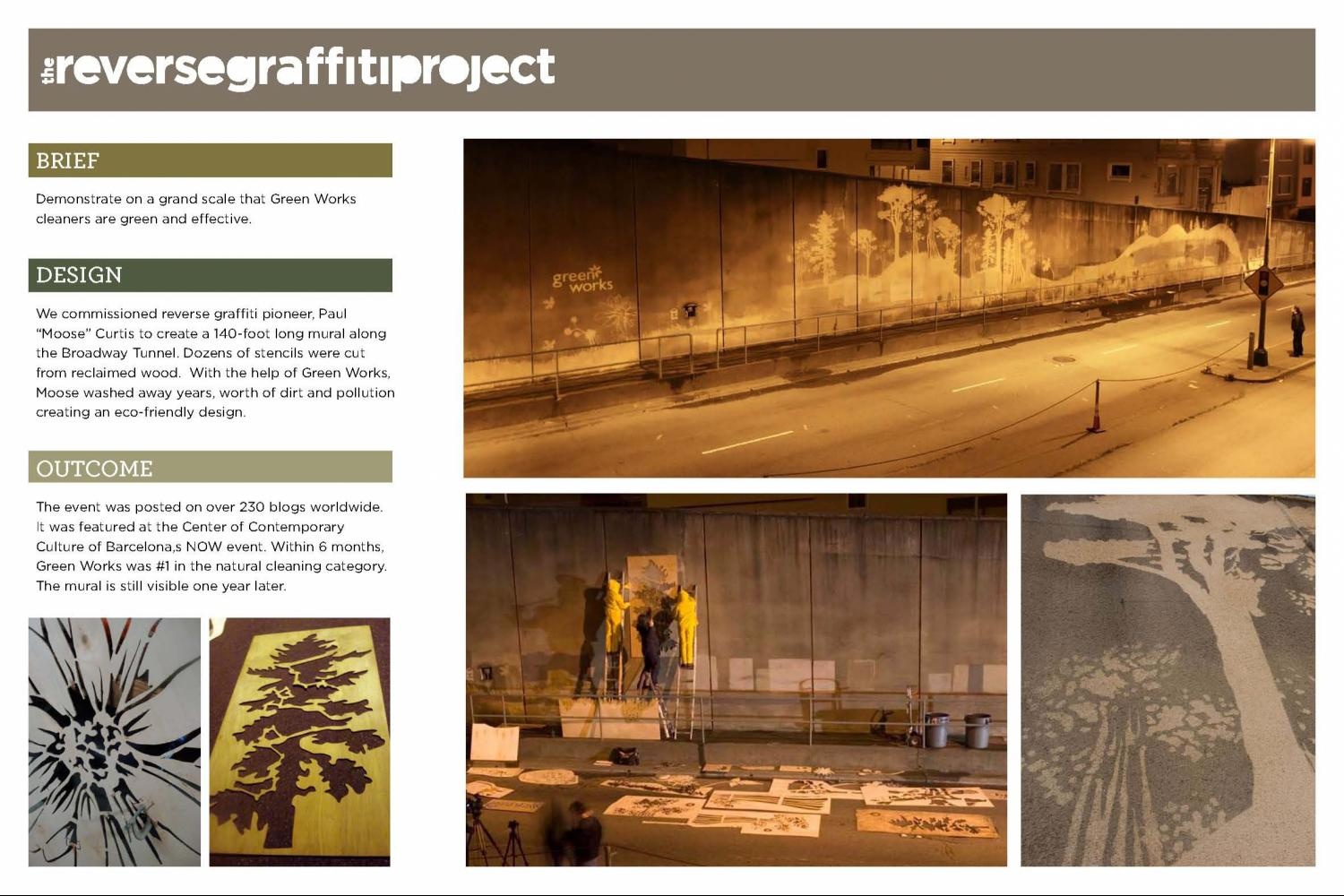
| REVERSE GRAFFITI PROJECT |
|
|
| Type of Entry: | Environmental Design |
| Category: | Environmental Design: Semi-Permanent |
| Title: | REVERSE GRAFFITI PROJECT |
| Advertiser/Client: | THE CLOROX COMPANY |
| Product/Service: | CLOROX BLEACH |
| Entrant Company: | DDB WEST San Francisco, USA |
| Design/Advertising Agency: | DDB WEST San Francisco, USA |
Creative Credits
| Name |
Company |
Position |
| Lisa Bennett |
DDB West |
Chief Creative Officer |
| Frank Brooks |
DDB West |
Director Of Production |
| Natalie Chambers |
DDB West |
Art Director |
| Dustin Smith |
DDB West |
Creative Director |
| Paul "moose" Curtis |
|
Artist |
| Mia Lischer |
DDB West |
Producer |
| Jessica Buttimer |
The Clorox Company |
VP Of Marketing |
| Stacey Grier |
DDB West |
Chief Strategic Officer |
| Debra Berman |
DDB West |
Planning Director |
| Michelle Ehlinger |
DDB West |
Account Director |
| Jon Lancaric |
|
Copywriter |
| Brief Explanation: |
| With a budget of only $55,000 USD we would need to find a way to overcome the scepticism and speak to both targets. We would have to prove that a green cleaner actually worked. Our objective was to get key influencers to start talking in a positive way about this new cleaning product. So, we set out to find a high-traffic location in San Francisco during Earth Month and with the help of Green Works, show how beautiful green cleaning could be. |
| Describe the brief from the client: |
| Cleaning products were getting a bad ecological rap, and as the inventor and manufacturer of bleach, Clorox was taking the brunt of it. In spite of that, Clorox planned to enter these treacherous waters with one of their most important product launches: an eco-friendly, 99% plant-based cleaner called Green Works. We needed to demonstrate in a big, memorable way to as many people as possible that contrary to popular perception, an environmentally-friendly cleaning product could be as powerful as a traditional cleaning product. |
|
Description of how you arrived at the final design:
|
| We commissioned an artist that specialized in an environmentally friendly form of graffiti called "clean tagging". Known as the reverse graffiti pioneer, Paul в??Mooseв?? Curtis cleaned away dirt to create art. We found Moose the perfect canvas -- a 140-foot long wall at the entrance to San Francisco's Broadway Tunnel. Moose and the team worked throughout the night cutting dozens of stencils from reclaimed wood of plant life indigenous to Northern California. With the help of Green Works, years worth of dirt and pollution were washed away to create a beautiful installation that was directly linked to the product. |
|
Indication of how successful the outcome was in the market:
|
| Images of the mural were posted on over 230 blogs around the world including inhabitat and tree hugger. A film about the event became YouTubeв?Ts #1 Featured Video and received over 500,000 views in one week. With $55,000 and one wall we received media value of $2.1 million resulting in 7.5 million media impressions. We turned negative conversations into influential ones driving negative tone down to a mere 5% in blog postings. Within 6 months, Green Works was #1 in the natural cleaning category. Over one year later, the mural is still visible and 20,000+ people view it daily. |
|
| LG FIVE |
|
|
| Type of Entry: | Environmental Design |
| Category: | Environmental Design: Semi-Permanent |
| Title: | LG FIVE |
| Advertiser/Client: | H.Y. GROUP |
| Product/Service: | LG SCREENS |
| Entrant Company: | SHIMONI FINKELSTEIN DRAFTFCB Tel Aviv, ISRAEL |
| Design/Advertising Agency: | SHIMONI FINKELSTEIN DRAFTFCB Tel Aviv, ISRAEL |
Creative Credits
| Name |
Company |
Position |
| Kobi Barki |
Shimoni Finkelstein Draftfcb |
Executive Creative Director |
| Liat Tzur |
Shimoni Finkelstein Draftfcb |
Creative Director |
| Dafna Orner |
Shimoni Finkelstein Draftfcb |
Art Director |
| Maayan Karniel |
Shimoni Finkelstein Draftfcb |
Copywriter |
| Oshik Rushinek |
Shimoni Finkelstein Draftfcb |
Executive Account Manager |
| Meytal Swisa |
Shimoni Finkelstein Draftfcb |
Account Supervisor |
| Tali Bendaat |
Shimoni Finkelstein Draftfcb |
Account Manager |
| Roy Kisch |
Shimoni Finkelstein Draftfcb |
Interactive Manager |
| Shimi Kuperly |
Shimoni Finkelstein Draftfcb |
Flash Designer |
| Emanuel Raz |
Shimoni Finkelstein Draftfcb |
Production |
| Boaz Meiri |
|
Production |
| Maya Dvash |
|
Curator |
| Ami Drach/Dov Ganchrow/Yossi Karni/Daniel Rosenthal/Sam Lifshitch/Doron Oryan/Er |
|
Designers |
| Brief Explanation: |
| 1. To find an original and stimulating way for people to engage with the LG product (screens), the product experience (a digital experience) and most importantly, the brand, by integrating the product into the format of a в??popularв?T culture exhibition.
2. To position LG as a brand leader with something meaningful to contribute to popular culture.
3. To find an exhibition space that would complement our main idea - the virtual vs. real debate. |
| Describe the brief from the client: |
| Having achieved number one position in terms of sales and share, the LG Screens division was looking for a way to demonstrate brand leadership. |
|
Description of how you arrived at the final design:
|
| We asked five leading product-design groups to go outside their comfort zones. Instead of asking them to design a product, we gave them the LG screen as raw material and challenged them to create an experience around it.
The idea was to provoke the general public to re-think their relationship with screens and the way that they blur the boundaries between the в??virtualв?T and the в??realв?T.
The result was "LG Five" a free exhibition featuring five diverse installations in five ancient spaces, aimed at provoking the general public to re-think their relationship with digital screens, and в??virtualв?T and в??realв?T experiences. |
|
Indication of how successful the outcome was in the market:
|
| в?ў Our viral e mail campaign drove people to register at the LG Five mini-site, resulting in the 3-day exhibition selling out in advance with over 8,000 visitors.
в?ў Our 'virtual vs. real' critique generated substantial PR coverage in press, magazines and national TV reaching an audience of 1.5 million.
в?ў The buzz caused major galleries to ask to stage the exhibition, further increasing its exposure.
в?ў Placing the LG brand within the world of pop-culture gave the brand a new level of substance, interest-value, and enriched imagery.
Post-campaign research showed the LG 5 Event had succeeded in causing a favorable shift in brand image and product perceptions:
There was a significant improvement in the perception of the quality of LG screens (4.24 out of 5) and its design. |
|
| NETWORK MANAGING BRAND TO A SERVICES BRAND |
|
|
| Type of Entry: | Environmental Design |
| Category: | Environmental Design: Permanent |
| Title: | NETWORK MANAGING BRAND TO A SERVICES BRAND |
| Advertiser/Client: | AEROPORTS DE PARIS |
| Product/Service: | PARISIAN AIRPORT |
| Entrant Company: | W&CIE Paris, FRANCE |
| Design/Advertising Agency: | W&CIE Paris, FRANCE |
Creative Credits
| Name |
Company |
Position |
| Gilles Deleris |
W/Cie |
Artistic/Creation Director |
| Gregoire Gilles |
W/Cie |
Creative |
| Brief Explanation: |
| Make the new corporate identity and the brand territory the illustration of the brandв?Ts new ambition. |
| Describe the brief from the client: |
| Faced with a very competitive European airport network, AГcroports de Paris has changed its status as an institution managing technical flight low data to that of a company with a commercial aim, to be 100% customer focused. |
|
Description of how you arrived at the final design:
|
| This change of global identity is the first step and the catalyst for radical development:
> A positive impact on passengersв?T perception
> A new commercial ambition that attracts a lot of commercial brands
> Identify its services with a specific colour code
> Welcome attitude and French lifestyle (Art de vivre) |
|
Indication of how successful the outcome was in the market:
|
| > A positive impact on passengersв?T perception
> A new commercial ambition that attracts a lot of commercial brands |
|
| ST.PAULI CHAPEL |
|
|
| Type of Entry: | Environmental Design |
| Category: | Environmental Design: Permanent |
| Title: | ST.PAULI CHAPEL |
| Advertiser/Client: | FC ST.PAULI SOCCER CLUB |
| Product/Service: | FC ST.PAULI SOCCER CLUB |
| Entrant Company: | JUNG von MATT Hamburg, GERMANY |
| Design/Advertising Agency: | JUNG von MATT Hamburg, GERMANY |
Creative Credits
| Name |
Company |
Position |
| Deneke Von Weltzien |
Jung Von Matt Ag |
Chief Creative Officer |
| Götz Ulmer |
Jung Von Matt Ag |
Creative Director |
| Frank Hose |
Jung Von Matt Ag |
Art Director |
| Laura MГ?ller-Rossbach |
Jung Von Matt Ag |
Copywriter |
| Clemens Sehi |
Jung Von Matt Ag |
Copywriter |
| Christian Hupertz |
Jung Von Matt Ag |
Account Supervisor |
| RenГc Requardt |
Jung Von Matt Ag |
Account Manager |
| Matthias Bauer |
Jung Von Matt Ag |
Graphics |
| Stefan Mildner |
Jung Von Matt Ag |
Graphics |
| Lilia Mezler |
Jung Von Matt Ag |
Graphics |
| Frank Hose |
Jung Von Matt Ag |
Illustrator |
| Andriy Vynogradov |
Jung Von Matt Ag |
Illustrator |
| Ole Grönwoldt |
Ole Grönwoldt/Artworks Altona |
Interior Designer |
| Effectiv Team Sets |
Effectiv Team Sets |
Set Production |
| Ole Grönwoldt |
Ole Grönwoldt C/O Hansastrasse |
Design |
| Brief Explanation: |
| Create a box that reflects the special spirit of the FC St.Pauli. |
| Describe the brief from the client: |
| Create a box that reflects the special spirit of the FC St.Pauli. |
|
Description of how you arrived at the final design:
|
| We didnВ?t just build a box, we built a church.
In the midst of angel statues, icons of legendary St. Pauli kickers are illustrated authentic. The box gleams as a sacred chapel. Under a ceiling fresco relics soar above the altar remind of great moments and heros are also pictured in the gothic stained-glass windows. |
|
Indication of how successful the outcome was in the market:
|
| The chapel became talk of soccerloving Germany. It still polarizes and inspires. Even couples want to marry there. And since the construction of the chapel the team hasnв?Tt lost a single game. |
|
| NEWSPAPER TO NEW PAPER PROJECT |
|
|
| Type of Entry: | Packaging Design |
| Category: | Foods |
| Title: | NEWSPAPER TO NEW PAPER PROJECT |
| Advertiser/Client: | ICHIDA GARDEN |
| Product/Service: | FRUIT AND VEGATABLES |
| Entrant Company: | DENTSU Tokyo, JAPAN |
| Design/Advertising Agency: | DENTSU Tokyo, JAPAN |
Creative Credits
| Name |
Company |
Position |
| Takanori Yasukochi |
Dentsu |
Creative Director |
| Haruko Tsutsui |
Dentsu |
Copywriter |
| Yoshihiro Yagi |
Dentsu |
Art Director |
| Katachi |
Katachi |
Production Company |
| Yo Kimura |
Katachi |
Designer |
| Nao Morimi |
Ichida Garden |
Silk Screen Print |
| Kosaku Miyata |
Dentsu |
Account Executive |
| Chie Ichida |
Ichida Garden |
Advertiser's Supervisor |
| Brief Explanation: |
| We focused on old newspaper used to wrap vegetables with. Newspaper was used for good reasons -- for its moisture retention quality, which helps keep vegetables fresh longer, and for its reuse value. |
| Describe the brief from the client: |
| Design a package for a street vendor that sells farm-grown vegetables and fruits. The brief required something original, easy-to-use and low cost. |
|
Description of how you arrived at the final design:
|
| Under the в??Newspaper-->New Paperв?? project, we utilized what was already there в?" the newspapers в?" and added an element of design that would be playful and make people smile; both those selling the vegetables and those buying them.
By reusing old papers that would be thrown away, the project was friendly to the environment as well as to the budget.
By simply adding dots or stripes to the old paper, we came up with a totally new package design. |
|
Indication of how successful the outcome was in the market:
|
| Sales grew by 20%, as did the number of customers. There was more interaction with customers. Because they liked the design, people didnв?Tt just throw away our New Paper but re-used it for something else.
News of the low-cost, original design wrapping paper spread virally to other stores that used newspaper for wrapping. The New Paper project was not just a new design for wrapping paper but a pointer to a new and better lifestyle for us all. |
|
| HONEYTUBE |
|
|
| Type of Entry: | Packaging Design |
| Category: | Foods |
| Title: | HONEYTUBE |
| Advertiser/Client: | ANTHONY`S GARAGE WINERY |
| Product/Service: | FOOD |
| Entrant Company: | KOLLE REBBE Hamburg, GERMANY |
| Design/Advertising Agency: | KOLLE REBBE Hamburg, GERMANY |
Creative Credits
| Name |
Company |
Position |
| Stefan Kolle |
Kolle Rebbe |
Executive Creative Director |
| Katrin Oeding |
Kolle Rebbe/Korefe |
Creative Director |
| Reginald Wagner |
Kolle Rebbe/Korefe |
Art Director |
| Katharina Trumbach |
Kolle Rebbe/Korefe |
Copywriter |
| Jan Simmerl |
Kolle Rebbe/Korefe |
Designer/Graphic Designer |
| Jan Simmerl |
Kolle Rebbe/Korefe |
Illustrator |
| Santa Gustina |
Kolle Rebbe/Korefe |
Illustration |
| Madelen Gwosdz |
Kolle Rebbe/Korefe |
Idea |
| Carolin Meyer |
Kolle Rebbe |
Account Supervisor |
| Kristina Wulf |
Kolle Rebbe |
Account Supervisor |
|
Produktionsbuero Romey Von Malottky |
Production Office |
| Brief Explanation: |
| Since winemaker Anthony Hammond produces his delicatessen foods in a former tractor repair shop, all of the products from his label have to have an industrial look and feel. |
| Describe the brief from the client: |
| The Mini Garage Winery needed innovative packaging to fit the companyв?Ts в??Garageв?? concept for its delicatessen honey flavoured with lemon, cinnamon and chocolate. |
|
Description of how you arrived at the final design:
|
| To match the industrial look and feel of the brand the honey comes in packaging similar to that found in garages; in this case, in tubes. Obviously, all in high quality designs with different illustrations for each type of honey.
The illustrative idea behind the design is to let consumers peek в??behind the scenesв?? inside the tubes. In the style of comic book set in a factory, the image on the packaging shows bees working on the nectar and its special ingredients. |
|
Indication of how successful the outcome was in the market:
|
| Launched in December 2008, shortly before Christmas, the first shops to receive the honey were sold out within 5 days. Both the national and regional press (Welt), design magazines (page) and design blogs covered the design. On top of that, there were plenty of queries for book production. |
|
| MR SINGH'S BANGRAS |
|
|
| Type of Entry: | Packaging Design |
| Category: | Foods |
| Title: | MR SINGH'S BANGRAS |
| Advertiser/Client: | MR SINGH'S BANGRAS |
| Product/Service: | SAUSAGES |
| Entrant Company: | THE PARTNERS London, UNITED KINGDOM |
| Design/Advertising Agency: | THE PARTNERS London, UNITED KINGDOM |
Creative Credits
| Name |
Company |
Position |
| Miranda Bolter |
The Partners |
Designer |
| Paul Currah |
The Partners |
Designer |
| Nick Eagleton |
The Partners |
Creative Director |
| Greg Quinton |
The Partners |
Creative Partners |
| Donna Hemley |
The Partners |
Project Manager |
| Ben Monk |
|
Photographer |
| Sarah Stott |
|
Food Stylist |
| Brief Explanation: |
| Create a unique and memorable brand that will make Mr Singhв?Ts Bangras stand out from all the other gourmet sausages on the market. |
| Describe the brief from the client: |
| The challenge for Mr Singhв?Ts Bangras was to find an unforgettable way of packaging gourmet Indian sausages. |
|
Description of how you arrived at the final design:
|
| The solution created the worldв?Ts first branded sausages.
Instead of creating packaging, each sausage has a unique henna print in edible ink. Every Bangra is packaged in its own skin.
A simple protective sleeve and tray holds the sausages together and shows off the product. Whether the sausages are seen on a barbecue, deli counter or beneath the sleeve of the pack, Mr Singhв?Ts Bangras will always stand out as the original Indian sausage. |
|
Indication of how successful the outcome was in the market:
|
| Unknown at this point. They have only just been launched onto the market. |
|
| SILVER HILLS BAKERY PACKAGING |
|
|
| Type of Entry: | Packaging Design |
| Category: | Foods |
| Title: | SILVER HILLS BAKERY PACKAGING |
| Advertiser/Client: | SILVER HILLS BAKERY |
| Product/Service: | BAKERY |
| Entrant Company: | DDB CANADA/VANCOUVER, CANADA |
| Design/Advertising Agency: | DDB CANADA/VANCOUVER, CANADA |
Creative Credits
| Name |
Company |
Position |
| James Bateman |
Ddb Canada/Karacters Vancouver |
Creative Director |
| Dan O'leary |
Ddb Canada/Karacters Vancouver |
Senior Designer |
| Jennifer Pratt |
Ddb Canada/Karacters Vancouver |
Designer |
| Jeff Galbraith |
Ddb Canada/Vancouver |
Copywriter |
| Heather Tryon |
Ddb Canada/Karacters Vancouver |
Senior Project Manager |
| Megan Mccord |
Ddb Canada/Karacters Vancouver |
Account Director |
| Hugh Ruthven |
Ddb Canada/Karacters Vancouver |
Brand Planner |
| Trish Beck |
Ddb Canada/Karacters Vancouver |
Producer |
| Robert Hanson |
|
Illustrator |
| Clinton Hussey |
|
Photographer |
| Brief Explanation: |
| For years, the company owned the sprouted whole grain bread market and, being one of the few players, had built a reputation for its product alone. With increased competition in this previously niche area, the bakery lost its differentiation. Consumer research also showed that the bakeryв?Ts в??Squirrellyв?? bread variety had higher brand recall than the Silver Hills parent brand.
Key objectives:
- Break through the generic product category littered with wheat sheaf cues and в??me tooв?? health claims
- Engage with the consumer, make them smile and remember the product
- Build off the success of the в??Squirrellyв?? name and expand this convention to the other eight products. |
| Describe the brief from the client: |
| Silver Hills Bakery wanted to increase sales of its sprouted whole grain breads. Seeking to raise its profile in the bread aisle and expand its market penetration, the company sought a package that would appeal to a broader audience but not exclude or confuse their existing health-food customers. An authentic and humble company, Silver Hills wanted a package that expressed who the company is, what it stands for, how its product is different and why consumers should buy it. |
|
Description of how you arrived at the final design:
|
| Building off of the companyв?Ts foundation as a provider of simple, healthy products, the brand strategy focused on the idea that Silver Hills makes bread в??the way it should beв?? в?" simple, honest and wholesome.
Consumersв?T affinity for the companyв?Ts в??Squirrellyв?? bread inspired the development of a series of eclectic names for each of Silver Hillsв?T eight other products. These names inspired personalities for each of the products, depicted through everyday whimsical illustrations purposely incorporating the product through a clear window. The witty tone of the copy builds the brand character. To further break through the product category, floods of bold, matte ink colours were used on biodegradable bags. |
|
Indication of how successful the outcome was in the market:
|
| Retailers are enthused about the new look and recognize that the change is revolutionary in the category. Consumer feedback has been very positive and the new packaging has been featured in many trade publications including Strategy Magazine, The Globe and Mail, Packaging Digest and Canadian Packaging. Although only in market for two weeks at the time of entry, Silver Hills has already seen a slight rise in sales. |
|
| STAG BEETLE, DRAGON FLY & FIRE SALAMANDER |
|
|
| Type of Entry: | Packaging Design |
| Category: | Alcoholic Drinks |
| Title: | STAG BEETLE, DRAGON FLY & FIRE SALAMANDER |
| Advertiser/Client: | WEINGUT ANDREAS TSCHEPPE |
| Product/Service: | TSCHEPPE WINES |
| Entrant Company: | DEMNER MERLICEK & BERGMANN Vienna, AUSTRIA |
| Design/Advertising Agency: | DEMNER MERLICEK & BERGMANN Vienna, AUSTRIA |
Creative Credits
| Name |
Company |
Position |
| Franz Merlicek |
Demner/Merlicek/Bergmann |
Creative Director/Concept/Copywriter |
| Rosa Haider |
Demner/Merlicek/Bergmann |
Creative Director/Concept/Client Assistant |
| Felix Broscheit |
Demner/Merlicek/Bergmann |
Art Director/Concept/Graphics |
| Bernhard Angerer/Stefan Badegruber |
|
Photographer |
| Brief Explanation: |
| The hills in South Styria are famed for their wine. Names such as Eduard Tscheppe are bywords for vinicultural quality. But there is also a certain Andreas Tscheppe who has little in common with his big, important namesake. This is is the reason Andreas Tscheppe is seeking his own proprietary stance - one which will do justice to his outstanding wine and the organic manner in which it is cultivated. |
|
Description of how you arrived at the final design:
|
| Andreas Tscheppe is a native of Glanz an der Weinstrasse, but it is not only he who is indigenous to the area - so too are insects and reptiles which, although endangered elsewhere, still thrive in Glanz because of his organic vinicultural methods. Besides showcasing the wine, the new label also puts the spotlight on this aspect of intact nature. The labels do this by means of a 'high gloss highlight' printed onto the label. This also provides an interesting 'double entendre' in the German language - 'Glanz', the name of the town, also has the meaning 'gloss, sparkle, splendour' in German. |
|
Indication of how successful the outcome was in the market:
|
| The new labels showcasing Tscheppe's respect for nature have been presented at several wine fairs and exhibitions, where the approach generated considerable interest and won Tscheppe new customers. |
|
| PUCKO |
|
|
| Type of Entry: | Packaging Design |
| Category: | Non-Alcoholic Drinks |
| Title: | PUCKO |
| Advertiser/Client: | ARLA |
| Product/Service: | CHOCOLATE DRINK |
| Entrant Company: | NEUMEISTER Stockholm, SWEDEN |
| Design/Advertising Agency: | NEUMEISTER Stockholm, SWEDEN |
Creative Credits
| Name |
Company |
Position |
| Peter Neumeister |
Neumeister |
Creative Director |
| Mattias Lindstedt |
Neumeister |
Designer |
| HГЁlГcne Mellander Holm |
Neumeister |
Production Manager |
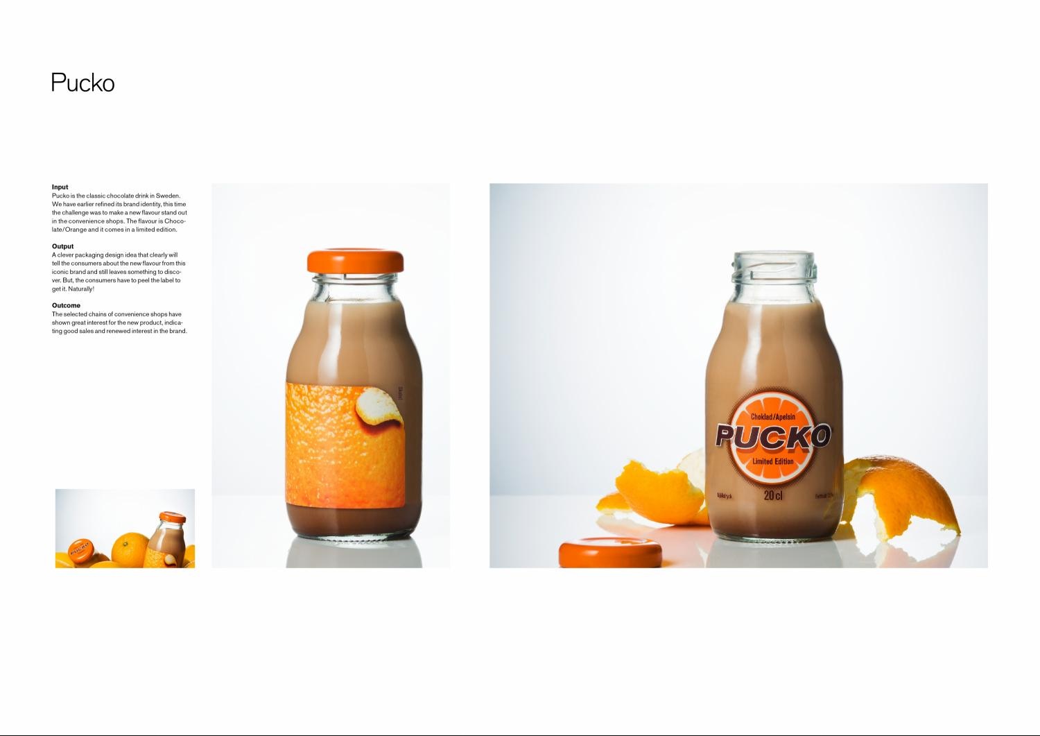
| Brief Explanation: |
| A clever packaging design idea that clearly will tell the consumers about the new flavour from this iconic brand and still leave something to discover. But, the consumers have to peel the label to get it. Naturally! |
| Describe the brief from the client: |
| Pucko is the classic chocolate drink in Sweden. The agency has earlier refined its brand identity, this time the challenge was to make a new flavour stand out in the convenience shops. The flavour is Chocolate/Orange and it comes in a limited edition. |
|
Description of how you arrived at the final design:
|
| A clever packaging design idea that clearly will tell the consumers about the new flavour from this iconic brand and still leave something to discover. But, the consumers have to peel the label to get it. Naturally! |
|
Indication of how successful the outcome was in the market:
|
| The selected chains of convenience shops have shown great interest for the new product, indicating good sales and renewed interest in the brand. 100,000 sold bottles in only four months. |
|
| SIX SCENTS FRAGRANCE INITIATIVE |
|
|
| Type of Entry: | Packaging Design |
| Category: | Cosmetics & Beauty |
| Title: | SIX SCENTS FRAGRANCE INITIATIVE |
| Advertiser/Client: | SYMRISE |
| Product/Service: | FRAGRANCE RANGE |
| Entrant Company: | METAPROJECT New York, USA |
| Design/Advertising Agency: | METAPROJECT New York, USA |
Creative Credits
| Name |
Company |
Position |
| Kaya Gavin Sorhaindo |
Metaproject |
Creative Director |
| Aramique Krauthamer |
Metaproject |
Story Director |
| David Roennfeldt |
3 Deep Design |
Art Direction/Design |
| Brett Phillips |
3 Deep Design |
Art Direction/Design |
| Lachlan Sumner |
3 Deep Design |
Art Direction/Design |
| Erik Jarlsson |
Metaproject |
Interactive Designer |
| Alexandre Lins |
Metaproject |
Interactive Designer |
| Miko Uno |
Metaproject |
Producer |
| Lucas Kim |
Metaproject |
Junior Designer |
| Gabriel Eid |
Gabriel Eid |
Still Life Photographer |
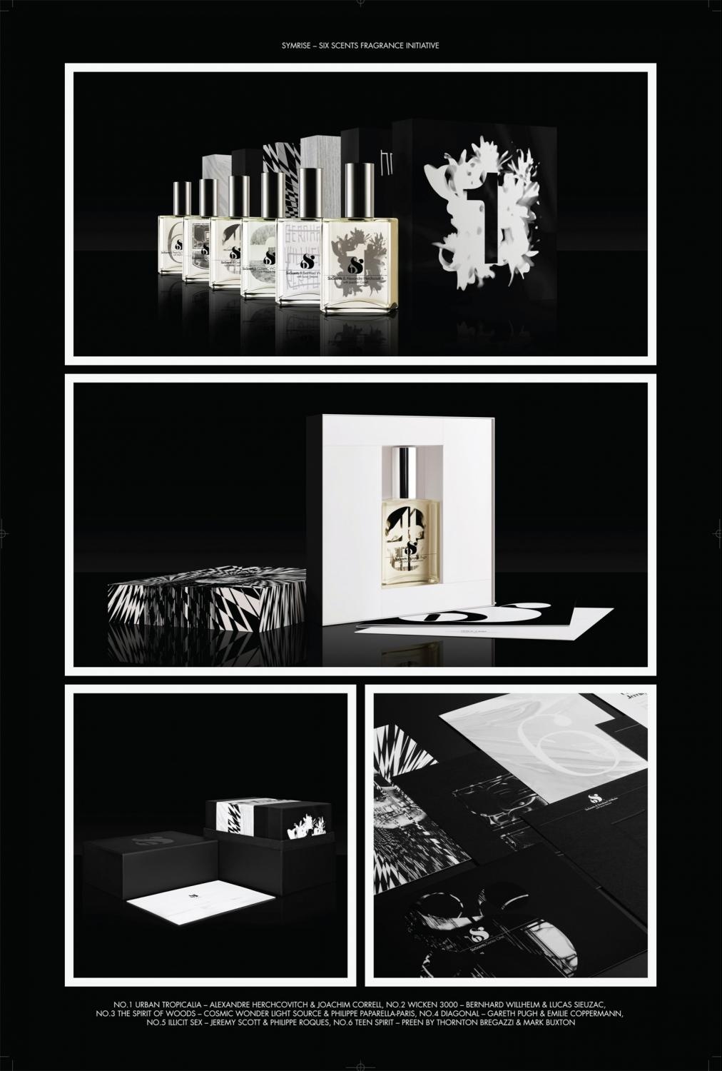
| Brief Explanation: |
| To create a distinctive and memorable fragrance program that positioned the Six Scents brand while communicating the diversity and identity of each of the invited designers. |
| Describe the brief from the client: |
| Establish the creative positioning, visual identity and packaging program for a avant-guard luxury fragrance initiative. |
|
Description of how you arrived at the final design:
|
| Create a flexible graphic, image & typographic system that adapts to the character of each designer while maintaining the integrity of the master brand.
Give some indication of how successful the outcome was in the market (We can pretty much write this section, but if you have anything to add please do send) |
|
Indication of how successful the outcome was in the market:
|
| We developed a collection that was positioned amongst the most prestigious perfumes in the world, selling at a higher price-point than almost any of the couture designers. The collection is currently carried by over 170 of the most avant-garde fashion boutiques in the world, across every continent and in most major international cities. 80% of these boutiques had not carried fragrance before. To date, 10,800 of the 12,000 fragrances have sold. Over 70 major print publications covered the project, over 60 major fashion websites, and NBC, Vogue TV and 2 major Japanese TV stations featured the initiative. |
|
|